You signed in with another tab or window. Reload to refresh your session.You signed out in another tab or window. Reload to refresh your session.You switched accounts on another tab or window. Reload to refresh your session.Dismiss alert
Check the main Readme for a complete installation guide.
Usage
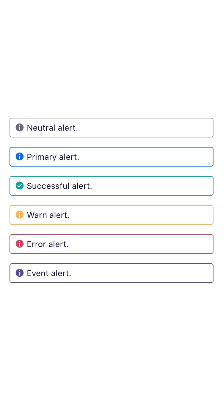
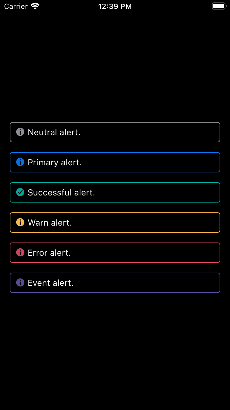
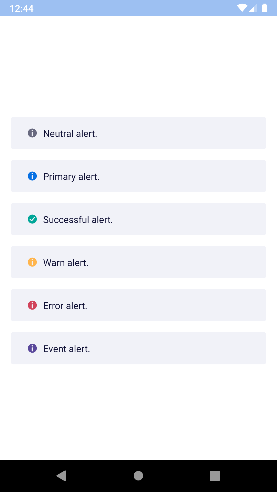
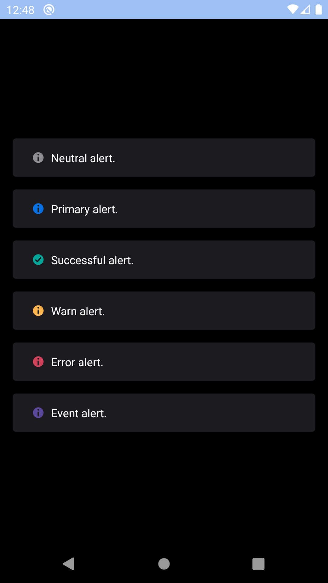
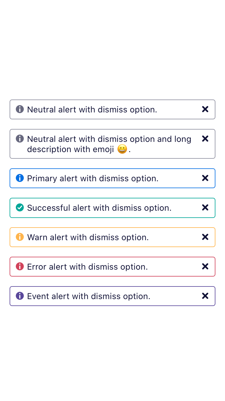
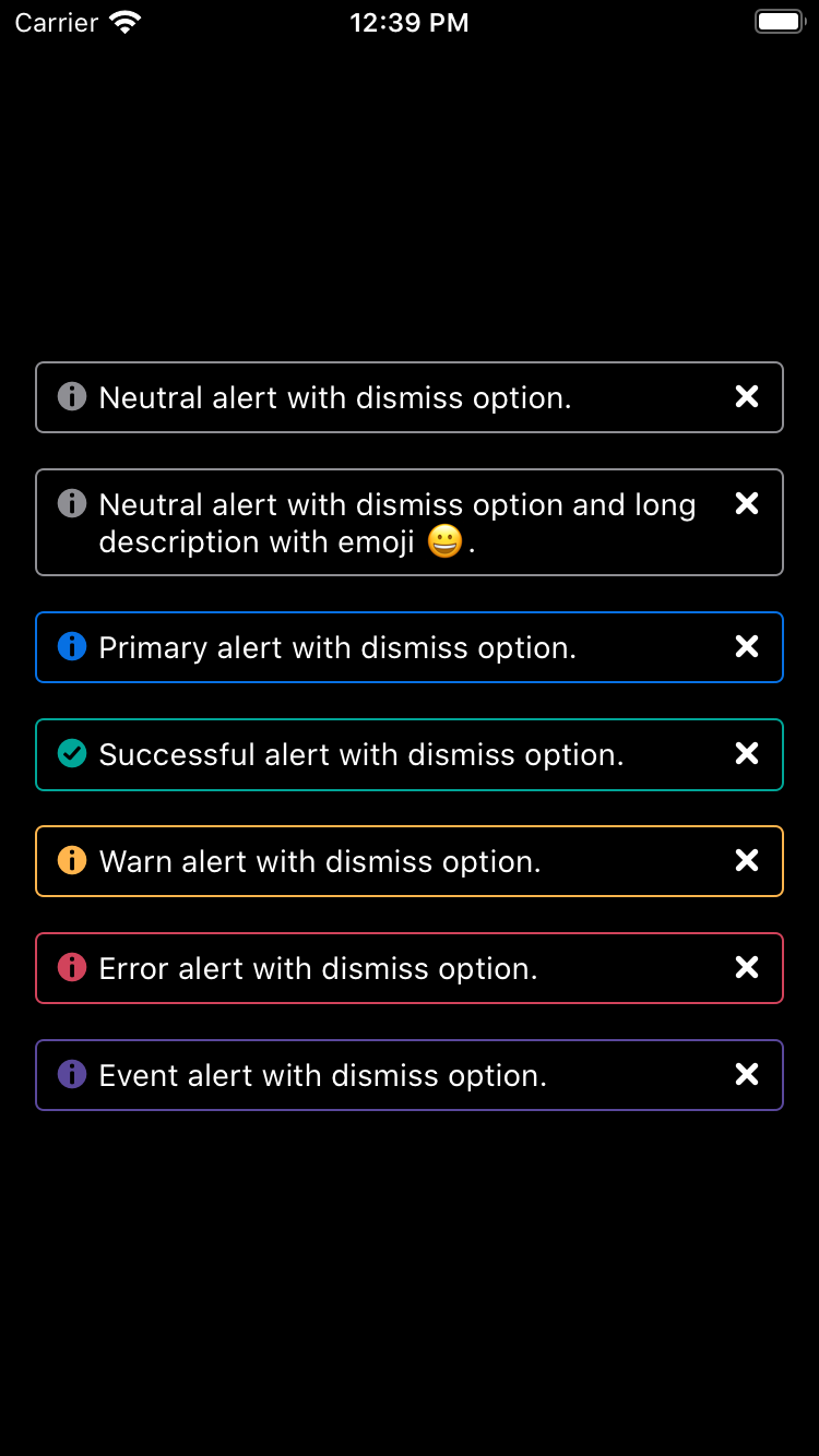
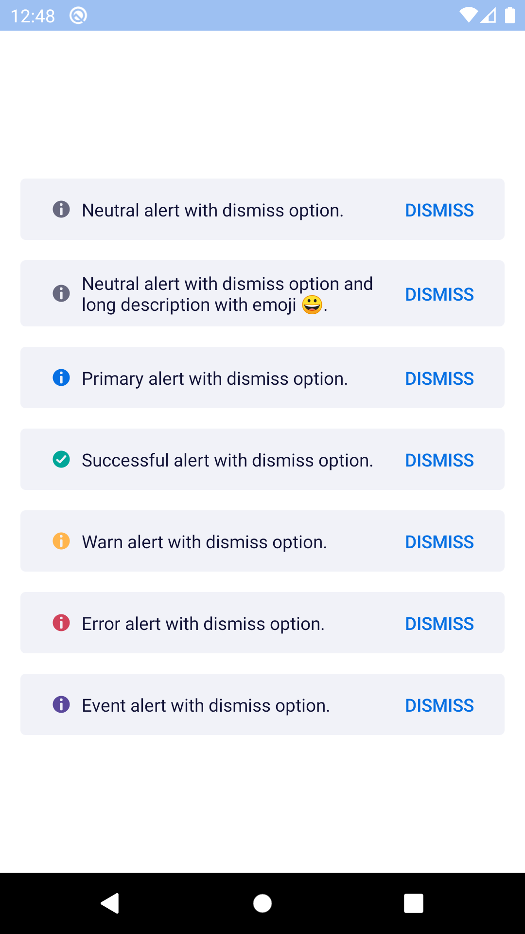
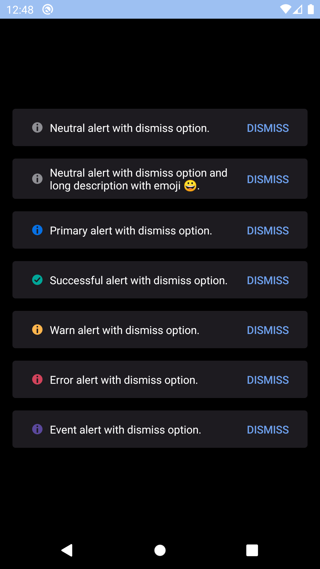
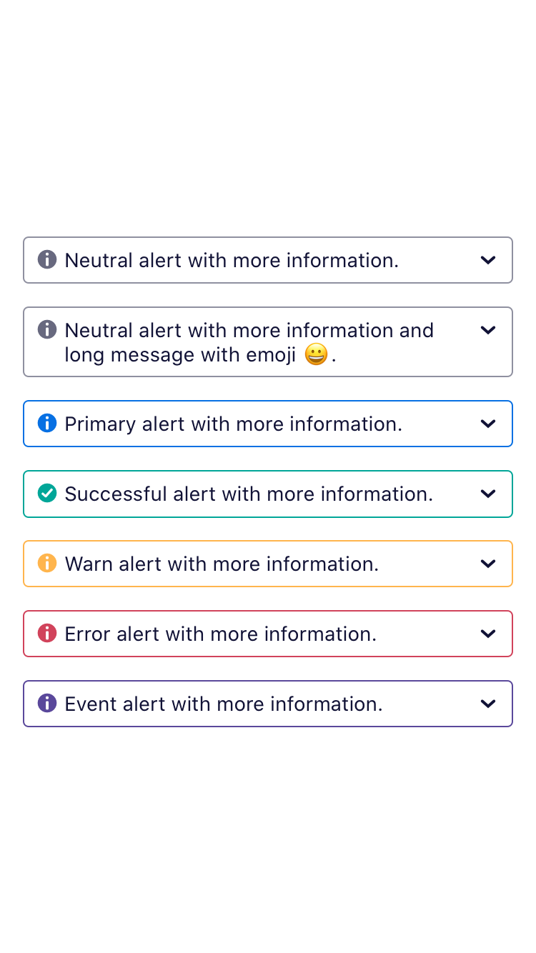
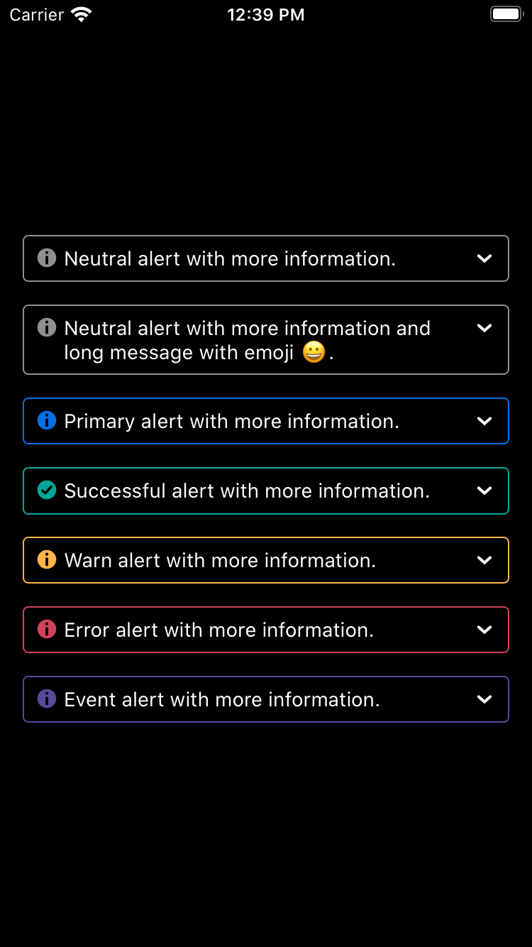
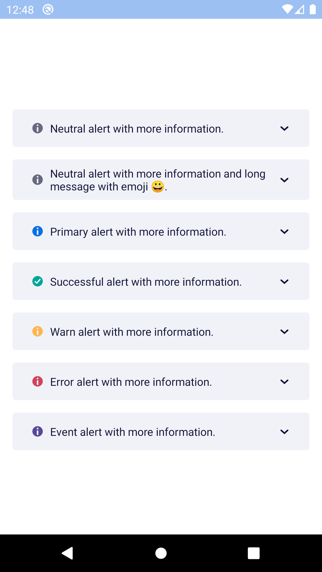
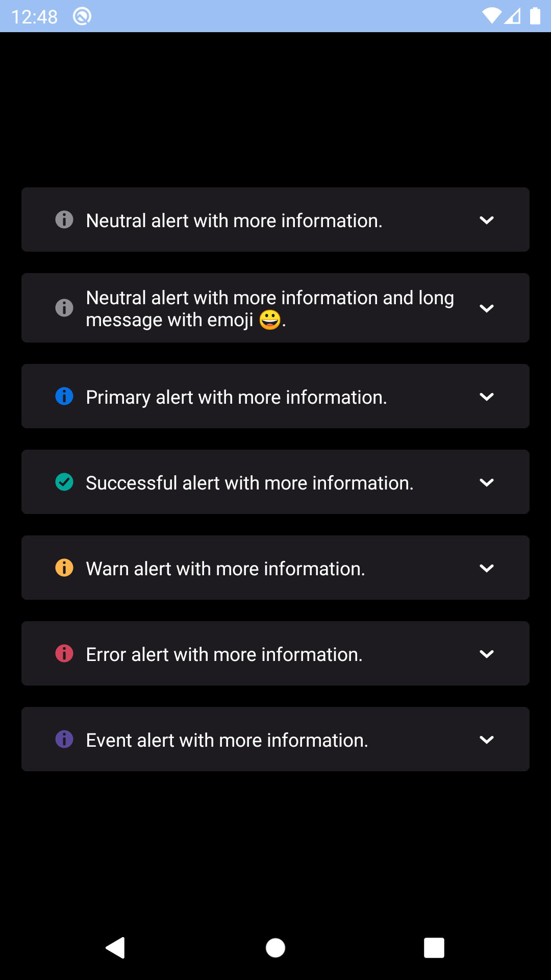
importReact,{Component}from'react';import{View,StyleSheet}from'react-native';importBpkTextfrom'backpack-react-native/bpk-component-text';import{spacingBase}from'@skyscanner/bpk-foundations-react-native/tokens/base.react.native';importBpkBannerAlert,{ALERT_TYPES}from'backpack-react-native/bpk-component-banner-alert';conststyles=StyleSheet.create({container: {flex: 1,justifyContent: 'center',padding: spacingBase,},bannerAlert: {marginBottom: spacingBase,},});exportdefaultclassAppextendsComponent{constructor(){super();this.state={showDismissable: true,expanded: false,};}onDismiss=()=>{this.setState({showDismissable: false});};onExpandablePress=()=>{this.setState({expanded: !this.state.expanded});};render(){return(<Viewstyle={styles.container}><BpkBannerAlertstyle={styles.bannerAlert}type={ALERT_TYPES.success}message="Success message!"/><BpkBannerAlertstyle={styles.bannerAlert}type={ALERT_TYPES.warn}message="Warn message!"dismissButtonLabel="Dismiss"onDismiss={this.onDismiss}dismissableshow={this.state.showDismissable}/><BpkBannerAlertstyle={styles.bannerAlert}type={ALERT_TYPES.error}message="Error message!"toggleExpandedButtonLabel="Expand"onToggleExpanded={this.onExpandablePress}expanded={this.state.expanded}><BpkTexttextStyle="sm">
Lorem ipsum dolor sit amet, consectetur adipiscing elit. Quisque
sagittis sagittis purus, id blandit ipsum. Pellentesque nec diam nec
erat condimentum dapibus. Nunc diam augue, egestas id egestas ut,
facilisis nec mi. Donec et congue odio, nec laoreet est. Integer
rhoncus varius arcu, a fringilla libero laoreet at.
</BpkText></BpkBannerAlert></View>);}}
Props
Property
PropType
Required
Default Value
message
string or Node
true
-
type
oneOf(ALERT_TYPES)
true
-
animateOnEnter
bool
false
false
animateOnLeave
bool
false
false
children
node
false
null
dismissable
bool
false
false
dismissButtonLabel
string
false
null
expanded
bool
false
false
onDismiss
func
false
null
onToggleExpanded
func
false
null
show
bool
false
true
toggleExpandedButtonLabel
string
false
null
bannerStyle
style
false
null
Prop Details
bannerStyle
These styles will be applied to the banner alerts outer View container, but still within it's animation container. This is useful for maintaining smooth animations whilst applying top/bottom margin.