You signed in with another tab or window. Reload to refresh your session.You signed out in another tab or window. Reload to refresh your session.You switched accounts on another tab or window. Reload to refresh your session.Dismiss alert
Note that on Android, style should be used for positional styling and innerChipStyle should be used for other styling.
(On iOS, style and innerChipStyle are applied together so it doesn't matter which you use!)
leadingAccessoryView and trailingAccessoryView
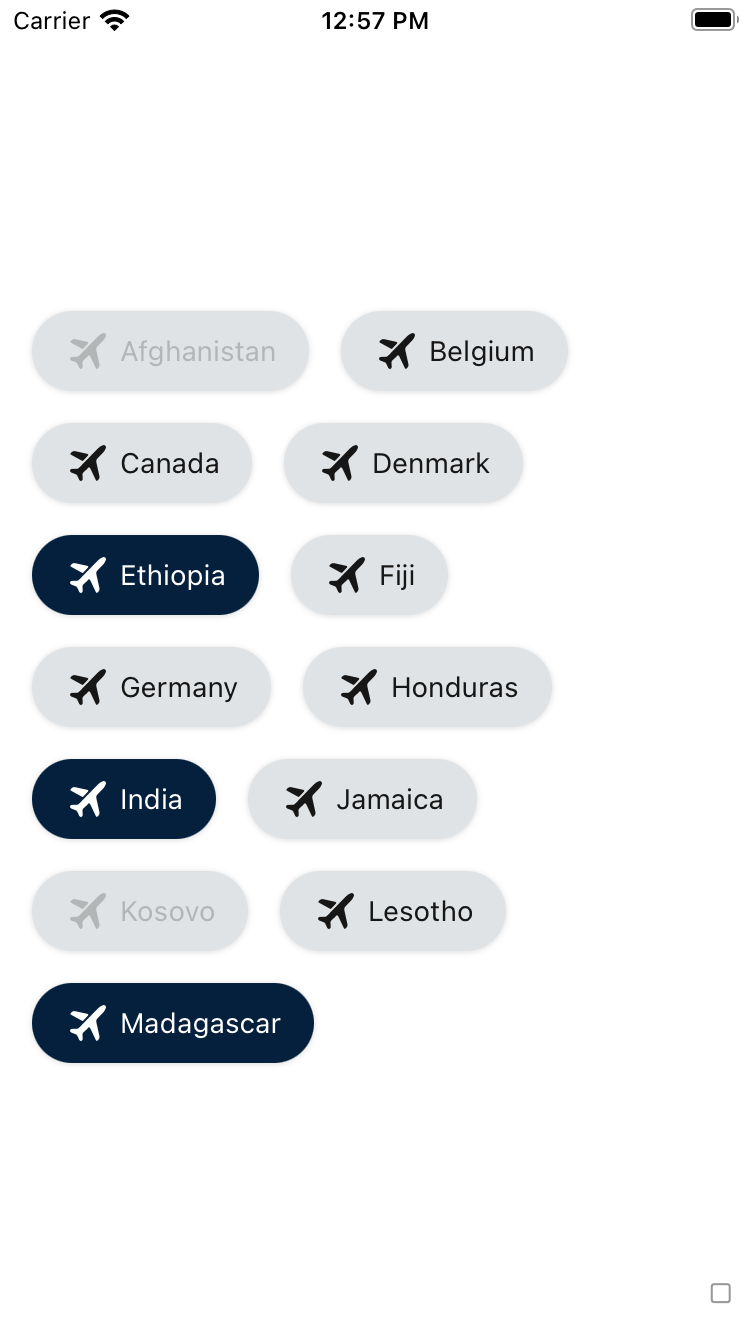
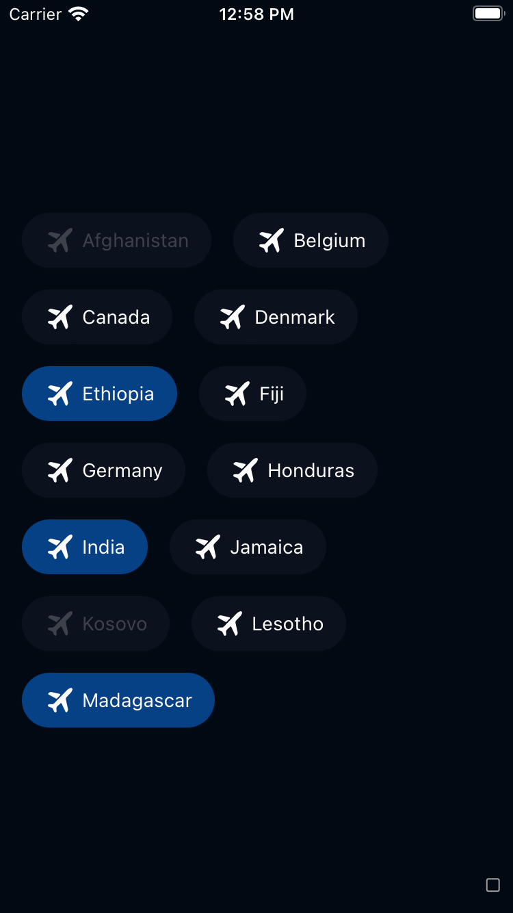
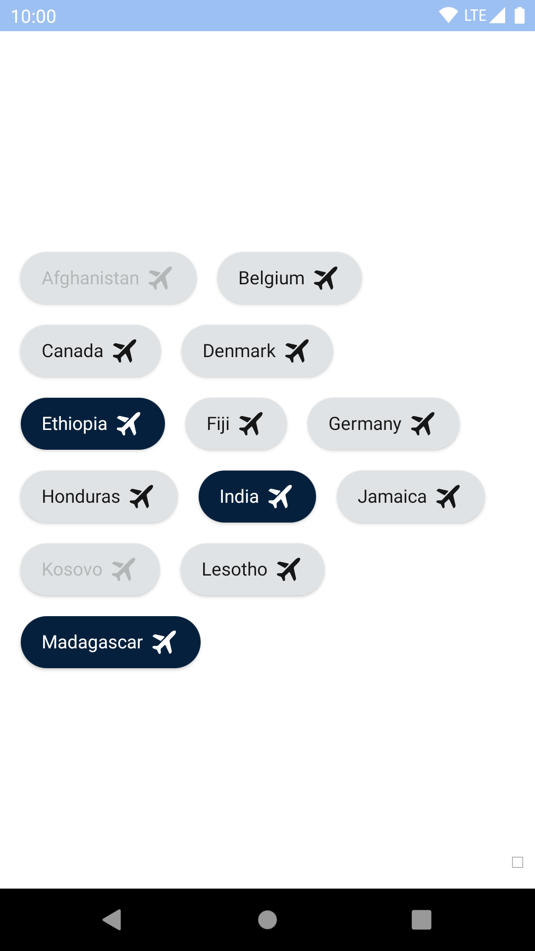
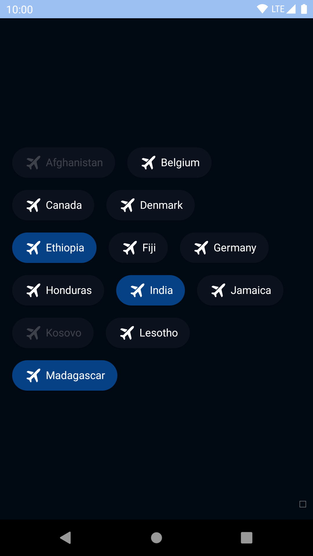
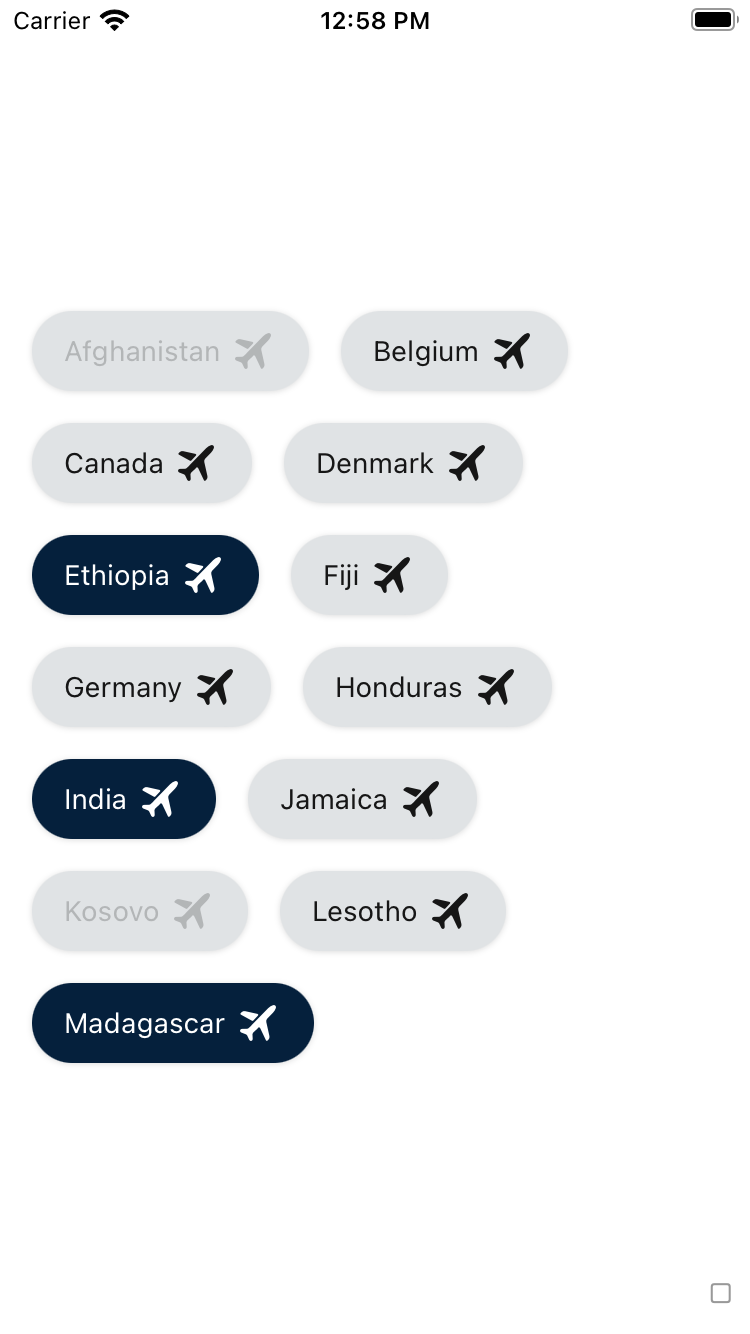
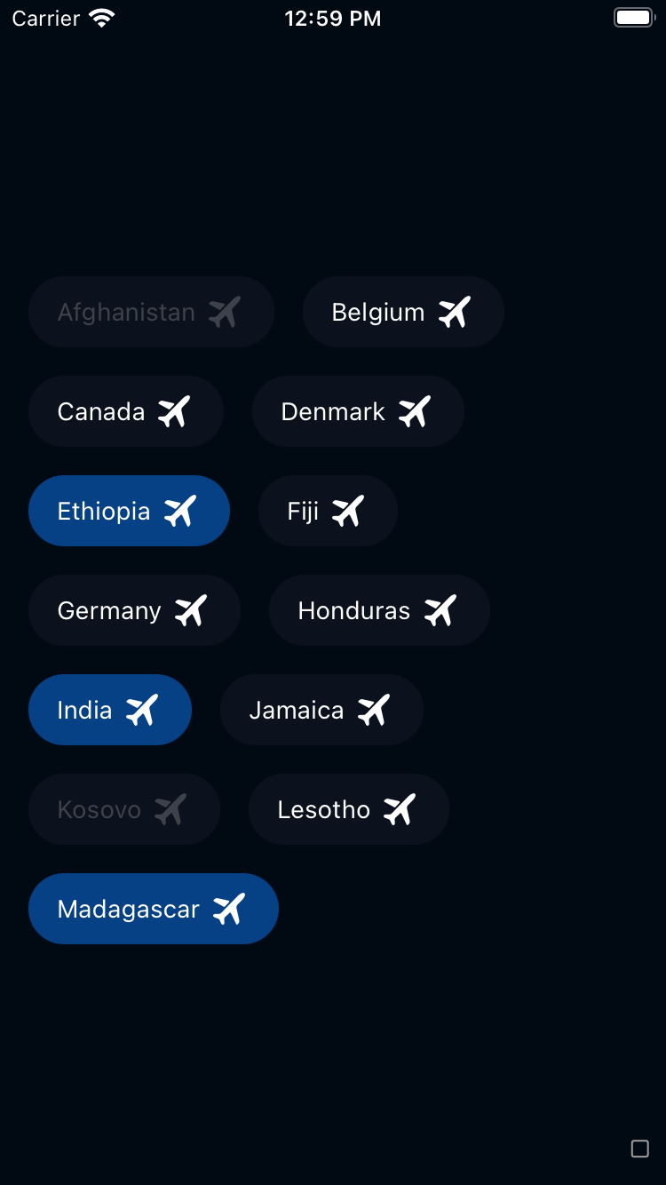
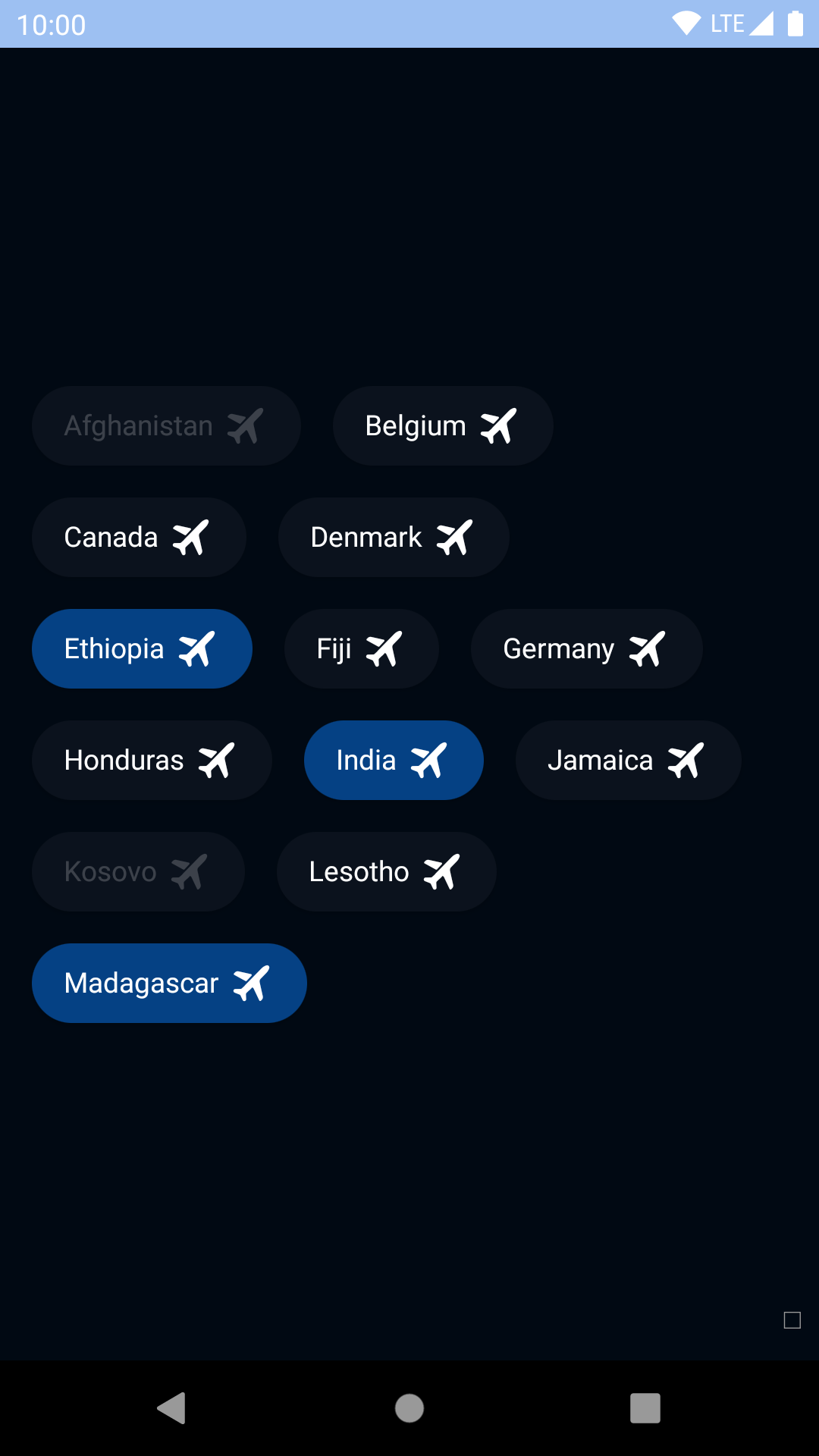
Use accessory views to place icons inside the chip.
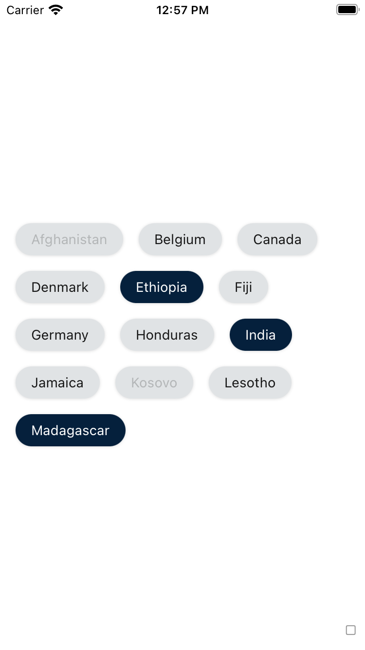
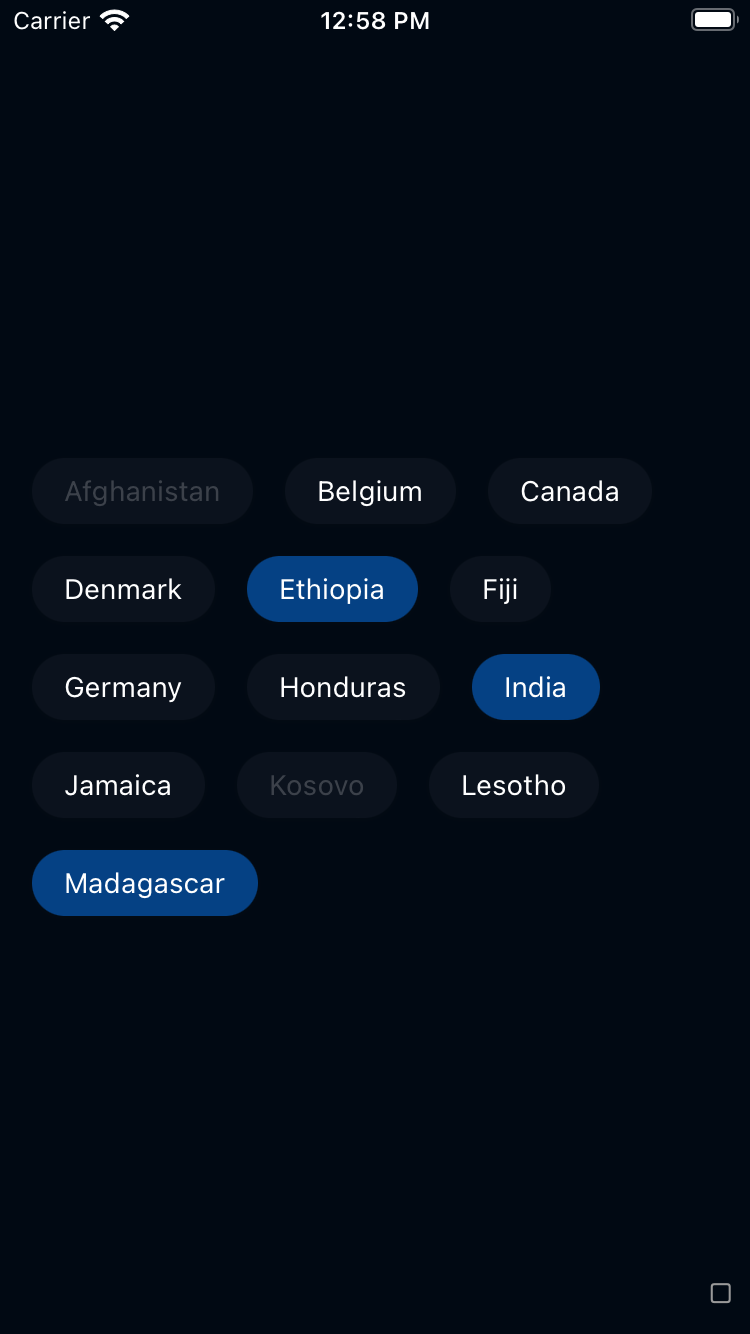
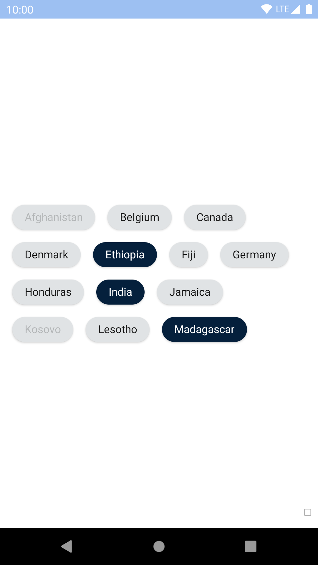
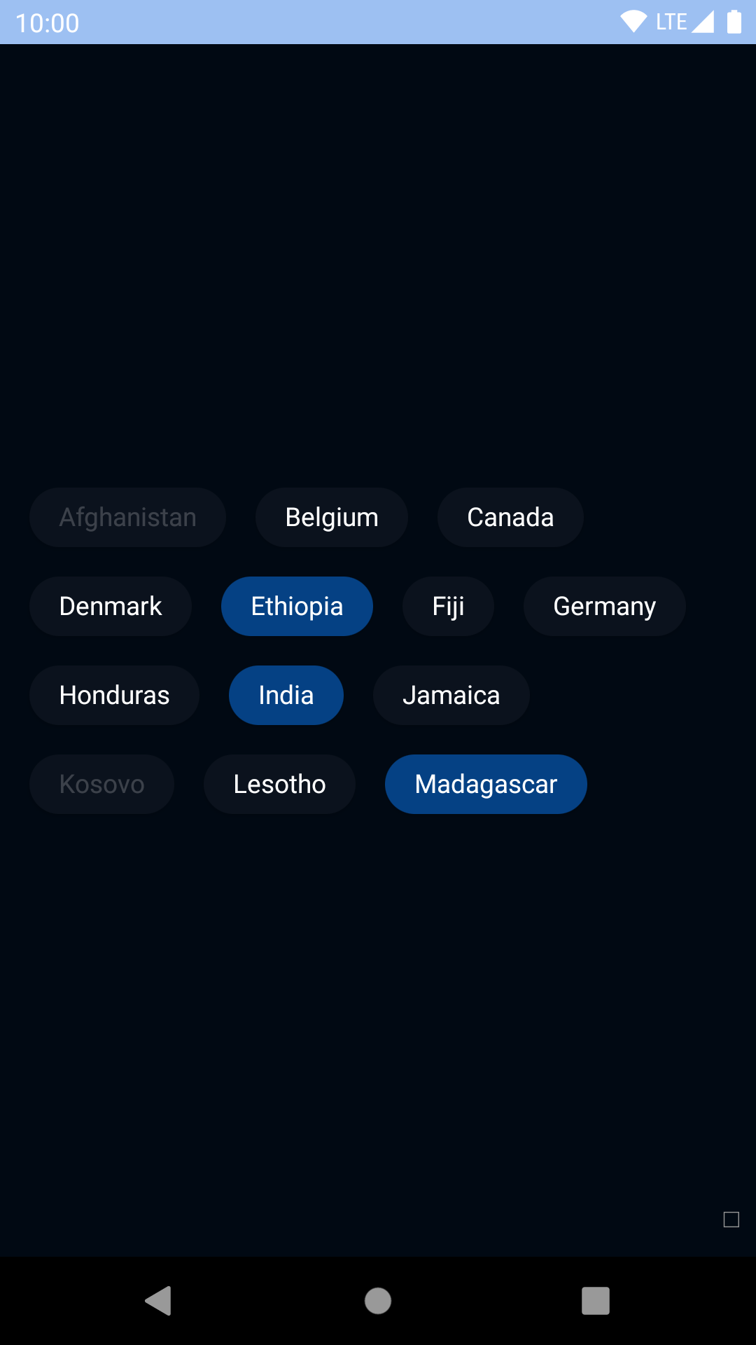
Theme Props
chipSelectedBackgroundColor
chipSelectedTextColor
chipOutlineSelectedBackgroundColor
chipOutlineSelectedTextColor
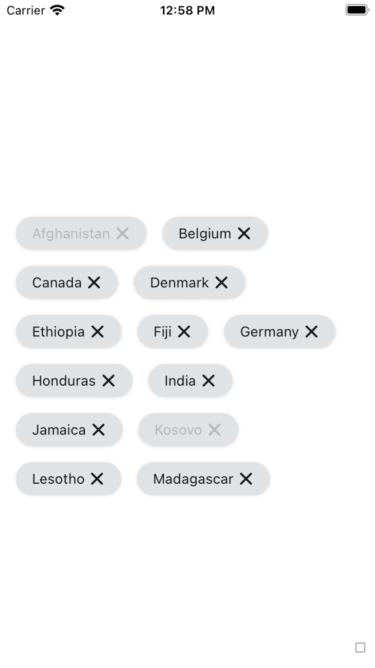
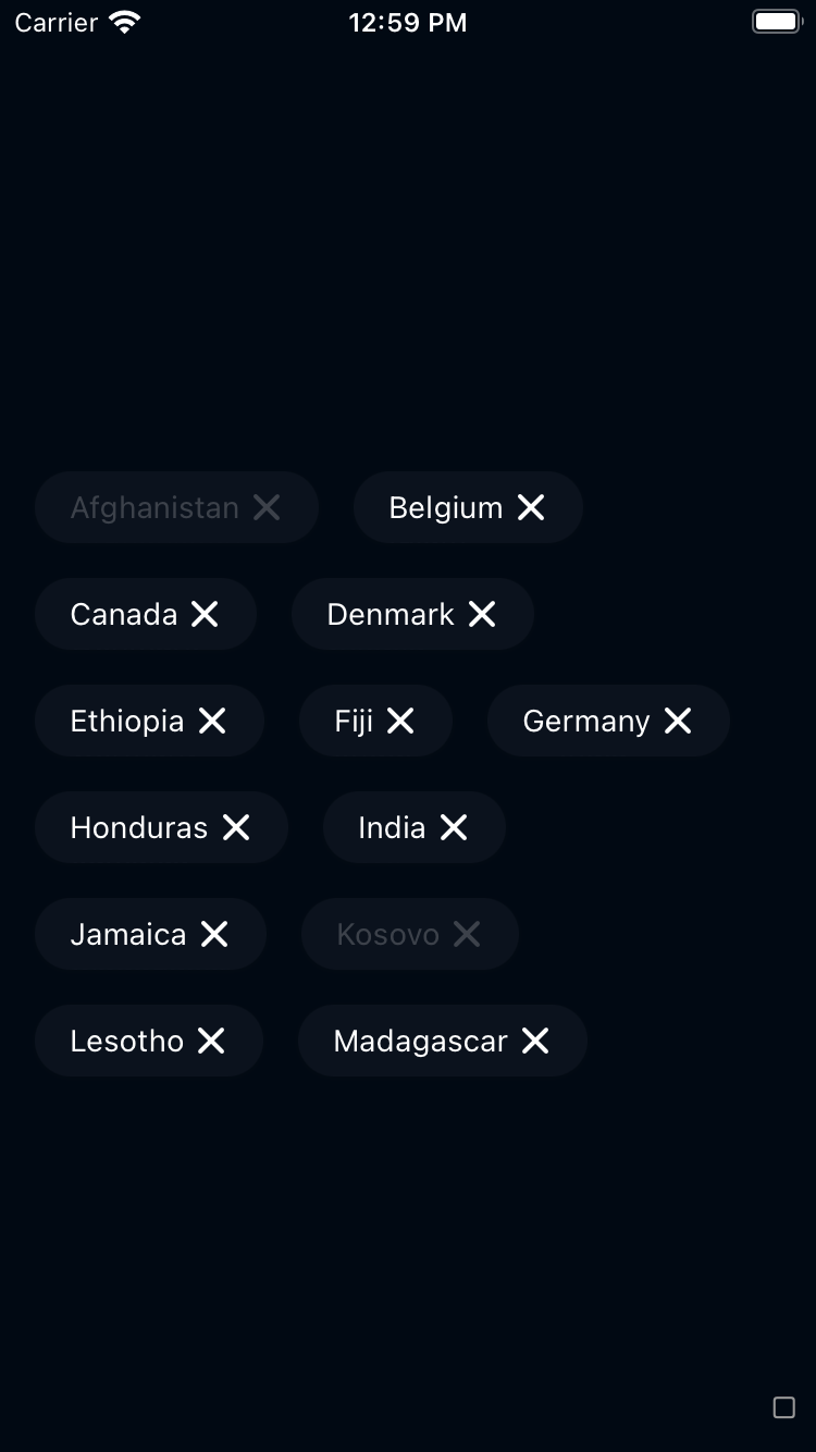
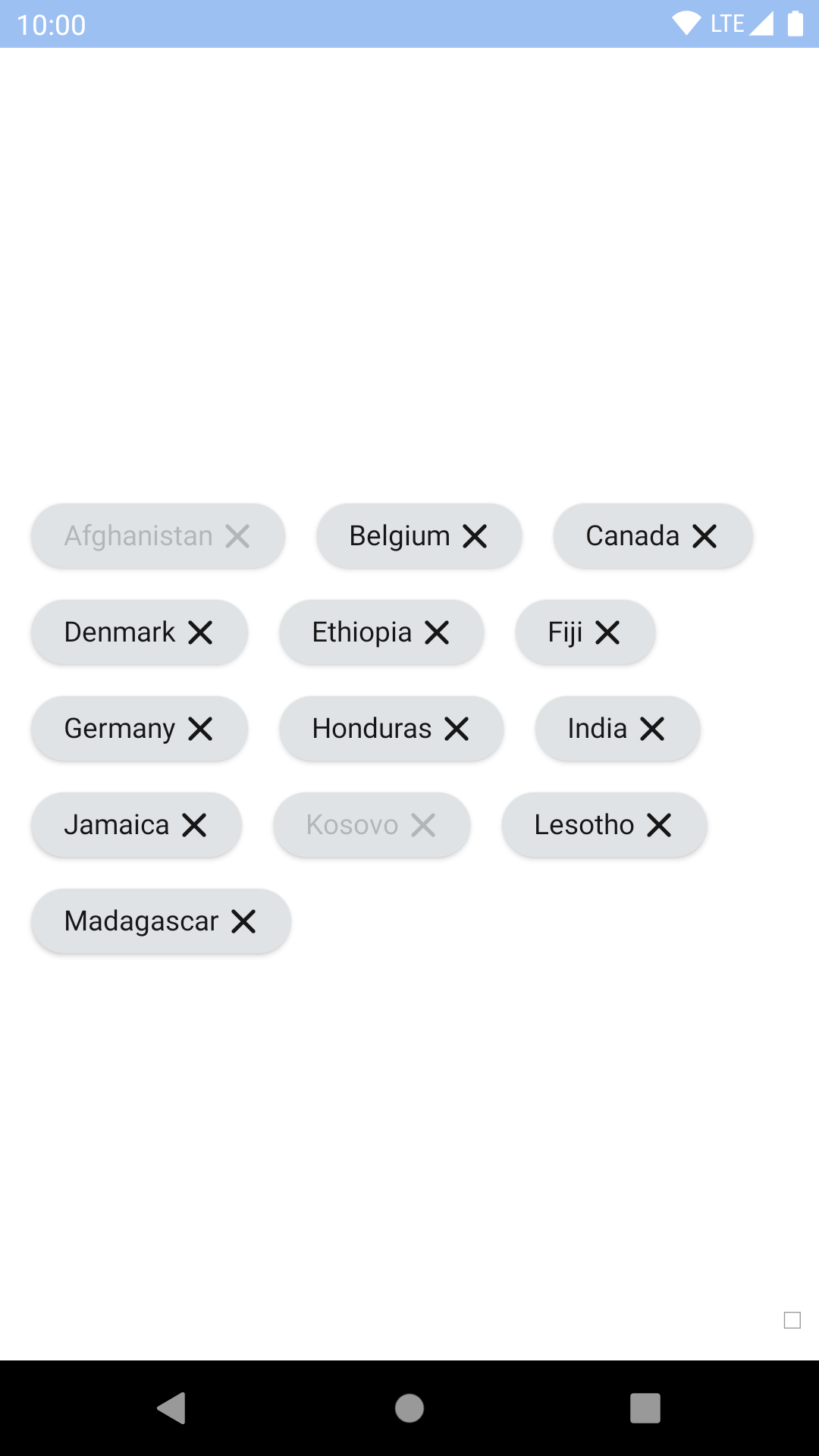
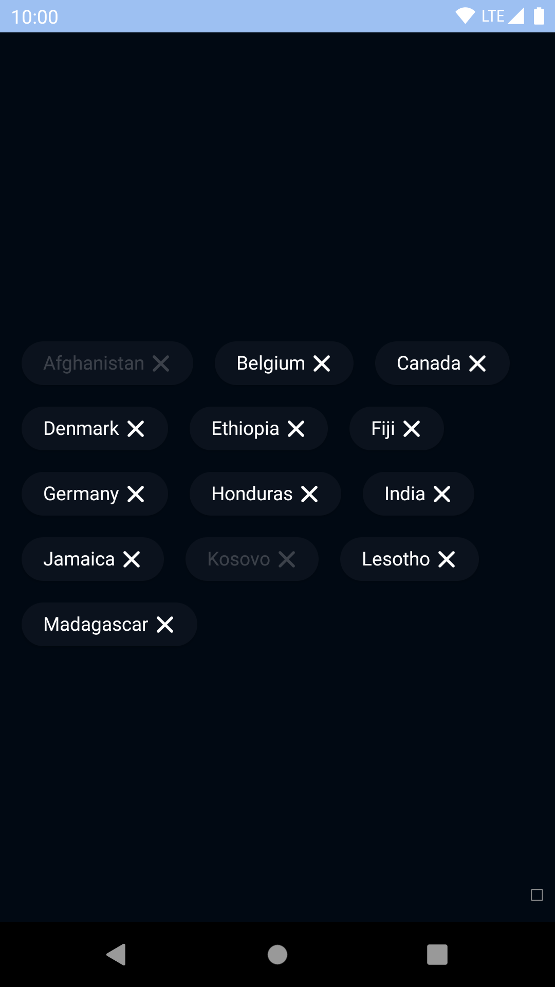
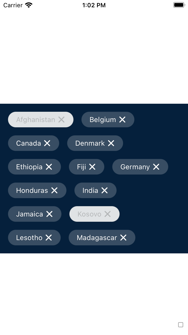
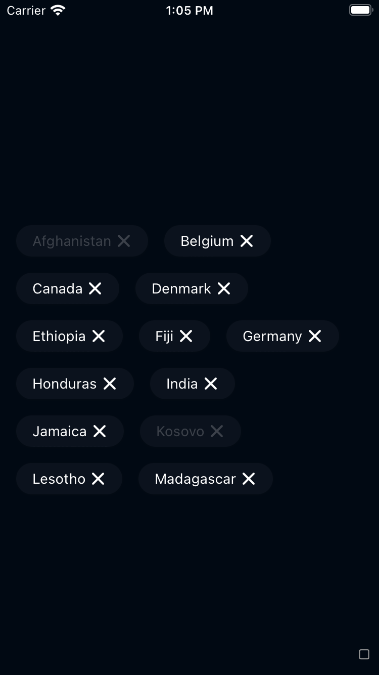
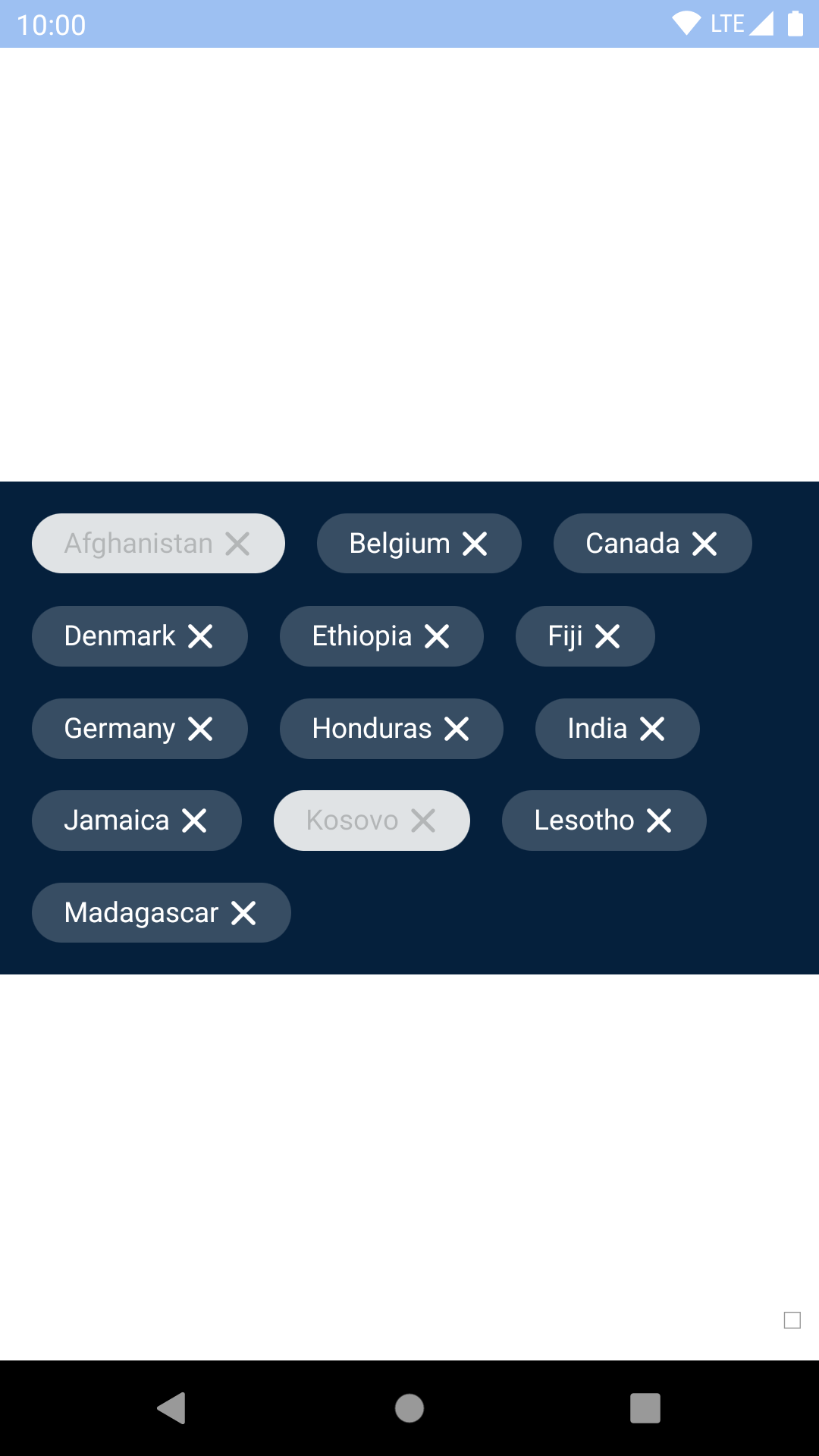
BpkDismissibleChip
Property
PropType
Required
Default Value
accessibilityLabel
string
true
-
label
string
true
-
onPress
func
true
-
disabled
bool
false
false
innerChipStyle
ViewStyle
false
null
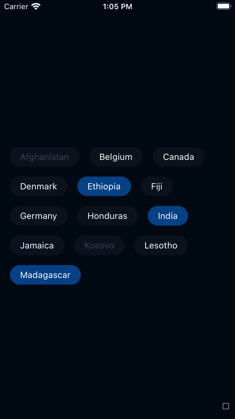
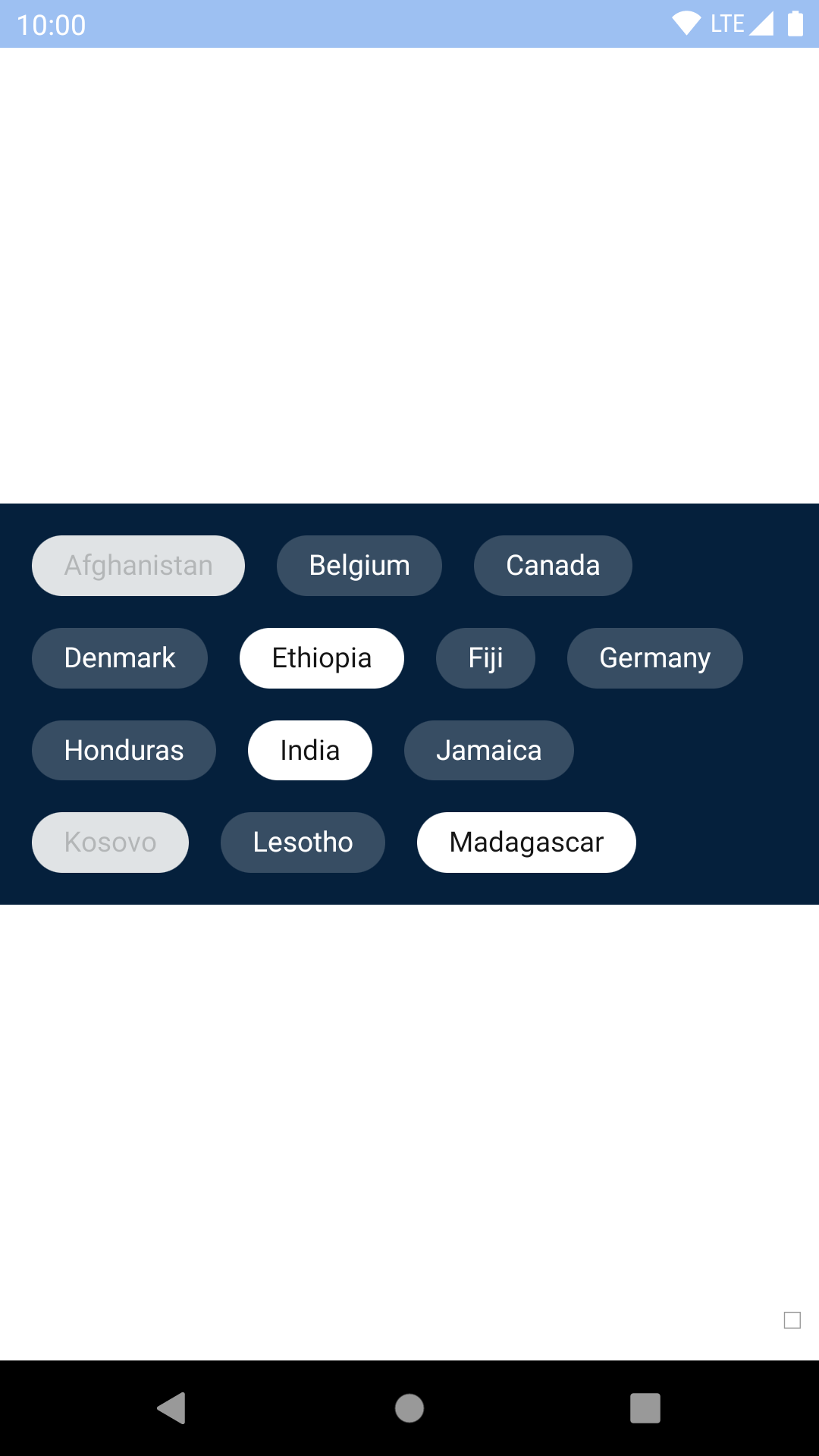
type
oneOf(CHIP_TYPES)
false
primary
leadingAccessoryView
element
false
null
Note that on Android, style should be used for positional styling and innerChipStyle should be used for other styling.
(On iOS, style and innerChipStyle are applied together so it doesn't matter which you use!)
leadingAccessoryView
Use accessory views to place icons inside the chip.
Note: Dismissible chips do not support trailing accessory views because they already have a close icon in that position.