
Provide an expandable details-summary view.
| Property | Attribute | Type | Default | Description |
|---|---|---|---|---|
ariaChecked |
aria-checked |
string |
Aria expanded attribute. | |
checked |
checked |
boolean |
false | Opens the expansion. |
disabled |
disabled |
boolean |
false | Disables the element. |
duration |
duration |
number |
250 | The duration of the animations. |
icon |
icon |
string | undefined |
"expand_more" | Icon name. |
name |
name |
string | undefined |
Name of the native form element. | |
noRipple |
noRipple |
boolean |
false | Deactivates the ripple. |
readonly |
readonly |
boolean |
false | Makes the element readonly (disabled but tabbable) |
required |
required |
boolean |
false | Makes the element required in a form context. |
role |
role |
AriaRole |
"radio" | Role of the radio behavior. |
value |
value |
string |
"" | Value of the form element. |
| Event | Description |
|---|---|
change |
Dispatched when the checked property changes due to a user interaction. |
| Name | Description |
|---|---|
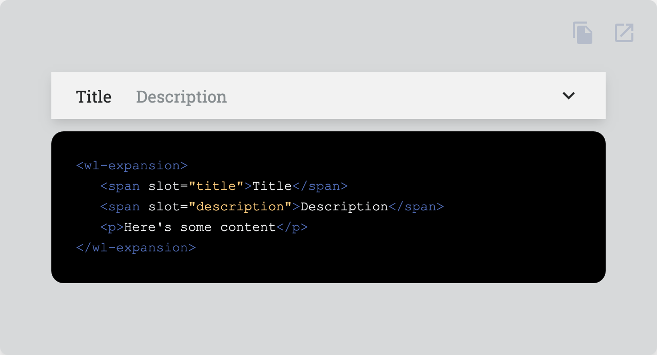
| Default content. | |
description |
Description to the left on the header. |
indicator |
Content to the right on the header. |
title |
Title to the left on the header. |
| Property | Description |
|---|---|
--expansion-bg |
Default background |
--expansion-color |
Default color |
--expansion-content-padding |
Padding of the content |
--expansion-elevation |
Box shadow |
--expansion-elevation-open |
Box shadow when open |
--expansion-header-bg-hover |
Background of the header when :hover |
--expansion-header-description-color |
Color of the description slot in the header |
--expansion-header-height |
Height of the header |
--expansion-header-height-open |
Height of the header when open |
--expansion-header-padding |
Padding of the header |
--expansion-header-title-margin |
Margin of the title slot in the header |
--expansion-header-transition |
Transition of the header |
--expansion-icon-transition |
Transition of the icon |
--expansion-margin-open |
Margin when open |
--expansion-transition |
Transition |
Go here to try the demo.
 |
|
|---|---|
| Andreas Mehlsen | You? |
Licensed under MIT.