
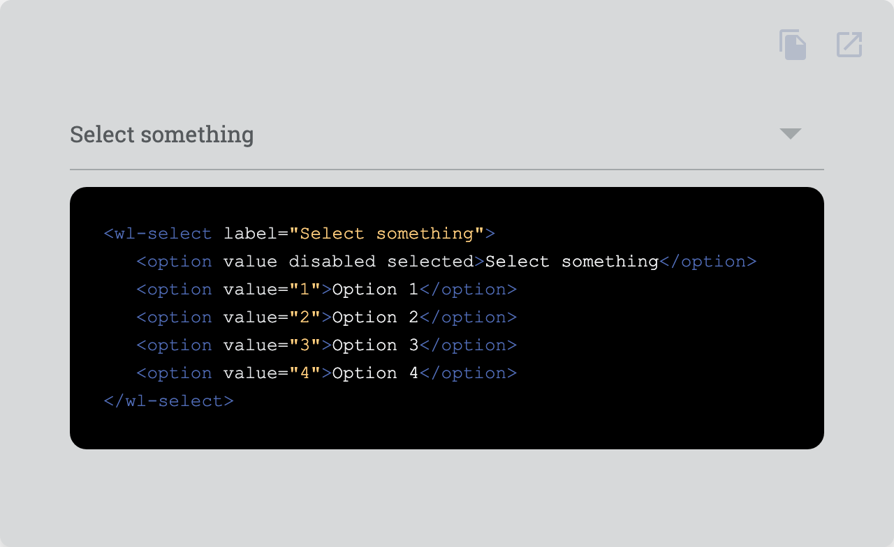
Select one or more values from a set of options.
| Property | Attribute | Type | Default | Description |
|---|---|---|---|---|
autocomplete |
autocomplete |
"on" | "off" | undefined |
Whether autocomplete is on or off. | |
disabled |
disabled |
boolean |
false | Disables the element. |
filled |
filled |
boolean |
false | Fills the input with a solid color. |
label |
label |
string | undefined |
Label text. | |
name |
name |
string | undefined |
Name of the native form element. | |
outlined |
outlined |
boolean |
false | Makes the input outlined. |
readonly |
readonly |
boolean |
false | Makes the element readonly (disabled but tabbable) |
required |
required |
boolean |
false | Makes the element required in a form context. |
role |
role |
AriaRole |
"select" | Role of the select. |
value |
value |
string |
Value of the form element. | |
valueAsNumber |
valueAsNumber |
number |
Value of the slider. |
| Event | Description |
|---|---|
input |
Dispatches from the native input event each time the input changes. |
invalid |
Dispatched when the input becomes invalid. |
submit |
Dispatched when the enter key is hit while pressing ctrl or the meta-key. |
| Name | Description |
|---|---|
| elements go here. | |
after |
Content after the input. |
before |
Content before the input. |
| Property | Description |
|---|---|
--input-before-after-color |
Color of the before and after slots |
--input-bg |
Default background |
--input-bg-filled |
Background when filled |
--input-bg-filled-hover |
Background when filled and hover |
--input-border-radius-filled |
Border radius when filled |
--input-border-radius-outlined |
Border radius when outlined |
--input-border-style |
Border style |
--input-border-style-disabled |
Border style when disabled |
--input-border-width |
Border width |
--input-color |
Default color |
--input-color-disabled |
Color when disabled |
--input-font-family |
Font family |
--input-font-size |
Font size |
--input-label-color |
Color of the label |
--input-label-color-disabled |
Color of the label when disabled |
--input-label-font-size |
Font size of the label |
--input-label-space |
Space between label and input |
--input-label-transition |
Transition of the label |
--input-padding-left-right |
Left and right padding |
--input-padding-left-right-outlined |
Left and right padding when outlined |
--input-padding-top-bottom |
Top and bottom padding |
--input-state-color-active |
Active state color |
--input-state-color-disabled |
Disabled state color |
--input-state-color-hover |
Hover state color |
--input-state-color-inactive |
Inactive state color |
--input-state-color-invalid |
Invalid state color |
--input-transition |
Transition |
--select-arrow-height |
Height of the arrow. |
Go here to try the demo.
 |
|
|---|---|
| Andreas Mehlsen | You? |
Licensed under MIT.