
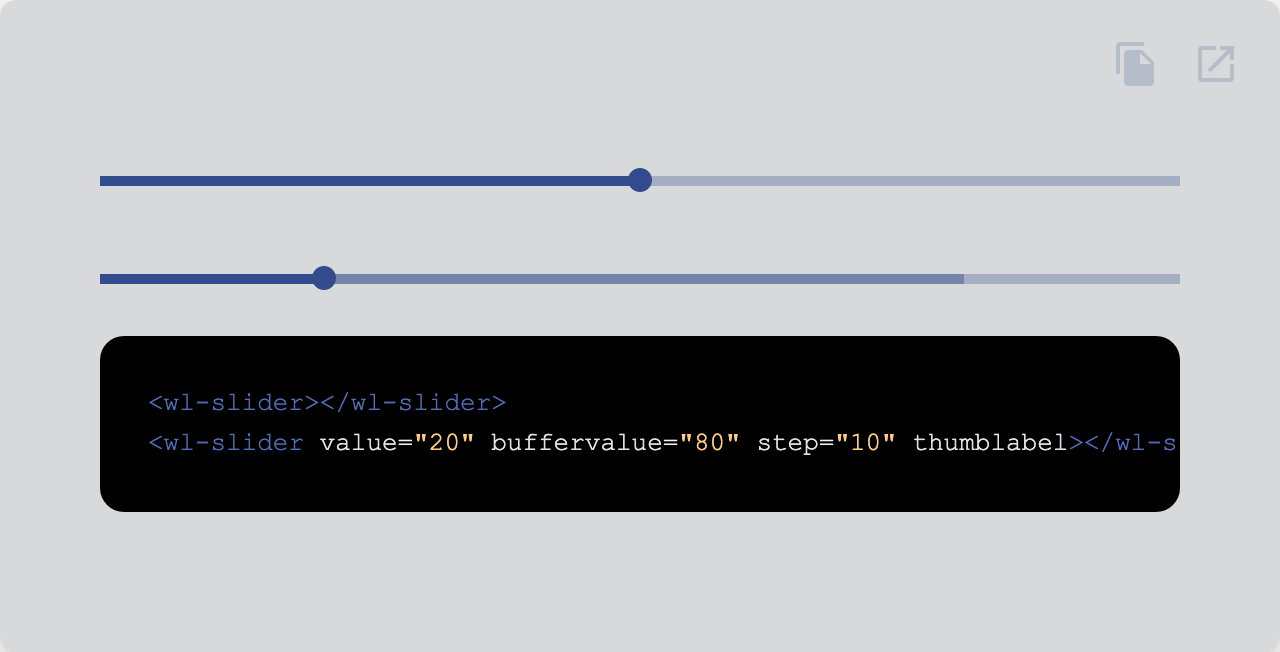
Make selections from a range of values.
| Property | Attribute | Type | Default | Description |
|---|---|---|---|---|
autocomplete |
autocomplete |
"on" | "off" | undefined |
Whether autocomplete is on or off. | |
bufferMax |
bufferMax |
number |
100 | The maximum buffer value allowed. |
bufferMin |
bufferMin |
number |
0 | The minimum buffer value allowed. |
bufferValue |
bufferValue |
number | undefined |
The buffer value. | |
disabled |
disabled |
boolean |
false | Disables the element. |
filled |
filled |
boolean |
false | Fills the input with a solid color. |
label |
label |
string | undefined |
Label text. | |
max |
max |
number |
100 | The maximum value allowed. |
min |
min |
number |
0 | The minimum value allowed. |
name |
name |
string | undefined |
Name of the native form element. | |
outlined |
outlined |
boolean |
false | Makes the input outlined. |
readonly |
readonly |
boolean |
false | Makes the element readonly (disabled but tabbable) |
required |
required |
boolean |
false | Makes the element required in a form context. |
role |
role |
AriaRole |
"slider" | Role of the slider. |
step |
step |
number | undefined |
The legal number intervals | |
thumbLabel |
thumbLabel |
boolean |
false | Label above the thumb that shows the value. |
value |
value |
string |
Value of the form element. | |
valueAsNumber |
valueAsNumber |
number |
Value of the slider. |
| Event | Description |
|---|---|
input |
Dispatches from the native input event each time the input changes. |
invalid |
Dispatched when the input becomes invalid. |
submit |
Dispatched when the enter key is hit while pressing ctrl or the meta-key. |
| Name | Description |
|---|---|
after |
Content after the input. |
before |
Content before the input. |
thumb-label |
Optional slot for the thumb label. |
| Property | Description |
|---|---|
--input-before-after-color |
Color of the before and after slots |
--input-bg |
Default background |
--input-bg-filled |
Background when filled |
--input-bg-filled-hover |
Background when filled and hover |
--input-border-radius-filled |
Border radius when filled |
--input-border-radius-outlined |
Border radius when outlined |
--input-border-style |
Border style |
--input-border-style-disabled |
Border style when disabled |
--input-border-width |
Border width |
--input-color |
Default color |
--input-color-disabled |
Color when disabled |
--input-font-family |
Font family |
--input-font-size |
Font size |
--input-label-color |
Color of the label |
--input-label-color-disabled |
Color of the label when disabled |
--input-label-font-size |
Font size of the label |
--input-label-space |
Space between label and input |
--input-label-transition |
Transition of the label |
--input-padding-left-right |
Left and right padding |
--input-padding-left-right-outlined |
Left and right padding when outlined |
--input-padding-top-bottom |
Top and bottom padding |
--input-state-color-active |
Active state color |
--input-state-color-disabled |
Disabled state color |
--input-state-color-hover |
Hover state color |
--input-state-color-inactive |
Inactive state color |
--input-state-color-invalid |
Invalid state color |
--input-transition |
Transition |
--slider-bg |
Background |
--slider-bg-active |
Background of the active part |
--slider-bg-active-disabled |
Background of the active part when disabled |
--slider-bg-buffer |
Background of the buffer part |
--slider-bg-buffer-disabled |
Background of the buffer part when disabled |
--slider-bg-disabled |
Background when disabled |
--slider-height |
Height |
--slider-thumb-bg |
Background of the thumb |
--slider-thumb-bg-disabled |
Background of the thumb when disabled |
--slider-thumb-border-radius |
Border radius of the thumb |
--slider-thumb-focus-ring-bg |
Background of the thumb focus ring |
--slider-thumb-focus-ring-size |
Size of the thumb focus ring when focused |
--slider-thumb-label-bg |
Background of the thumb label |
--slider-thumb-label-border-radius |
Border radius of the thumb label |
--slider-thumb-label-color |
Color of the thumb label |
--slider-thumb-label-font-size |
Font size of the thumb label |
--slider-thumb-label-size |
Size of the thumb label |
--slider-thumb-label-transition |
Transition of the thumb label |
--slider-thumb-size |
Size of the thumb |
--slider-thumb-space |
Space between slider track and thumb label |
--slider-thumb-transform-focus |
Transform of the thumb when focused |
--slider-thumb-transition |
Transition of the thumb |
Go here to try the demo.
 |
|
|---|---|
| Andreas Mehlsen | You? |
Licensed under MIT.