
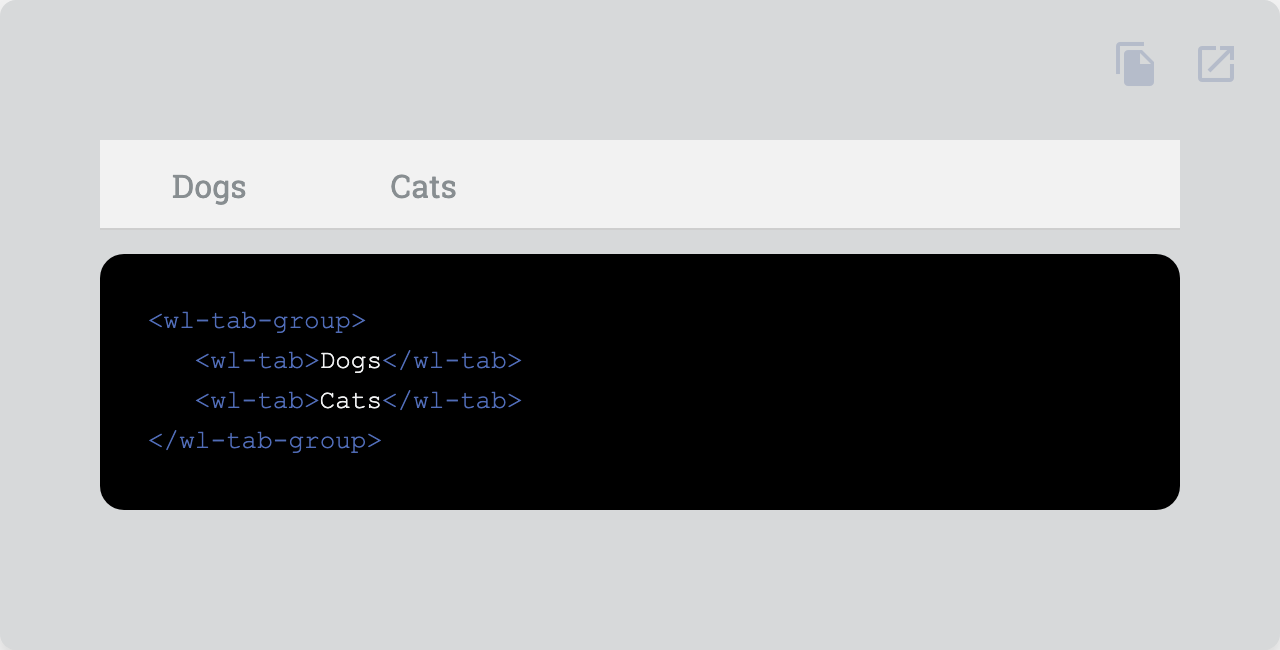
Organize navigation between groups of content.
| Property | Attribute | Type | Default | Description |
|---|---|---|---|---|
ariaChecked |
aria-checked |
string |
Aria checked attribute. | |
checked |
checked |
boolean |
false | Checks the switch. |
disabled |
disabled |
boolean |
false | Disables the element. |
name |
name |
string | undefined |
Name of the native form element. | |
readonly |
readonly |
boolean |
false | Makes the element readonly (disabled but tabbable) |
required |
required |
boolean |
false | Makes the element required in a form context. |
role |
role |
AriaRole |
"tab" | Role of the tab. |
value |
value |
string |
"" | Value of the form element. |
vertical |
vertical |
boolean |
false | Vertical tab style. |
| Event | Description |
|---|---|
change |
Dispatched when the checked property changes due to a user interaction. |
| Name | Description |
|---|---|
| Default content. | |
before |
Default content. |
| Property | Description |
|---|---|
--tab-before-margin |
Margin of the before slot |
--tab-before-margin-vertical |
margin of the before slot when vertical |
--tab-bg |
default background |
--tab-bg-active |
background when active |
--tab-bg-active-filled |
background when active and filled |
--tab-bg-active-hover |
background when active and hover |
--tab-bg-active-hover-filled |
background when active, hover and filled |
--tab-bg-disabled |
background when disabled |
--tab-bg-disabled-filled |
background when disabled and filled |
--tab-bg-filled |
default background when filled |
--tab-bg-hover |
background when hover |
--tab-bg-hover-filled |
background when hover and filled |
--tab-color |
default color |
--tab-color-active |
color when active |
--tab-color-active-filled |
color when active and filled |
--tab-color-active-hover |
color when active and hover |
--tab-color-active-hover-filled |
color when active, hover and filled |
--tab-color-disabled |
color when disabled |
--tab-color-disabled-filled |
color when disabled and filled |
--tab-color-filled |
default color when filled |
--tab-color-hover |
color when hover |
--tab-color-hover-filled |
color when hover and filled |
--tab-opacity-disabled |
opacity when disabled |
--tab-padding |
Padding |
--tab-padding-vertical |
Padding when vertical |
--tab-transition |
transition |
Go here to try the demo.
 |
|
|---|---|
| Andreas Mehlsen | You? |
Licensed under MIT.