v2.0 max ticks labeling issue #1968
Comments
|
A work around to this bug is to use maxTicksLimit and stepSize. I created a code-pen showing this particular bug and this workaround. You could additionally set stepSize to I would try and help address this issue, but in its current form it seems to address two different problems; rounding of the axis labels showing too many decimals, and the bug shown in the codepen where max values are improperly handled. I can come back in a week or so to help with this Issue, but for my first contribution to this project I am probably going to split this into two separate tasks. |
|
@etimberg Any update on this ? i am having same issue . |
|
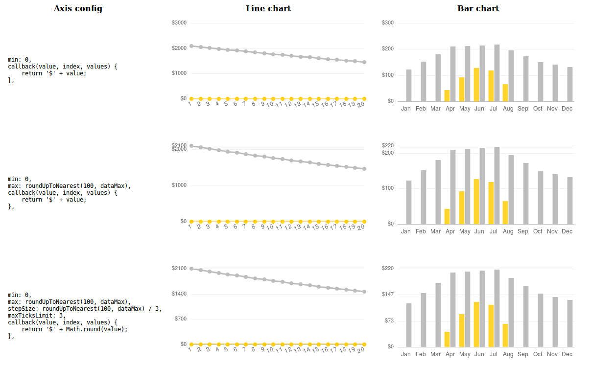
We're running into issues with this as well. Here's a demonstration of the options we've tried (no example code, sorry. Image version in case my hosting changes). We've eventually decided to go with the top option, which sometimes leaves more whitespace on the top than we'd like, but seems by far the least undesirable. My personal ideal would have been to go with the middle row, if we could chop off the top-most ticks and their lines. I don't mind leaving the chart data hanging over the top tick a little, though I've been advised it's not good chart UX. |
|
This was fixed in #5938 |
|
Thanks for following up on this @kurkle 😄 |
Hi,
when max ticks is generated dynamically and very near the next thousand the labels are overlapping.
For example
max ticks is set to 2001:
Also when the width is between 460 and 666 the Y Axis labels for small result sets are looking like this:

The text was updated successfully, but these errors were encountered: