[URGENT] Trying to replicate results on 3.4.1 #9689
Comments
|
in V3 the scales have changed from an array to objects where the key of the object is the ID of the scale. Then you can set scales: {
"bar-x-axis1": {
stacked: true,
barThickness: 70,
display: false
},
"bar-x-axis2": {
stacked: true,
barThickness: 70,
// these are needed because the bar controller defaults set only the first x axis properties
type: 'category',
categoryPercentage: 0.8,
barPercentage: 0.9,
gridLines: {
offsetGridLines: true
},
display: false,
offset: true,
},
y: {
stacked: false,
beginAtZero: true
}
} |
|
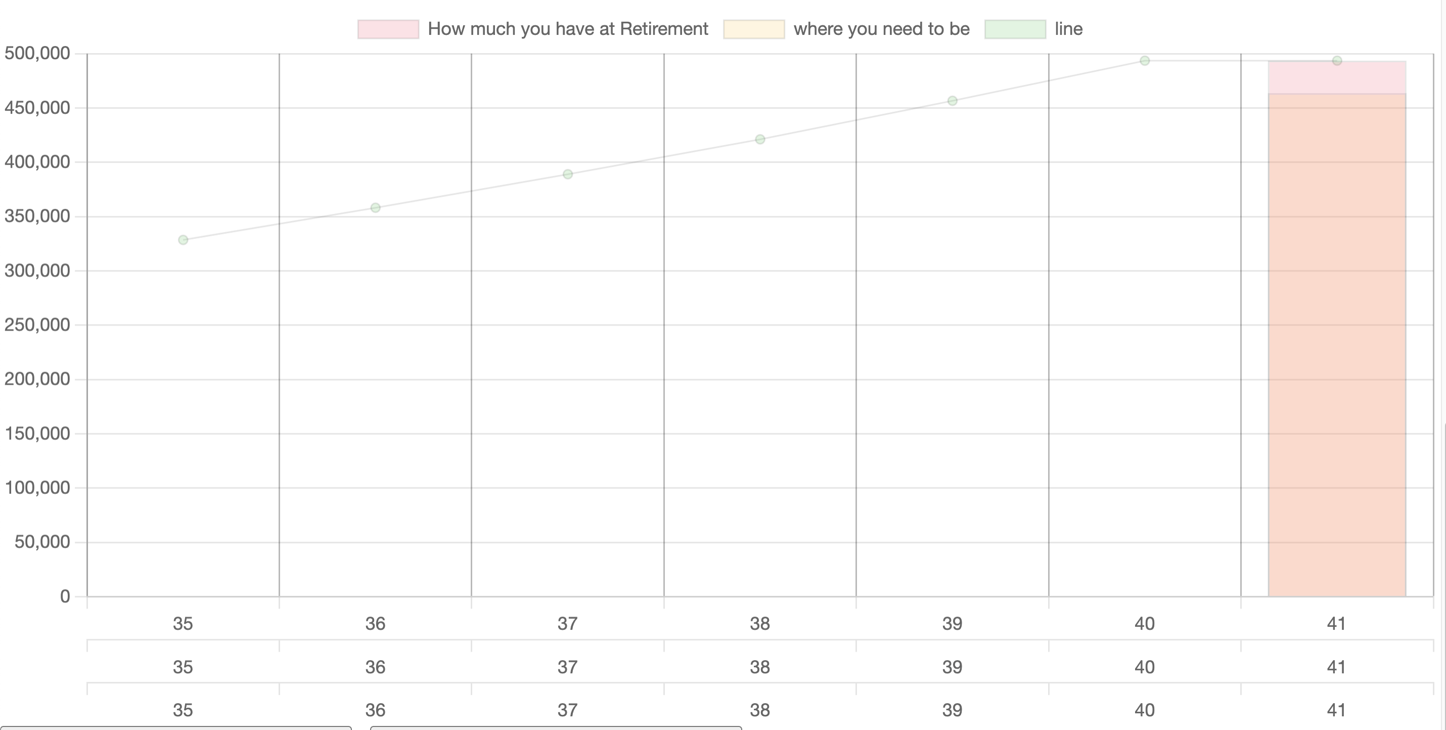
@LeeLenaleee it doesn't display any x-axis labels and displays an extra y-axis label instead... is the chart.js version u used 3.4.1? would it be better if i switched over to 3.5.1 instead? i figure that asking for help with providing the way my data is structured will help more: for reference: basicaly what im looking for is something like this (in a hypothetical situation): |


|
A better solution might be to use the floating bar feature because otherwise the bars draw on top of each other and the colours do not blend well. https://jsfiddle.net/3wfsodct/ |
|
I actually want them to be drawn on top of each other since i will eventually change the two colours to different shades of grey and considering that my data will be generated through calculations it will be harder to have the code automatically form it an array within an array... |
|
Ah, ok. In that case I think you can just removing the floating bar from the fiddle above. The axes are already close to your ideal image |
|
Thank you soo much for your help @etimberg the fiddle really helped!! :) |
i am creating a bar/line chart on the same xaxis. however i seem to be having multiple labels of the xaxis stacking up on each other.
i am getting the results in @nagix second example but want the result from the first in terms of the xaxis.
#5224 (comment)
** the line and one of the bars are sharing the same xAxisId while the other is on its own.
my data arrays are generated using javascript calculations after user input in html.
sorry my code is quite messy still a newbie at this **
here are my chart options:
The text was updated successfully, but these errors were encountered: