Skip to content
New issue

Have a question about this project? Sign up for a free GitHub account to open an issue and contact its maintainers and the community.

By clicking “Sign up for GitHub”, you agree to our terms of service and privacy statement. We’ll occasionally send you account related emails.

Already on GitHub? Sign in to your account

widget.Entry and widget.Form redesign #1701

Open
fpabl0 opened this issue Dec 30, 2020 · 68 comments
Open

widget.Entry and widget.Form redesign #1701

fpabl0 opened this issue Dec 30, 2020 · 68 comments
Labels
Design Requires some visual design process

Comments

@fpabl0
Copy link
Member

fpabl0 commented Dec 30, 2020

Is your feature request related to a problem? Please describe:

Yes, the current widget.Entry does not show the error messages, just notify to the user that there is an error. Current widget.Form only allows us to create 1 column form.

Is it possible to construct a solution with the existing API?

Yes, it is possible but there will be break changes (at least for the widget.Form, the other ones can be implemented as new widgets)

Describe the solution you'd like to see:

I have designed some apps with Flutter framework and I could say that its API is great. So maybe Fyne could adopt somethings from it. Based on it and to make things easier, the Entry widget could be redesign to this appearance:

fyne-textfield.mp4

And then create something like a widget.TextFormField that will add the label on the top of rectangle input as you can see in the video.
widget.Form could be completely redesign to accept variable columns.
This is how the above video was done:

input := driverservice.CreateInput{}
vtOpts := []string{"Motorcycle","Car"}
form := xwidget.Form{}
form.Inputs = []xwidget.FormInput{
    xwidget.NewTextFormField("First name:", "", xwidget.InputFieldText).
	SetValidator(xwidget.NewFormValidator().NotEmpty().Build()).
	SetOnSaved(func(s string) { input.FirstName = s }),
   xwidget.NewTextFormField("Last name:", "", xwidget.InputFieldText).
	SetValidator(xwidget.NewFormValidator().NotEmpty().Build()).
	SetOnSaved(func(s string) { input.LastName = s }),
   xwidget.NewTextFormField("ID Card:", "", xwidget.InputFieldText).
	SetValidator(xwidget.NewFormValidator().NotEmpty().Build()).
	SetOnSaved(func(s string) { input.IDCard = s }),
   xwidget.NewTextFormField("Driver License:", "", xwidget.InputFieldText).
	SetValidator(xwidget.NewFormValidator().NotEmpty().Build()).
	SetOnSaved(func(s string) { input.DriverLicense = s }),
   xwidget.NewTextFormField("Email:", "", xwidget.InputFieldEmail).
	SetValidator(xwidget.NewFormValidator().NotEmpty().Email().Build()).
	SetOnSaved(func(s string) { input.Email = s }),
  xwidget.NewTextFormField("Phone:", "", xwidget.InputFieldText).
	SetValidator(xwidget.NewFormValidator().NotEmpty().Build()).
	SetOnSaved(func(s string) { input.Phone = s }),
  xwidget.NewDropdownFormField("Vehicle.Type:", vtOpts, vtOpts[0]).
	SetOnSaved(func(s string) { input.Vehicle.Type = s }),
  xwidget.NewTextFormField("Vehicle.Plate:", "", xwidget.InputFieldText).
	SetValidator(xwidget.NewFormValidator().NotEmpty().Build()).
	SetOnSaved(func(s string) { input.Vehicle.Plate = s }),
  xwidget.NewTextFormField("Vehicle.Capacity:", "", xwidget.InputFieldInt).
	SetValidator(xwidget.NewFormValidator().NotEmpty().Build()).
	SetOnSaved(func(s string) { input.Vehicle.Capacity, _ = strconv.Atoi(s) }),
}
form.Divisor = layout.NewSpacer()
form.ButtonContainer = container.NewHBox(
  widget.NewButton("Create", func() {
	if !form.IsValid() {
		return
	}
	form.Save()
	// custom user logic
  }),
  widget.NewButton("Reset", form.Reset),
)
xcontainer.NewPadded(xcontainer.NewPaddingOpts(), form.Build(2))

Every TextFormField has an InputType that will prevent the user to enter letters when a number is expected (for example). It has a SetValidator function where we can add validators (FormValidator is a helper to add common validations). widget.Form will have three fields Inputs, Divisor and ButtonContainer, as you can see. Then we can user form.Build(cols) to create the form as fyne.CanvasObject by specifying the number of columns we want. form.IsValid() will trigger Validate() method on all the inputs and will return true or false to indicate if the form has errors or not. form.Save() will trigger the OnSaved callback that will have the inputs. form.Reset() will reset all inputs to its zero values (or the user initial ones??).

xcontainer.NewPadded is a new container too, that allows user to create custom paddings. By using just xcontainer.NewPaddingOpts() we are created a padding container just like the container.NewPadded, but you can add more options for example:

xcontainer.NewPadded(xcontainer.NewPaddingOpts().All(5, 0, 0, 0), title)
xcontainer.NewPadded(xcontainer.NewPaddingOpts().Symetric(10, 15), title)
@Jacalz
Copy link
Member

Jacalz commented Dec 30, 2020

Related to #1269.

@AlbinoGeek
Copy link
Contributor

I'd personally see a move to the consistent formats available in Material Design Spec when it comes to Entry and Form:

Even from the Flutter Specification, (the current version) the fields are much larger than shown in your video.

Types

image

Anatomy and key properties for filled text

image

  1. Container
  2. Leading icon (optional)
  3. Label text
  4. Input text
  5. Trailing icon (optional)
  6. Activation indicator
  7. Helper text (optional)

https://material.io/components/text-fields/flutter#outlined-text

@fpabl0
Copy link
Member Author

fpabl0 commented Jan 1, 2021

@AlbinoGeek You are right. The app in the video I had to develop it quickly, so I just wanted to do something functional.
I worked over the current release of Fyne, then I just extended the current widgets to do it. If these changes are going to be part of Fyne (widget redesigns), then I agree that must be better to follow material design specs, although that would probably mean a lot of break changes.

@AlbinoGeek
Copy link
Contributor

@fpabl0 Now I understand 👍🏻

Consider: https://github.com/fyne-io/fyne-x

We could play with this over there.

@andydotxyz
Copy link
Member

As this is modifications to existing widgets, and in-keeping with out goals for 2.0 I would recommend keeping the development here in the main repo.

@andydotxyz andydotxyz added blocker Items that would block a forthcoming release Design Requires some visual design process labels Jan 1, 2021
@fpabl0
Copy link
Member Author

fpabl0 commented Jan 1, 2021

@andydotxyz So what should be next step? Will widget.Entry be redesigned to satisfy material design specs?

@andydotxyz
Copy link
Member

If we could adapt the existing widgets with your changes to be more inline with material design I think it will be a bit improvement.
Other than lines appearing and disappearing (shuffling content around) it is what we had in mind.

mine question that comes to mind is should we adapt the form layout for mobile vs desktop? For example a left/right label/entry on bigger screens and the above/below layout for narrower?

@fpabl0
Copy link
Member Author

fpabl0 commented Jan 1, 2021

@andydotxyz hmm and that means editing widget.Entry or creating another one called TextField and deprecating widget.Entry? Then TextFormField will use a TextField internally to render an input with the label.

Hmm I think the big problem with left/right label approach is harder to use because of the alignment with the others FormInput labels (we have to treat labels and inputs as independent objects instead of just one). Above/below approach is more versatile and more compact, so I would say that both desktop and mobile must have above/below approach, and the ones who wants the other approach, they can easily create it using a TextField and a Label within a Grid, but it is just my point of view.

@AlbinoGeek
Copy link
Contributor

AlbinoGeek commented Jan 2, 2021

Yeah, that's the thing -- this requires quite a large re-design to the *widget.Entry if it were not going to be a new component.

The dimensions of this component are entirely different than the *widget.Entry, and thus would change Form drastically.

I've found implementing material design's "spacious by default" components required changing Fyne's padding model...

Which was also a breaking change.

Filled TextField

image
image
image

Outlined TextField:

image
image
image

@fpabl0
Copy link
Member Author

fpabl0 commented Jan 2, 2021

@AlbinoGeek I think widget.Form needs to be changed anyways to be more flexible, and as it is going to be a new major version (2.0), I think is a good idea to do these changes there.
Now, if material design spec is adopted as it, the Entry or TextField widget must have animations, that will probably delay the 2.0 release I think (I am not very familiar with Fyne, as I said at the beginning I have just started to try this amazing toolkit). Also, material design text fields have round corners, is there a way to do that the with the current Fyne release?

@AlbinoGeek
Copy link
Contributor

AlbinoGeek commented Jan 2, 2021

@fpabl0

That's a good point on it being a new major version, and I agree with you on Form not being very flexible at the moment.

As far as I know, fyne 2.0 will contain Animations (for example, if you pull the develop branch into your project, you will notice the widget.Entry contains a "fading cursor".

As per the rounded corners, the specification also lists the amount of rounding as theme-specific -- it would be fair for fyne to simply ignore that aspect until it could have a canvas.Rectangle accept some sort of borderRadius equiv.


My concern is that this can't be for 2.0 because Andrew seems to already have a lot on their plate in regards to the current things slated for this release, given that it's only in a couple of weeks now -- alongside the book. (Nevermind, I see they chimed in above, sorry I missed that.) Making this change to the widget.Entry would require the same padding changes to be made to many other widgets, including at least the widget.Button, and the respective change to the theme API (if vpad and hpad were separated.)


The page I have linked shows examples of material forms on mobile, with and without inline labels.

@andydotxyz
Copy link
Member

Also, material design text fields have round corners, is there a way to do that the with the current Fyne release?

Our widgets are occasionally limited by the canvas capabilities, then we get the features in to canvas and move on :).
In this instance I wonder if we could use the MD underline style - using somehow a subtle background to indicate the entry area - this might make a smoother transition from our current Entry widget as well.

Theme2 is in place, we can add a new color type to articulate this if required. We also still need to split focus from selected color as well. There is a lot to do before 2.0 but we have 2 solid weeks of coding before we need to feature freeze ;).

@andydotxyz
Copy link
Member

@andydotxyz hmm and that means editing widget.Entry or creating another one called TextField and deprecating widget.Entry?

We should, if we can, continue with the current Entry field - I don't see any reason why that should not be possible.
Additionally we can hopefully adapt it appropriately when in a form so that we don't need a new type when used in the form container.

@fpabl0
Copy link
Member Author

fpabl0 commented Jan 2, 2021

@andydotxyz hmm and that means editing widget.Entry or creating another one called TextField and deprecating widget.Entry?

We should, if we can, continue with the current Entry field - I don't see any reason why that should not be possible.
Additionally we can hopefully adapt it appropriately when in a form so that we don't need a new type when used in the form container.

I see, but if widget.Entry shows Helper Text and Error Text, then its MinSize is going to be larger, doesn't it matter?

@andydotxyz
Copy link
Member

There is a balance to be made here :) we want to avoid re-layout if possible, so reserving space fits better with how we have designed to now.

Material Design seems to imply that you have either helper or error text, so maybe we have the error overlay the helper?

@fpabl0
Copy link
Member Author

fpabl0 commented Jan 2, 2021

so reserving space fits better with how we have designed to now.

Sorry, I don't understand very much what do you mean by "reserving space" 😅. Does it mean to keep the space as it is now?

Material Design seems to imply that you have either helper or error text, so maybe we have the error overlay the helper?

Yes, that's right, just one of them is shown at a time. widget.Entry may have a belowText (or something like that) that will be the helper text if there is no error. However
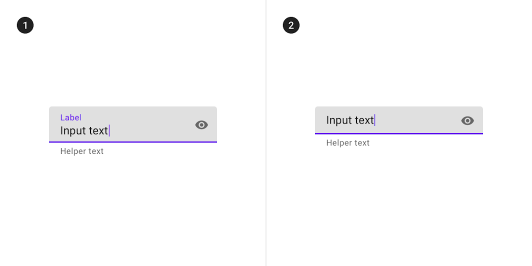
 belowText implies that widget.Entry needs more height.

@AlbinoGeek
Copy link
Contributor

There is a balance to be made here :) we want to avoid re-layout if possible, so reserving space fits better with how we have designed to now.

Material Design seems to imply that you have either helper or error text, so maybe we have the error overlay the helper?

The current widget.Entry().MinSize() is Height: 37, Width: 38

The filled Material Design TextField MinSize is Height: 64, Width: 280

@fpabl0
Copy link
Member Author

fpabl0 commented Jan 2, 2021

@AlbinoGeek maybe widget.Entry could have a min height of 37 + 16 (when using helper text or error text), to avoid changing dramatically the size of this widget?
Min width could remain as it, because it can change dynamically, I think.

@AlbinoGeek
Copy link
Contributor

@fpabl0 Fair points.

It might not feel... like there's enough room to "breath" -- but again, this is based on the theme.Padding(). The 48 Height of the Entry alone could be as small as 40 with only 4 (default) Padding().

It's also worth noting that Material Design uses 16 as the Body font, and fyne uses 14 at the moment.


And to be fair, the 48 comes from the Accessibility guidelines on touch elements.

image

@fpabl0
Copy link
Member Author

fpabl0 commented Jan 3, 2021

@AlbinoGeek maybe we can just be flexible and try to convert the entry widget in a similar widget to the one in material design?

I have edited the Entry widget to have a new boolean field called OutlineBorder, so users can choose if they want the underline form or the outline border form:

e1 := widget.NewEntry()
e1.OutlineBorder = true

This screenshot shows the two forms:
Captura de Pantalla 2021-01-03 a la(s) 04 32 10
However, as you can see, the icon in the underline form must have the same background, is it possible to do it?

I have seen that the underline color will be red only if the field is unfocused (and has an error), is it the desired behavior? Personally, I prefer to show the red color as soon as the person makes the mistake (just like in the video in the start of this issue), isn't it better?

@andydotxyz
Copy link
Member

a new boolean field called OutlineBorder

We typically don't expose "design choices" as widget API as the widgets focus on behavior. The theme / widget should pick a design and just use it if following the Fyne API intent.

However, as you can see, the icon in the underline form must have the same background, is it possible to do it?

Icon background should be transparent to show through what is below, perhaps something else is going on here?

the underline color will be red only if the field is unfocused (and has an error), is it the desired behavior?

Yes, this is intended - confirmation will be shown immediately, but error markings will not show during edits. See "Assistive elements" in https://material.io/components/text-fields.

@andydotxyz
Copy link
Member

Sorry, I don't understand very much what do you mean by "reserving space" 😅. Does it mean to keep the space as it is now?

I was considering that the space required would be left blank so it can be used - i.e. if a widget might use some space then make sure you have available space to use it.
So I guess that it may need more height, yes, or maybe it's layout needs adjusted?
There is a related issue about how label and entry vertical alignment do not match (#1531).

@fpabl0
Copy link
Member Author

fpabl0 commented Jan 3, 2021

We typically don't expose "design choices" as widget API as the widgets focus on behavior. The theme / widget should pick a design and just use it if following the Fyne API intent.

I see, that is one of thing I am not totally agreed with Fyne, that kind of behavior is too rigid and limit the reusability of the widgets to create others. The theme should set the default options for all the widgets but not force them to look as state in the theme. That's the way Flutter works, you can themify your app from Theme settings and all the widgets will look according to the theme, nevertheless, you can customize their styles if you want, the theme does not force you to use one single style.

Icon background should be transparent to show through what is below, perhaps something else is going on here?

Yes, that will be better and it matches all the needs, transparent background by default on icons should be great.

Yes, this is intended - confirmation will be shown immediately, but error markings will not show during edits. See "Assistive elements" in https://material.io/components/text-fields.

I see, that's fine. So, with the new changes (adding Leading and Trailing icons) the confirm icon must disappear, right? And user trailing icon must appear as long as there is no error?

I was considering that the space required would be left blank so it can be used - i.e. if a widget might use some space then make sure you have available space to use it.

Hmm, talking about label required space, then I think yes. But for helper or error text, I think that would change the size of the widget dynamically, otherwise it will look a weird blank space unused?

@andydotxyz
Copy link
Member

That's the way Flutter works

Yes, indeed, but we have a different design style in that regard. The theme does not enforce the look however - it's the widget package that enforces use of theme. Custom widgets, or extended versions of the builtin ones, can choose not to.

with the new changes (adding Leading and Trailing icons) the confirm icon must disappear, right?

I don't follow on this point sorry - I don't know how the addition of more icons was part of your proposal. The Entry already includes the right-hand area for items, that is how the validation and password icon are included.

I think that would change the size of the widget dynamically

We want to avoid doing this as it causes the whole UI to rearrange based on one widget state. Unless by design (such as accordion) this should not happen. Let us explore options - I suspect there is a way, I wonder if the label could be re-used as error instead of an additional help text area. Or perhaps it is optional, and reserved if that option is enabled? Just thinking out loud here.

@AlbinoGeek
Copy link
Contributor

AlbinoGeek commented Jan 5, 2021

Back form a large internet outage:

So, as per my understand of Material Design Specification (e.g.: imho / iirc):

The leading icon is used to indicate different field types (such as Currency symbols, Data Entry, etc.)

The trailing icon (as already used) is for validation and password visibility toggle.

The bottom text area is always padded out -- and is either:

  • Validation text if an error has occurred [bottom left]
  • Helper text otherwise [bottom left] (if set)
  • Character count [bottom right] (if enabled)

You can enable both helper text and the character counter.

You can enable both helper text and validation.

  • In this case, helper text is replaced with validation text when validation text is non-empty.
  • Helper text is restored when the validation text becomes empty again (error has been fixed).

anatomy


Specification

The Entry always takes up 64 display units of vertical space.

The Input Area of the Entry always takes up 48 units of height.

  • This includes the 1dp underline, or 2dp validation error underline

@fpabl0
Copy link
Member Author

fpabl0 commented Jan 5, 2021

@andydotxyz

but we have a different design style in that regard.

Ok, I see, that's fine.

Custom widgets, or extended versions of the builtin ones, can choose not to.

I see, however as we cannot fully customize them (I am referring to the extended versions) without changing the theme, we have to either create a new widget from scratch or do some tricky code to fully customize it (as the TextFormField widget in the video, I have to take the objects of Entry widget from Objects() function and change their style from that slice). But, it is only my opinion, there are many advantages to have all the styles in the Theme, like consistency. Hmm maybe, there should EntryStyle type to edit all the entry style from the Theme? And basically for all widgets that can have various styles.

I don't know how the addition of more icons was part of your proposal.

It does not part of my proposal, however as you said before you want "to be more inline with material design", I think you want to incorporate them as it states in the material design specs. But I am agreed with you, those new icons are not really important, it is just to "indicate different field types" (as @AlbinoGeek said)

We want to avoid doing this as it causes the whole UI to rearrange based on one widget state.

Oh I see, sorry I didn't know it.

Or perhaps it is optional, and reserved if that option is enabled?

Reserved space must be a great option to avoid UI to rearrange dynamically and as @AlbinoGeek said, it seems that material design spec states that "The bottom text area is always padded out" . Maybe there should be a default Helper Text, to avoid have an empty space? Maybe something like "* Optional" or "* Required" if they attach a required validator (only if there is an implementation for common validators). Also, text lines must be limited to one line to avoid resizing the UI (specially for validation errors messages).

@AlbinoGeek
Copy link
Contributor

@fpabl0 One unfortunate correction on my part,

I have found examples in Material Design spec where a field does not have either helper text, validation or character count (such as the fields shown within the "Contacts" apps.)

However... I have also found examples where they had no helper text, but did have validation-- where the layout did have to reflow because of validation.

I really don't like that last situation.

@fpabl0
Copy link
Member Author

fpabl0 commented Jan 8, 2021

@andydotxyz

the hint / error text / label

Oh ok, but isn't label behavior specific for widget.Entry? For example, a check box widget wouldn't need an animated label, since its label will always be stacked at the top.

@AlbinoGeek
So in summary, widget.Entry will not change at all in 2.0? Just background color and underline height?

@AlbinoGeek
Copy link
Contributor

It was decided that the label, helper and validation error message behaviour could be used in multiple widgets, such as:
widget.CheckGroup
widget.Entry
widget.RadioGroup
widget.Select
widget.SelectEntry

But technically it is only used within the context of a widget.Form


Otherwise, widget.Entry should be changed to look like the "Dense Text Field Without Label" from MD Spec

image

  1. Dense text field with a label
  2. Dense text field without a label

@AlbinoGeek
Copy link
Contributor

@fpabl0 Can you please join the #fyne gophers slack channel so I can send you more information?

@fpabl0
Copy link
Member Author

fpabl0 commented Jan 8, 2021

@AlbinoGeek

It was decided that the label, helper and validation error message behaviour could be used in multiple widgets

It seems great, but I think Entry must be working separately as it is different from the others (label animation for example only occurs in Entry, label in the center without placeholder only happens in Entry too). Or that means Entry would not have those features and it will just have a stacked label?

Can you please join the #fyne gophers slack channel so I can send you more information?

Yes, I can. I have just joined.

@andydotxyz
Copy link
Member

After 2.0 we need to return to this for the label / form layout discussion I think.
Get more of those shiny animations in :)

@andydotxyz andydotxyz removed the blocker Items that would block a forthcoming release label Jan 13, 2021
@andydotxyz
Copy link
Member

Removed blocking label as the stuff that requires the breaking changes are in.

@BhanuMeghraj
Copy link

@AlbinoGeek maybe we can just be flexible and try to convert the entry widget in a similar widget to the one in material design?

I have edited the Entry widget to have a new boolean field called OutlineBorder, so users can choose if they want the underline form or the outline border form:

e1 := widget.NewEntry()
e1.OutlineBorder = true

This screenshot shows the two forms:
Captura de Pantalla 2021-01-03 a la(s) 04 32 10
However, as you can see, the icon in the underline form must have the same background, is it possible to do it?

I have seen that the underline color will be red only if the field is unfocused (and has an error), is it the desired behavior? Personally, I prefer to show the red color as soon as the person makes the mistake (just like in the video in the start of this issue), isn't it better?

@fpabl0 Can I please get the code for the Border outline?

@fpabl0
Copy link
Member Author

fpabl0 commented May 12, 2021

Hello @BhanuMeghraj 👋

I have edited the Entry widget to have a new boolean field called OutlineBorder,

I would suggest you to not do so (editing directly the Entry widget), because you could lose the latest versions of Fyne that could include fixes and improvements. Instead, you can extend the Entry widget or create a custom one. Extending should be the easiest way for this, basically you would need to draw canvas. Lines bordering the entry widget and change their color when the entry gets focused, it will a bit hacky but it would work. Or you could wait for the text refactor plan that will let you create better custom inputs :)

Can I please get the code for the Border outline?

Unfortunately I don't have that code anymore 😞, because I migrated to the latest fyne version and hard reset the changes I have done in that application, sorry.

@andydotxyz
Copy link
Member

You could also overlay a rectangle on top, setting a stroke colour and width instead of drawing 4 lines.

@fpabl0
Copy link
Member Author

fpabl0 commented May 12, 2021

You could also overlay a rectangle on top, setting a stroke colour and width instead of drawing 4 lines.

Yes that would be easier :)

@BhanuMeghraj
Copy link

Hey there, sorry for not replying I have tried the suggestion given by @andydotxyz and it worked for me .Thankyou @fpabl0 and @andydotxyz

@Conan520
Copy link

Is your feature request related to a problem? Please describe:

Yes, the current widget.Entry does not show the error messages, just notify to the user that there is an error. Current widget.Form only allows us to create 1 column form.

Is it possible to construct a solution with the existing API?

Yes, it is possible but there will be break changes (at least for the widget.Form, the other ones can be implemented as new widgets)

Describe the solution you'd like to see:

I have designed some apps with Flutter framework and I could say that its API is great. So maybe Fyne could adopt somethings from it. Based on it and to make things easier, the Entry widget could be redesign to this appearance:

fyne-textfield.mp4
And then create something like a widget.TextFormField that will add the label on the top of rectangle input as you can see in the video. widget.Form could be completely redesign to accept variable columns. This is how the above video was done:

input := driverservice.CreateInput{}
vtOpts := []string{"Motorcycle","Car"}
form := xwidget.Form{}
form.Inputs = []xwidget.FormInput{
    xwidget.NewTextFormField("First name:", "", xwidget.InputFieldText).
	SetValidator(xwidget.NewFormValidator().NotEmpty().Build()).
	SetOnSaved(func(s string) { input.FirstName = s }),
   xwidget.NewTextFormField("Last name:", "", xwidget.InputFieldText).
	SetValidator(xwidget.NewFormValidator().NotEmpty().Build()).
	SetOnSaved(func(s string) { input.LastName = s }),
   xwidget.NewTextFormField("ID Card:", "", xwidget.InputFieldText).
	SetValidator(xwidget.NewFormValidator().NotEmpty().Build()).
	SetOnSaved(func(s string) { input.IDCard = s }),
   xwidget.NewTextFormField("Driver License:", "", xwidget.InputFieldText).
	SetValidator(xwidget.NewFormValidator().NotEmpty().Build()).
	SetOnSaved(func(s string) { input.DriverLicense = s }),
   xwidget.NewTextFormField("Email:", "", xwidget.InputFieldEmail).
	SetValidator(xwidget.NewFormValidator().NotEmpty().Email().Build()).
	SetOnSaved(func(s string) { input.Email = s }),
  xwidget.NewTextFormField("Phone:", "", xwidget.InputFieldText).
	SetValidator(xwidget.NewFormValidator().NotEmpty().Build()).
	SetOnSaved(func(s string) { input.Phone = s }),
  xwidget.NewDropdownFormField("Vehicle.Type:", vtOpts, vtOpts[0]).
	SetOnSaved(func(s string) { input.Vehicle.Type = s }),
  xwidget.NewTextFormField("Vehicle.Plate:", "", xwidget.InputFieldText).
	SetValidator(xwidget.NewFormValidator().NotEmpty().Build()).
	SetOnSaved(func(s string) { input.Vehicle.Plate = s }),
  xwidget.NewTextFormField("Vehicle.Capacity:", "", xwidget.InputFieldInt).
	SetValidator(xwidget.NewFormValidator().NotEmpty().Build()).
	SetOnSaved(func(s string) { input.Vehicle.Capacity, _ = strconv.Atoi(s) }),
}
form.Divisor = layout.NewSpacer()
form.ButtonContainer = container.NewHBox(
  widget.NewButton("Create", func() {
	if !form.IsValid() {
		return
	}
	form.Save()
	// custom user logic
  }),
  widget.NewButton("Reset", form.Reset),
)
xcontainer.NewPadded(xcontainer.NewPaddingOpts(), form.Build(2))

Every TextFormField has an InputType that will prevent the user to enter letters when a number is expected (for example). It has a SetValidator function where we can add validators (FormValidator is a helper to add common validations). widget.Form will have three fields Inputs, Divisor and ButtonContainer, as you can see. Then we can user form.Build(cols) to create the form as fyne.CanvasObject by specifying the number of columns we want. form.IsValid() will trigger Validate() method on all the inputs and will return true or false to indicate if the form has errors or not. form.Save() will trigger the OnSaved callback that will have the inputs. form.Reset() will reset all inputs to its zero values (or the user initial ones??).

xcontainer.NewPadded is a new container too, that allows user to create custom paddings. By using just xcontainer.NewPaddingOpts() we are created a padding container just like the container.NewPadded, but you can add more options for example:

xcontainer.NewPadded(xcontainer.NewPaddingOpts().All(5, 0, 0, 0), title)
xcontainer.NewPadded(xcontainer.NewPaddingOpts().Symetric(10, 15), title)

could you show me your code? I have encountered some probelm.

Sign up for free to join this conversation on GitHub. Already have an account? Sign in to comment
Labels
Design Requires some visual design process
Projects
None yet
Development

No branches or pull requests

6 participants