Style of form elements in blogs #208
Labels
help wanted
Extra attention is needed
Comments
|
Another form in https://kentcdodds.com/blog/avoid-the-test-user has an explicit |
|
is this better ?? @Aprillion |

Sign up for free
to join this conversation on GitHub.
Already have an account?
Sign in to comment
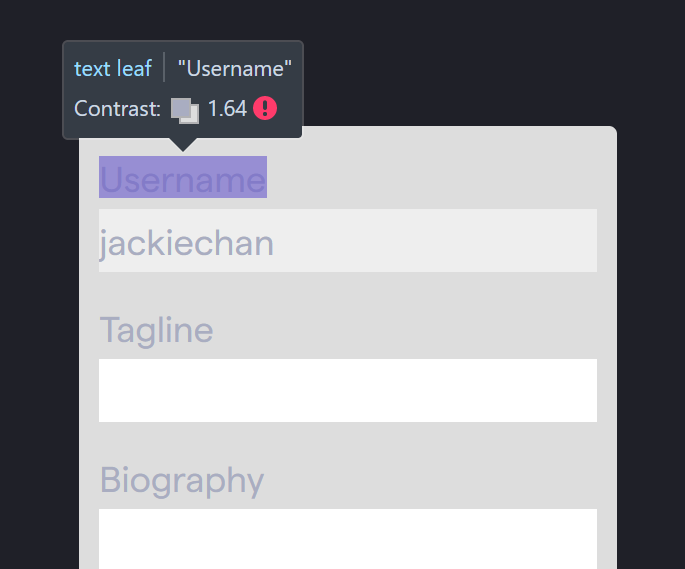
Form inputs and buttons embedded in the blogs deserve a "nicer" style than the default tailwind CSS reset, e.g. in https://kentcdodds.com/blog/fix-the-not-wrapped-in-act-warning
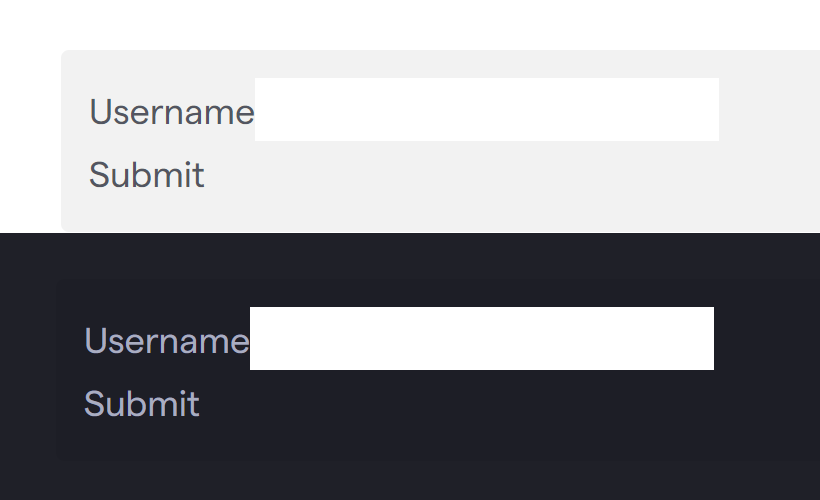
Screenshots when using light/dark theme:
The text was updated successfully, but these errors were encountered: