fix tab colors #194
fix tab colors #194
Conversation
|
|

There was a problem hiding this comment.
Hi @1r00t 👋, thanks for your contribution 👍
Nord makes use of the awesome Refactoring UI design patterns.
The principle for dark themes is that active elements should always use brighter colors to achieve the effect of making them appear “nearer“ to the user. Therefore the current style of tabs were chosen that way on purpose and this change would make it look like inactive tabs are more elevated than the active one.
When implementing dark mode, don’t throw away the visual cues in the light version by naively inverting the color scheme.
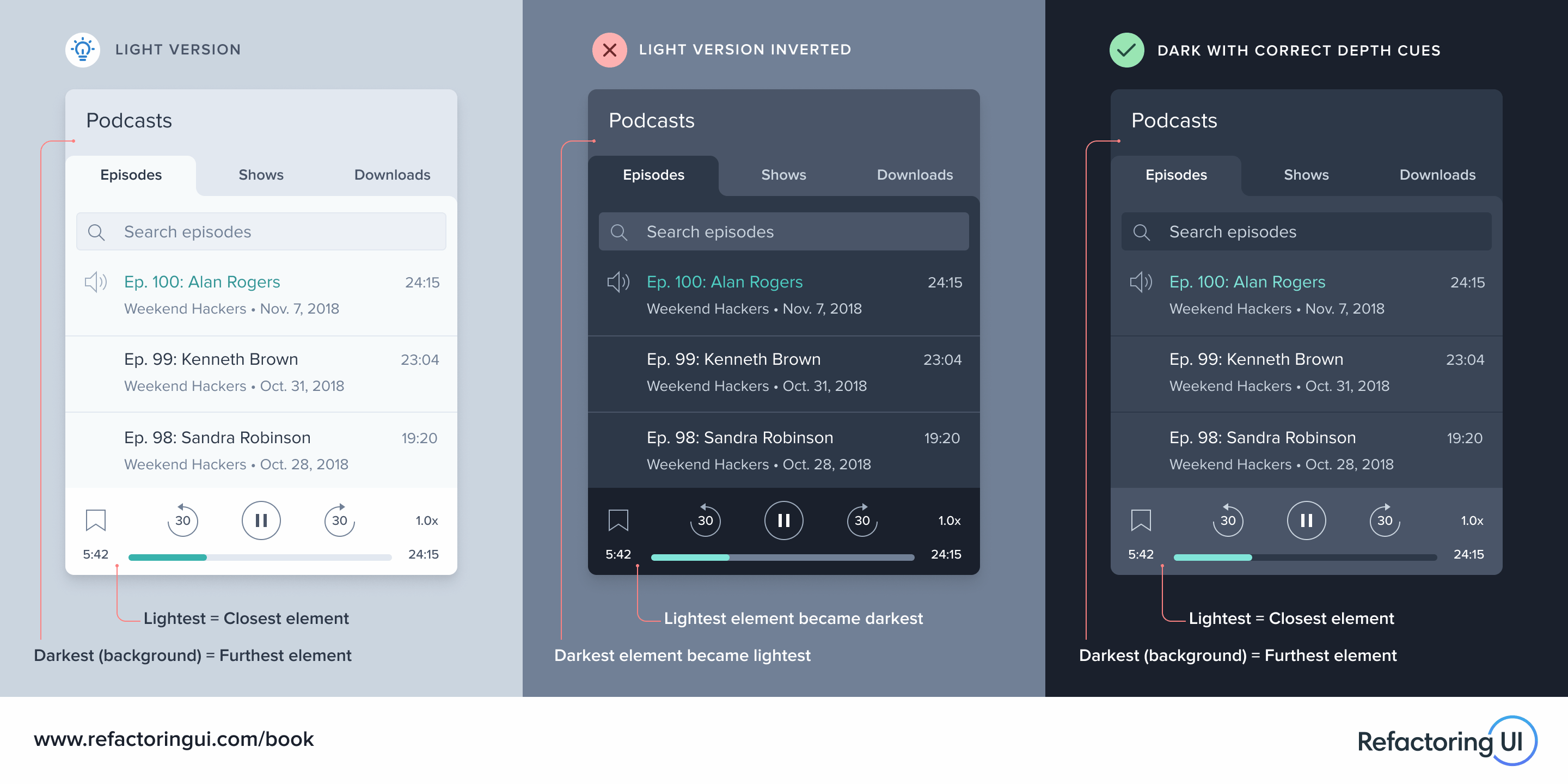
Your contribution is really appreciated, but I hope you can understand the decision that this change does not fully correspond to the goals of this project.
|
@arcticicestudio In the example you link, the active tab and the main body of the active are are all the same colour though, making them appear connected. In the VSCode theme, the tab is light while the editor background is dark which is not continuous and appears as though the tab is not connected to the editor window. I had the same issue as @1r00t in that I found it very confusing and overrode the colours to my liking. |
|
What about a highlighted bounding box to the active tab, like in the "Winter is coming" theme?
|

Metadata Head
Description
Makes the tab bar colors less confusing