Make section index page links more visible #4832
Comments
|
I should note that I think the issue exists to a lesser degree when using |
|
Thanks for suggesting. So off the top of my head, the simplest thing we could probably do is make non-clickable sections greyish, while keeping clickable links black. Off course, it's trivial to apply further styling, but I think this might be a good default. It could look something like this:
|
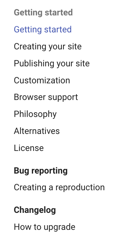
|
Another approach, maybe a bit more involved, would be to have |
|
I'm not sure I would agree – I think it's very useful that it applies to section headers. However, in the end it might be a matter of taste. As always, we try to strike a good balance here. If you have |
|
fc352ee is an attempt to improve discernability of section index pages in navigation. If that's not to the taste of the author, it can be easily changed with a little CSS, overriding the selectors that apply the styles. |
|
Thanks for the quick attention. I'll give it a try. |
|
Released as part of 9.0.3. |
|
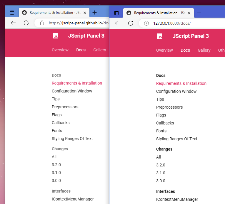
I really dislike this change in 9.0.3 on the left. 9.0.2 on the right is far more pleasant.
I need some CSS please. 😬 |
|
Well, the points the author brought up are very relevant – it's unclear whether a section index is clickable or not. Do you have a better idea how we could distinguish both cases with alternate styling? |
|
In my particular use case, none of the section headers are clickable and with that lack of contrast, it just looks like a huge list with no grouping at all. I have no idea what any solution could look like. It's very much "not my thing" (tm) Since I'm utterly clueless, I'll pin my github action to 9.0.2. |
|
It's trivial to override. Use the following CSS to revert to the previous behavior: .md-nav__link[for] {
color: var(--md-default-fg-color)
}Please keep in mind that with a project of this size, it's impossible to please everybody. This is why this theme is extensible, hackable and easy to customize. We're putting a huge effort on keeping overriding as simple as possible. In this case, accessibility is clearly the priority, which is why we made links discernible. |
|
That's great, thanks. |
|
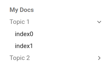
Sorry for bumping in again (I opened #4841) results to this ("Topic 1" and "Topic 2" are clickable): I'm aware, that 3 lines of css can remedy this, however the statement gray == not clickable does not hold here. |
|
The behavior is correct – clickable in that case meant there's an actual page behind that section index. We might consider limiting the grey color to navigation section without index pages behind them, but that would make it less consistent. However, I'll reopen it so we can re-evaluate. |
|
Thanks for being that patient ;) This minimal example Results to this:
I'll try to figure out, how to make this more consistent. |

|
Using
|
|
@dr-br Could I please ask you to provide reproductions for both cases? It makes the life of us maintainers much easier. |
|
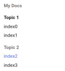
It is my pleasure to do so: The sample withNavigationSections is logically consistent. |
|
Thanks for the reproduction, made it trivial to inspect the situation! Fixed in 02637ef. Only sections should now receive the grey color, regardless of Your example:
Your example without
Your example with
|


|
There was one additional case that needed to be handled, which is the titles of sections when |
|
Excellent work. Thanks for reopening/fixing. I guess, the initial consideration of @ekoleda-codaio as well as the concerns of @marc2k3 have been met. |
So this breaks my ability to style it using the CSS you gave me the other day. I tested the latest with
and this no longer works...
After poking around a bit, I managed to "fix" it by adding |
|
I think using |
|
The latest changes were released as part of 9.0.4. |
Thanks for the great changes! I agree with @marc2k3 that the gray color is too weak to show the title clearly. The title with gray color can not make me realize it is unclickable. I evenly don't think it is necessary to distinguish them because the answer reveals when we hover the cursor on the title. If it is necessary, could we add different default icons or symbols before the title to distinguish them instead of using different colors? |
|
You can achieve all of that with customization. Please understand that Material for MkDocs is heavily opinionated and tries to provide sensible and great defaults. If that doesn't match your taste, the theme is very extensible and hackable. We can't please everyone, so we need to keep a common ground. |
Contribution guidelines
I want to suggest an idea and checked that ...
Description
When using both the feature
navigation.sectionsandnavigation.indexesyou can get into situations where the section header is itself a link to an index page. For example, on this page the headers "Migration" and "Contributing" appear like other section headings, but are in fact clickable links to index pages.On hover the color of the text changes to indicate there is a link, but prior to that there is no visual indication to the user that more content lives there.
I'm not sure what the best UI treatment should be, but it would be great if the clickable section headers were visually distinguished from the non-clickable ones.
Use Cases
It would make it easier for users to discover content, or at least less likely to miss content that they are looking for.
Screenshots / Mockups
No response
The text was updated successfully, but these errors were encountered: