Skip to content
New issue

Have a question about this project? Sign up for a free GitHub account to open an issue and contact its maintainers and the community.

By clicking “Sign up for GitHub”, you agree to our terms of service and privacy statement. We’ll occasionally send you account related emails.

Already on GitHub? Sign in to your account

Bug: Type support for Vue component slots in stories #21221

Closed
CasperSocio opened this issue Feb 23, 2023 · 51 comments · Fixed by #21273 or #21359
Closed

Bug: Type support for Vue component slots in stories #21221

CasperSocio opened this issue Feb 23, 2023 · 51 comments · Fixed by #21273 or #21359

Comments

@CasperSocio
Copy link

CasperSocio commented Feb 23, 2023

Is your feature request related to a problem? Please describe

Storybook 7 introduces many improvements for type support when using Vue. Still, we're seeing errors when trying to pass arguments to component slots.

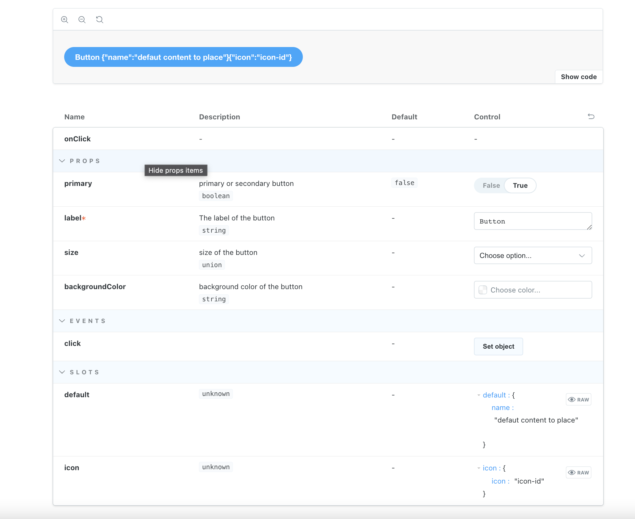
Below, I'm making stories for my button component. Instead of passing text (content) to a label prop, I want my button component to behave like a native HTML element. The button component has a single, unnamed slot (default) where the content goes. The correct way to set up the default slot is with args/argTypes:

// Button.stories.ts

import { Meta, StoryObj } from '@storybook/vue3'
import Button from './Button.vue'

const meta: Meta<typeof Button> = {
  title: 'Components/Button',
  component: Button,
  render: (args) => ({
    components: {
      Button,
    },
    setup() {
      return { args }
    },
    template: `
      <Button v-bind="args">{{ args.default }}</Button>
    `,
  }),
  argTypes: {
    default: {
      control: 'text',
    },
    size: {
      control: 'select',
      options: ['small', 'medium', 'large'],
    },
  },
  args: {
    default: 'Click me',
    size: 'medium',
  },
}
export default meta

type Story = StoryObj<typeof meta>

export const Default: Story = {}

export const LongText: Story = {
  args: {
    default: 'I am a button with faaaar toooo much text',
  },
}

The code runs correctly and the story controls allows me to change the button text, but TypeScript is not happy.

Describe the solution you'd like

Add type support for Vue component slots, both default slot and named.

The BaseAnnotations type, which is extended by the ComponentAnnotations interface, holds the type definitions for args (Partial<TArgs>) and argTypes (Partial<ArgTypes<TArgs>>). From what I've been able to find, this seems like the right place to do the implementation.

TArgs is a mapped type by default, but is likely assigned only the component props. Then the implementation might be deeper than I've been able to look at this point.

Describe alternatives you've considered

The alternative is using @ts-ignore, but that is never a permanent solution.

Are you able to assist to bring the feature to reality?

yes, I can

Additional context

I've tried to solve this myself, but I'm not familiar enough to see where the actual changes needs to be made. I am however a TypeScript developer so if anyone could point me to the right file, I'd be happy to work out a solution.

@CasperSocio
Copy link
Author

CasperSocio commented Feb 23, 2023

When this is done, we should also improve the documentation for how to use slots in stories.

Write stories / Args / Args can modify any aspect of your component contains information on how to use slots with Vue and TS, but the example can definitely be improved once we have proper type support.

@matthew-dean
Copy link

When this is done, we should also improve the documentation for how to use slots in stories.

Just a small detail, the boilerplate for Vue docs can also be simplified if using TypeScript 4.9 by writing:

export default {
// ...
} satisfies Meta<typeof Button>

...instead of first assigning to another variable.

@matthew-dean
Copy link

@CasperSocio

Write stories / Args / Args can modify any aspect of your component contains information on how to use slots with Vue and TS

I'm looking at that example, and it's not clear to me how that Vue3 / TS example would compile, based on current typings and the regression in slot support. Are the examples type-checked?

@shilman
Copy link
Member

shilman commented Feb 24, 2023

@matthew-dean the reason we don't use that syntax is that we're promoting the following pattern:

const meta = { } satisfies Meta<...>;
export default meta;

type Story = StoryObj<typeof meta>;
export const Story1: Story = { ... }

This allows you to split required args across both the default export & the story exports, at the expense of an extra line of code.

@shilman
Copy link
Member

shilman commented Feb 24, 2023

@kasperpeulen calling this a bug, but if it's actually a feature request feel free to relabel and we can address in 7.1

@shilman shilman changed the title [Feature Request]: Type support for Vue component slots in stories Bug: Type support for Vue component slots in stories Feb 24, 2023
@CasperSocio
Copy link
Author

I'm looking at that example, and it's not clear to me how that Vue3 / TS example would compile, based on current typings and the regression in slot support. Are the examples type-checked?

The link was not leading to the correct example (has been updated now). Just scroll down to the heading "Args can modify any aspect of your component" and look at the TS-3 example (with Vue and SB7 selected).

@chakAs3
Copy link
Contributor

chakAs3 commented Feb 24, 2023

@CasperSocio @shilman Actually in the current version Vue3/TS SB7, you should not be able to pass default as arg cause it is not a prop of the component, however, you can pass it in Slot control. The only downside here is the control type which is JSON object by default, we can easily support string as well, but for a proper type like HTML may be relevant here, definitely, we can have it in 7.1

@chakAs3 chakAs3 assigned chakAs3 and unassigned kasperpeulen Feb 24, 2023
@matthew-dean
Copy link

@CasperSocio

The link was not leading to the correct example (has been updated now).

args.footer would still cause a type error, unless this has been fixed. The typings don't add the slot names to the args property keys, so I feel like the Vue 3 / TS example is not real.

@chakAs3

however, you can pass it in Slot control

In what control? How? Do you have an example?

@chakAs3
Copy link
Contributor

chakAs3 commented Feb 26, 2023

@CasperSocio

The link was not leading to the correct example (has been updated now).

args.footer would still cause a type error, unless this has been fixed. The typings don't add the slot names to the args property keys, so I feel like the Vue 3 / TS example is not real.

@chakAs3

however, you can pass it in Slot control

In what control? How? Do you have an example?

image

if you component has slots it will be shown in the control in SLOTS section , see here i have 2 default and icon and i can passe as JSON format

@CasperSocio
Copy link
Author

if you component has slots it will be shown in the control in SLOTS section , see here i have 2 default and icon and i can passe as JSON format

In my example at the top, you'll find the *.stories.ts file that yields the slot section of the controls. The code will work as intended, but TS still throws a type error Object literal may only specify known properties, and 'default' does not exist in type 'Partial<Readonly<ExtractPropTypes....

meta.args and meta.argTypes must be able to contain the component slots as props. If the component has an unnamed slot, we also need to have meta.argTypes.default. And if the component has a sectionAside slot, we also need meta.argTypes.sectionAside.

@kasperpeulen
Copy link
Contributor

@chakAs3 Maybe we can pair up on this?

@CasperSocio As a workaround you can do:

type Story = StoryObj<typeof meta> & { default: string; sectionAside: string }

I'm not 100% sure how slots in Vue work, and what makes sense here. Those slots args are only used if there is a custom render function right? Does it make sense to show autocompletion for the slots, even when they are not referenced in the render function?

And what if a user wants to do something differently, then use the named slots:

  render: (args) => ({
    components: {
      Select,
      Option,
    },
    setup() {
      return { args }
    },
    template: `
      <Select v-bind="args">
        <Option>{{ args.option1 }}</Option>
        <Option>{{ args.option2 }}</Option>
      </Select>
    `,
  }),

@CasperSocio
Copy link
Author

If you look at how Cypress is currently implementing component testing, you have:

cy.mount(Button, {
  props: {
    icon: 'add',
  },
  slots: {
    default: () => 'Add new',
  },
})

This would translate to:

const meta: Meta<typeof Button> = {
  title: 'Components/Button',
  component: Button,
  render: (args, slots) => ({
    components: {
      Button,
    },
    setup() {
      return { args, slots }
    },
    template: `
      <Button v-bind="args">{{ slots.default }}</Button>
    `,
  }),
  argTypes: {
    icon: {
      control: 'select',
      options: ['add', 'remove', 'save'],
    },
  },
  args: {
    icon: 'add',
  },
  slots: {
    default: 'Add new',
  },
}

This would separate slots from args, but require more work to implement. If we also had something like slotTypes, we'd be able to define some example elements/components that we could switch between using a select control.

That said, hasn't this been available for React a while now? I worked with TypeScript and React when I first started using Storybook and can't recall having these issues. There's probably an existing implementation for React that can pave the way for how to implement this.

@CasperSocio
Copy link
Author

The Vue TS-3 example (Args can modify any aspect of your component) uses args.footer which is also used by the React TS example. This, combined with the fact that using slot names as properties for args and argTypes actually works as intended (making controls for slots available), makes a good point for this issue being bug. I've already put // @ts-ignore – Missing type support into my code and Storybook runs as intended and lets me edit my component slot content on the fly. The only thing missing here is proper type support so that we don't need to use TS exceptions.

I'll set up a React project to verify that props.children (the React implementation of slots) has proper type support in stories. That might actually give us some ideas of how to go forward.

@CasperSocio
Copy link
Author

I can confirm that SB7 has full support for props.children in React. In the button component I can set type string for props.children and it will automatically provide text controls.

Button.tsx

import './button.css'

interface ButtonProps {
  children: string
  icon?: 'add' | 'arrow-left' | 'arrow-right' | 'delete' | 'remove' | 'save'
  primary?: boolean
  size?: 'small' | 'medium' | 'large'
  onClick?: () => void
}

export const Button = ({
  children,
  icon,
  primary = false,
  size = 'medium',
  ...props
}: ButtonProps) => {
  const mode = primary ? 'storybook-button--primary' : 'storybook-button--secondary'
  return (
    <button
      type="button"
      className={['storybook-button', `storybook-button--${size}`, mode].join(' ')}
      {...props}
    >
      {
        icon && <img src={`../assets/icons/${icon}.svg`} alt={`${icon} icon`} />
      }
      {children}
    </button>
  )
}

Button.stories.tsx

import { Meta, StoryObj } from '@storybook/react'
import { Button } from './Button'

const meta: Meta<typeof Button> = {
  title: 'Example/Button',
  component: Button,
  args: {
    children: 'Click me',
    primary: false,
    size: 'medium',
  },
}
export default meta

type Story = StoryObj<typeof meta>

export const Primary: Story = {
  args: {
    primary: true,
  }
}

export const Secondary: Story = {}

export const Large: Story = {
  args: {
    size: 'large',
  }
}

export const Small: Story = {
  args: {
    size: 'small',
  }
}

There's not even a need for argTypes when using React. The list of icon names defined in the union type will show up as radio options until you add more than 5 options, at which point it will turn into a select. Again, no argTypes needed.

Vue is such a fast growing framework, we should be able to have the same amount of SB features as for React.

@chakAs3
Copy link
Contributor

chakAs3 commented Feb 27, 2023

I can confirm that SB7 has full support for props.children in React. In the button component I can set type string for props.children and it will automatically provide text controls.

Button.tsx

import './button.css'

interface ButtonProps {
  children: string
  icon?: 'add' | 'arrow-left' | 'arrow-right' | 'delete' | 'remove' | 'save'
  primary?: boolean
  size?: 'small' | 'medium' | 'large'
  onClick?: () => void
}

export const Button = ({
  children,
  icon,
  primary = false,
  size = 'medium',
  ...props
}: ButtonProps) => {
  const mode = primary ? 'storybook-button--primary' : 'storybook-button--secondary'
  return (
    <button
      type="button"
      className={['storybook-button', `storybook-button--${size}`, mode].join(' ')}
      {...props}
    >
      {
        icon && <img src={`../assets/icons/${icon}.svg`} alt={`${icon} icon`} />
      }
      {children}
    </button>
  )
}

Button.stories.tsx

import { Meta, StoryObj } from '@storybook/react'
import { Button } from './Button'

const meta: Meta<typeof Button> = {
  title: 'Example/Button',
  component: Button,
  args: {
    children: 'Click me',
    primary: false,
    size: 'medium',
  },
}
export default meta

type Story = StoryObj<typeof meta>

export const Primary: Story = {
  args: {
    primary: true,
  }
}

export const Secondary: Story = {}

export const Large: Story = {
  args: {
    size: 'large',
  }
}

export const Small: Story = {
  args: {
    size: 'small',
  }
}

There's not even a need for argTypes when using React. The list of icon names defined in the union type will show up as radio options until you add more than 5 options, at which point it will turn into a select. Again, no argTypes needed.

Vue is such a fast growing framework, we should be able to have the same amount of SB features as React.

Hi @CasperSocio I even think that Vue has more features when it comes to slots, it is really incredible how named and scoped slots can give you encapsulation of Logic or UI, also Dynamics slots, which is something that svelte can't do because svelte is based heavily on the build.

@chakAs3
Copy link
Contributor

chakAs3 commented Feb 27, 2023

@chakAs3 Maybe we can pair up on this?

@CasperSocio As a workaround you can do:

type Story = StoryObj<typeof meta> & { default: string; sectionAside: string }

I'm not 100% sure how slots in Vue work, and what makes sense here. Those slots args are only used if there is a custom render function right? Does it make sense to show autocompletion for the slots, even when they are not referenced in the render function?

And what if a user wants to do something differently, then use the named slots:

  render: (args) => ({
    components: {
      Select,
      Option,
    },
    setup() {
      return { args }
    },
    template: `
      <Select v-bind="args">
        <Option>{{ args.option1 }}</Option>
        <Option>{{ args.option2 }}</Option>
      </Select>
    `,
  }),

Yes @kasperpeulen sure, I was thinking a bit about what we can do, this can be a big feature.

@kasperpeulen
Copy link
Contributor

Nice! So we can get the type def like this:

image

Copy link
Contributor

chakAs3 commented Mar 2, 2023

I was thinking about using volar ( 'vue-component-meta' package) to replace the current docgen we have for Vue.
the good news I got from volar team they really going agnostic so we will have same thing for svelte, angular and web component.
what do you think @kasperpeulen ? we can peer on this task if we get approval from the team

@kasperpeulen
Copy link
Contributor

Sounds like a good idea @chakAs3 Probably after the 7 release.

Trying to implement the types now, the type definition should also support scoped slots right?

image

Copy link
Contributor

chakAs3 commented Mar 2, 2023

it should definitely work and it is really similar, I haven't tested it specifically but I guess it works like normal named slots.

@kasperpeulen
Copy link
Contributor

Okay, I got something working on typelevel, will finalize tomorrow, and check if it also works on runtime:

<script setup lang="ts">
defineProps<{ otherProp: boolean; }>();
</script>

<template>
  <div class="container">
    <header>
      <slot name="header" title="Some title"></slot>
    </header>
    <main>
      <slot></slot>
    </main>
    <footer>
      <slot name="footer"></slot>
    </footer>
  </div>
</template>
test('Infer type of slots', () => {
  const meta = {
    component: BaseLayout,
  } satisfies Meta<typeof BaseLayout>;

  const Basic: StoryObj<typeof meta> = {
    args: {
      otherProp: true,
      default: () => 'Default',
      header: ({ title }) => `<h1>Some header with a ${title}</h1>`,
      footer: () => 'Footer',
    },
  };

  type Props = {
    readonly otherProp: boolean;
    header?: (_: { title: string }) => any;
    default?: (_: {}) => any;
    footer?: (_: {}) => any;
  };

  type Expected = StoryAnnotations<VueRenderer, Props, Props>;
  expectTypeOf(Basic).toEqualTypeOf<Expected>();
});

@kasperpeulen kasperpeulen self-assigned this Mar 3, 2023
@kasperpeulen
Copy link
Contributor

It is quite neat that default h function (that we use as default render function) also accept non-string slots, like so:

export const Primary: Story = {
  args: {
    otherProp: true,
    header: ({ title }) =>
      h({
        components: { Button },
        template: `<Button :primary='true' label='${title}'></Button>`,
      }),
    default: 'default slot',
    footer: h(Button, { primary: true, label: 'footer' }),
  },
};

@kasperpeulen
Copy link
Contributor

@chakAs3 I think we want to only close tickets when we do a new release cc @shilman

@shilman
Copy link
Member

shilman commented Mar 3, 2023

Egads!! I just released https://github.com/storybookjs/storybook/releases/tag/v7.0.0-beta.61 containing PR #21359 that references this issue. Upgrade today to the @next NPM tag to try it out!

npx sb@next upgrade --prerelease

@matthew-dean
Copy link

matthew-dean commented Mar 3, 2023

@shilman I just upgraded and am still getting: Property 'default' does not exist on type 'T' and Type '{ default: string; }' is not assignable to type

Edit: Okay, I got it working. I wiped node_modules and re-installed, but I still had an error because I had this:

export default {
  title: 'Stack',
  component: Stack,
  render: <T,>(args: T) => ({
    components: { Stack, Box },
    setup() {
      return { args }
    },
    template: `<Stack v-bind="args">${args.default}</Stack>`
  })
} satisfies Meta<typeof Stack>

I had to remove the generic type to get it to work:

export default {
  title: 'Stack',
  component: Stack,
  render: args => ({
    components: { Stack, Box },
    setup() {
      return { args }
    },
    template: `<Stack v-bind="args">${args.default}</Stack>`
  })
} satisfies Meta<typeof Stack>

Thanks so much!

@matthew-dean
Copy link

matthew-dean commented Mar 3, 2023

What would really make this rock is to not have to write a render function in order to get this to work (similar to the auto-render functions provided for React). 😁

Copy link
Contributor

chakAs3 commented Mar 4, 2023

@matthew-dean same feeling here, that will have more rocking features. already in mind, if you have any you can share them with us

@kasperpeulen
Copy link
Contributor

I don't understand, it works without render functions right? @matthew-dean @chakAs3 ?

image

Copy link
Contributor

chakAs3 commented Mar 6, 2023

yes @kasperpeulen i can't see the issue here ?
you don't need a render function, if you component has slots (read for docGenInfo table ).
1- we generate the equivalent controls.
2- we inject slot content to your story component ( in this case BaseLayout )

@kasperpeulen
Copy link
Contributor

What would really make this rock is to not have to write a render function in order to get this to work (similar to the auto-render functions provided for React). 😁

So then we already have this implemented right? Or do we need to do something more to make it more in line with what we do in React?

Copy link
Contributor

chakAs3 commented Mar 7, 2023

no it is there that is why we have

export const render: ArgsStoryFn<VueRenderer> = (props, context) => {
  const { id, component: Component } = context;
  if (!Component) {
    throw new Error(
      `Unable to render story ${id} as the component annotation is missing from the default export`
    );
  }

  return h(Component, props, getSlots(props, context));
};

in renderer render function we pull the info from docgen and generate the slots content
this slot content normally you pass in the story template but here since we use the component we can render h , we all necessary info to do that, no need the render function

Copy link
Contributor

chakAs3 commented Mar 8, 2023

@kasperpeulen i guess there is some bugs but no worries i'm already reworking the renderer render in reactive way i'm will be checking this and fix the bug i will add you to review the PR if you don't mind

@matthew-dean
Copy link

@kasperpeulen Yes, I was mistaken.

However, I think adding arg types for slots opens up another bug, or at least something in conflict with documentation.

That is, if I do a standard pattern, according to the docs of:

template: `
      <Dialog v-bind="args">
        {{ args.default }}
      </Dialog>
      `

The problem is that all args are bound to the outer element, including the default slot. So I get Vue warnings in the console, and the contents of default gets inserted into the outer <div>

@CasperSocio
Copy link
Author

I really apriciate the work put into this bug guys! TS is happy again in 7.0.0-rc.0 and only throws these while building SB:

[vite:dts] Start generate declaration files...
src/components/Button/Button.stories.ts:20:5 - error TS2322: Type '{ default: { control: string; }; icon: { control: string; options: readonly ["add-circle-outline", "add-circle", "add", "arrow-down", "arrow-left", "arrow-right", "arrow-up", "check-circle-outline", ... 21 more ..., "upload"]; }; ... 5 more ...; onClick: { ...; }; }' is not assignable to type 'Partial<ArgTypes<Readonly<ExtractPropTypes<{ icon: { type: PropType<"add-circle-outline" | "add-circle" | "add" | "arrow-down" | "arrow-left" | "arrow-right" | "arrow-up" | "check-circle-outline" | "check-circle" | "check" | ... 21 more ... | undefined>; required: false; default: null; }; ... 4 more ...; variant: { ...'.
  Object literal may only specify known properties, and 'default' does not exist in type 'Partial<ArgTypes<Readonly<ExtractPropTypes<{ icon: { type: PropType<"add-circle-outline" | "add-circle" | "add" | "arrow-down" | "arrow-left" | "arrow-right" | "arrow-up" | "check-circle-outline" | "check-circle" | "check" | ... 21 more ... | undefined>; required: false; default: null; }; ... 4 more ...; variant: { ...'.

20     default: {
       ~~~~~~~~~~
21       control: 'text',
   ~~~~~~~~~~~~~~~~~~~~~~
22     },
   ~~~~~

  node_modules/@storybook/types/dist/index.d.ts:1153:5
    1153     argTypes?: Partial<ArgTypes<TArgs>>;
             ~~~~~~~~
    The expected type comes from property 'argTypes' which is declared here on type 'Meta<DefineComponent<{ icon: { type: PropType<"add-circle-outline" | "add-circle" | "add" | "arrow-down" | "arrow-left" | "arrow-right" | "arrow-up" | "check-circle-outline" | "check-circle" | "check" | ... 21 more ... | undefined>; required: false; default: null; }; ... 4 more ...; variant: { ...; }; }, ... 10 more...'
src/components/Button/Button.stories.ts:51:5 - error TS2322: Type '{ default: string; iconPosition: "left"; shape: "pill"; size: "medium"; type: "button"; variant: "secondary"; }' is not assignable to type 'Partial<Readonly<ExtractPropTypes<{ icon: { type: PropType<"add-circle-outline" | "add-circle" | "add" | "arrow-down" | "arrow-left" | "arrow-right" | "arrow-up" | "check-circle-outline" | "check-circle" | "check" | ... 21 more ... | undefined>; required: false; default: null; }; ... 4 more ...; variant: { ...; }; }...'.
  Object literal may only specify known properties, and 'default' does not exist in type 'Partial<Readonly<ExtractPropTypes<{ icon: { type: PropType<"add-circle-outline" | "add-circle" | "add" | "arrow-down" | "arrow-left" | "arrow-right" | "arrow-up" | "check-circle-outline" | "check-circle" | "check" | ... 21 more ... | undefined>; required: false; default: null; }; ... 4 more ...; variant: { ...; }; }...'.

51     default: 'Click me',
       ~~~~~~~~~~~~~~~~~~~

  node_modules/@storybook/types/dist/index.d.ts:1148:5
    1148     args?: Partial<TArgs>;
             ~~~~
    The expected type comes from property 'args' which is declared here on type 'Meta<DefineComponent<{ icon: { type: PropType<"add-circle-outline" | "add-circle" | "add" | "arrow-down" | "arrow-left" | "arrow-right" | "arrow-up" | "check-circle-outline" | "check-circle" | "check" | ... 21 more ... | undefined>; required: false; default: null; }; ... 4 more ...; variant: { ...; }; }, ... 10 more...'
src/components/Button/Button.stories.ts:76:5 - error TS2322: Type '{ default: string; icon: "arrow-right"; iconPosition: "right"; }' is not assignable to type 'Partial<{ readonly type: "button" | "reset" | "submit" | undefined; readonly size: "small" | "large" | "medium" | undefined; readonly variant: "primary" | "secondary" | undefined; readonly icon: "add-circle-outline" | ... 30 more ... | undefined; readonly iconPosition: "left" | ... 1 more ... | undefined; readonly s...'.
  Object literal may only specify known properties, and 'default' does not exist in type 'Partial<{ readonly type: "button" | "reset" | "submit" | undefined; readonly size: "small" | "large" | "medium" | undefined; readonly variant: "primary" | "secondary" | undefined; readonly icon: "add-circle-outline" | ... 30 more ... | undefined; readonly iconPosition: "left" | ... 1 more ... | undefined; readonly s...'.

76     default: 'Read more',
       ~~~~~~~~~~~~~~~~~~~~

  node_modules/@storybook/types/dist/index.d.ts:1148:5
    1148     args?: Partial<TArgs>;
             ~~~~
    The expected type comes from property 'args' which is declared here on type 'StoryAnnotations<VueRenderer, { readonly type: "button" | "reset" | "submit" | undefined; readonly size: "small" | "large" | "medium" | undefined; readonly variant: "primary" | "secondary" | undefined; readonly icon: "add-circle-outline" | ... 30 more ... | undefined; readonly iconPosition: "left" | ... 1 more ... |...'

Using vite v4.1.4 and vite-plugin-dts 2.1.0, which is throwing the errors, but it doesn't prevent the build from completing. Nor does it impact the SB instance I'm hosting om Firebase. Just thought you should know that there's probably missing type exports 😅

Again: Thanks guys, stories are going to be a lot easier to write now

@shilman
Copy link
Member

shilman commented Apr 19, 2023

Son of a gun!! I just released https://github.com/storybookjs/storybook/releases/tag/v7.1.0-alpha.7 containing PR #21954 that references this issue. Upgrade today to the @future NPM tag to try it out!

npx sb@next upgrade --tag future

@johnsoncodehk
Copy link

Sorry for missing this issue, I noticed that PR now uses vue-tsc to generate component types, volar v1.3 adds a new vue-component-type-helpers package, which is used behind vue-component-meta and can be used to extract The component type generated by vue-tsc, this may also apply to storybook.

Please note that v1.3 is a pre-release version of v1.4, there are still some unresolved edge cases, you can also wait for v1.4.

@mryellow
Copy link

Given we're dealing with slots designed to accept HTML, this should probably be defaulting to binding with v-html rather than inserting strings which are then sanitised.

For those looking for a working solution without the non-javascript code mixed in.

export const Example = {
	args: {
		// Props
		bar: 'baz',

		// Slots
		default: '<img src="/images/testpattern.jpg"/>',
	},
	render: args => ({
		components: { Foo },
		setup() {
			return { args };
		},
		template: `
			<foo v-bind="args">
				<template #default>
					<div v-html="args.default"/>
				</template>
			</foo>
		`,
	}),
}

@kasperpeulen
Copy link
Contributor

@mryellow You can also do:

export const Example = {
	args: {
		// Props
		bar: 'baz',

		// Slots
		default: h({ template: '<img src="/images/testpattern.jpg"/>' }),
	},
}

@mryellow
Copy link

mryellow commented Mar 1, 2024

How would one go about passing slot properties?

For example if we wish to fire a method (loaded) on the component when an event in the slot is triggered (@load):

Component:

<slot :loaded="loaded" />

Usage:

<template #default="{ loaded }">
  <img src="/images/testpattern.jpg" @load="loaded"/>
</template>

Attempting the slot pattern from https://vuejs.org/guide/extras/render-function#rendering-slots the slots object contains no default even when using <slot name="default" :loaded="loaded"/> . I guess this is that the scope is that of the StoryBook and not the underlying component being displayed. Thus no slots exists.

...

I can wrap the entire component in a demo version which initialises the components, defines slots and attaches their events. Then exposes new properties for things within that template (i.e. imageUrl to define the src and everything else hard-coded).

However I'd like to give the end-user the ability to simply edit the template as a string and have the correct context so that properties from the displayed component are passed to templates as required.

@mryellow
Copy link

mryellow commented Mar 1, 2024

Struggled to get anything out of attempting to improve getSlots() so it passes context from the component on through to slots.

This pattern looks workable. By injecting the string directly into that slot it binds the slot properties correctly.

render: (args, ctx) => ({
	components: { MyComponent },
	setup() {
		return { args };
	},
	template: `
		<my-component
			v-bind="args"
			<template #default="{ loaded }">
				${args.default}
			</template>
		</my-component>
	`,
}),

@kasperpeulen
Copy link
Contributor

@mryellow Do you mean something like this?

<!-- <MyComponent> template -->
<script setup lang="ts">
const props = defineProps({
  label: String,
  year: Number,
});
</script>
<template>
  <div data-testid="scoped-slot">
    <slot :text="`Hello ${props.label} from the slot`" :year="props.year"></slot>
  </div>
</template>
const meta = {
  component: MySlotComponent,
} satisfies Meta<typeof MySlotComponent>;

export default meta;
type Story = StoryObj<typeof meta>;

export const Basic: Story = {
  args: {
    label: 'Storybook Day',
    year: 2022,
    default: ({ text, year }) => `${text}, ${year}`,
  },
}

This is supported.

@mryellow
Copy link

mryellow commented Mar 1, 2024

There is no slot component, only native HTML placed into an arg which is then used as the contents for a slot. Events emitted from that HTML are bound to methods of the component exposed via slot properties.

The contents of the HTML may be img or video tags, or any other type of content. When that content is ready it needs to fire the method it has been passed as a slot property.

  • In the case of an img tag this would be @load
  • In the case of a video tag this would be @canplay
  • In some other user provided case it may be any other event or even a script tag

There is no preset expectations of what this content might look like, only that it must fire a method provided by slot property.

  • When injected as a string, of course nothing is bound as it's sanitised and no longer HTML
  • When injected via v-html, nothing is bound as the context containing slot properties is not available

Only when given a render function and template with the value concatenated in-line does the scope exist to see the slot properties and thus able to fire the loaded method.

Sign up for free to join this conversation on GitHub. Already have an account? Sign in to comment
Projects
Archived in project
7 participants