Splitting styles with props and makeup into two layers #86
Comments
|
Hi @Danilqa, thank you for the issue! At this moment, dynamic values are supported only by I'm sorry that there is no best solution for that case, but I think that we'll ship dynamic The ways to achieve such behaviour today:
The relevant things that we're going to support in near future:
|
|
@lttb wonderful, thanks! Looking forward to your updates :) |
Hi again! :)
I have another issue:
In an ideal way, I wanna have 2 layers of some view component: makeup and styles. Styles can use props from component: theme, state props, etc. I analyzed use cases in spec. files and create some demo component:
So, with importing
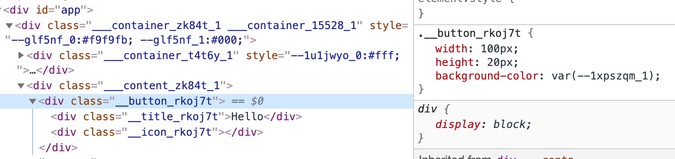
cssfromreshadow/reactcompiler doesn't crash, but in the runtime there is no css-variable:If I try with importing
cssfromreshadowdirectly I get:May be an alternative way exists?
The text was updated successfully, but these errors were encountered: