
A Flutter plugin to handle input autocomplete suggestions

- ToDo
- Done
- Installation
- Basic example
- Example with customized style
- Example with asynchronous data fetch
- API
- Issues & Suggestions
- Add validation functionality
- Add possibility to show empty message when no suggestion is found
- Add asynchronous suggestions fetch
- Add possibility to customize suggestions list item
In the pubspec.yaml of your flutter project, add the following dependency:
dependencies:
  ...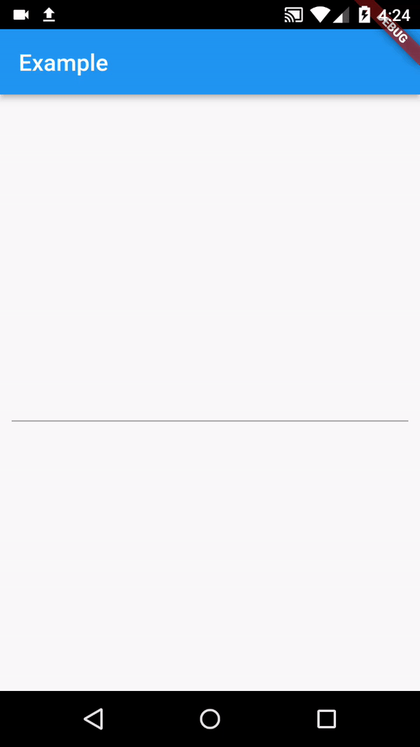
easy_autocomplete: ^1.6.0You can create a simple autocomplete input widget as shown in first preview with the following example:
import 'package:easy_autocomplete/easy_autocomplete.dart';
import 'package:flutter/material.dart';

void main() {
  runApp(MyApp());
}

class MyApp extends StatelessWidget {
  @override
  Widget build(BuildContext context) {
    return MaterialApp(
      title: 'Example',
      theme: ThemeData(
        primarySwatch: Colors.blue,
      ),
      home: SafeArea(
        child: Scaffold(
          appBar: AppBar(
            title: Text('Example')
          ),
          body: Container(
            padding: EdgeInsets.all(10),
            alignment: Alignment.center,
            child: EasyAutocomplete(
              suggestions: ['Afeganistan', 'Albania', 'Algeria', 'Australia', 'Brazil', 'German', 'Madagascar', 'Mozambique', 'Portugal', 'Zambia'],
              onChanged: (value) => print('onChanged value: $value'),
              onSubmitted: (value) => print('onSubmitted value: $value')
            )
          )
        )
      )
    );
  }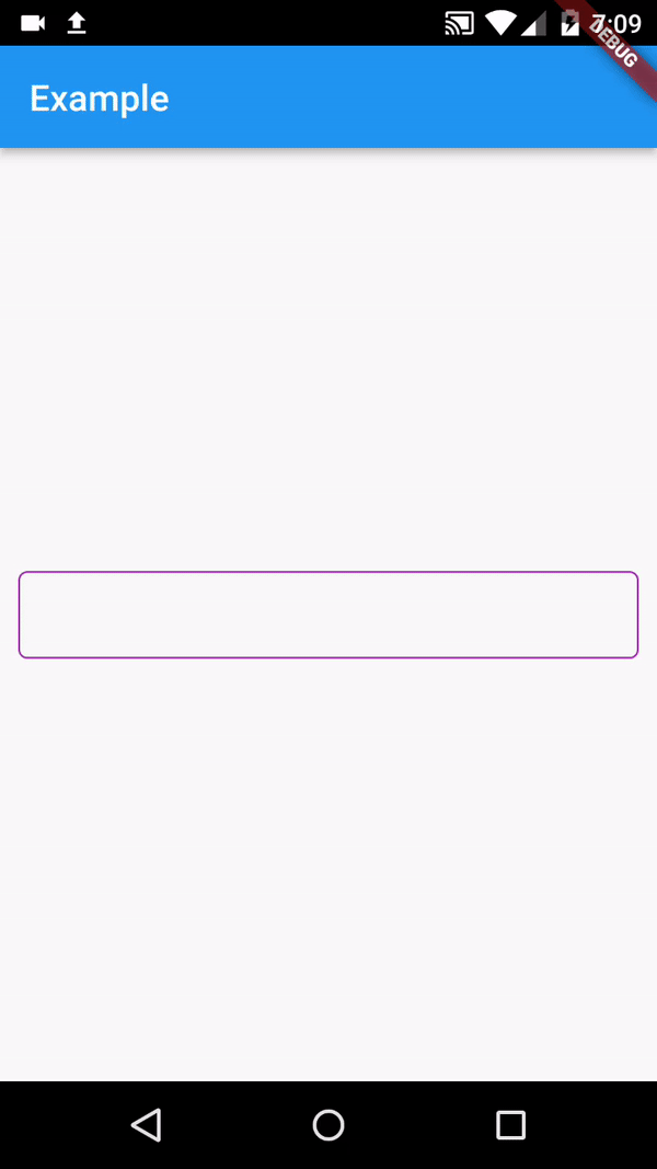
}You can customize other aspects of the autocomplete widget such as the suggestions text style, background color and others as shown in example below:
import 'package:easy_autocomplete/easy_autocomplete.dart';
import 'package:flutter/material.dart';

void main() {
  runApp(MyApp());
}

class MyApp extends StatelessWidget {
  @override
  Widget build(BuildContext context) {
    return MaterialApp(
      title: 'Example',
      theme: ThemeData(
        primarySwatch: Colors.blue,
      ),
      home: SafeArea(
        child: Scaffold(
          appBar: AppBar(
            title: Text('Example')
          ),
          body: Container(
            padding: EdgeInsets.all(10),
            alignment: Alignment.center,
            child: EasyAutocomplete(
              suggestions: ['Afeganistan', 'Albania', 'Algeria', 'Australia', 'Brazil', 'German', 'Madagascar', 'Mozambique', 'Portugal', 'Zambia'],
              cursorColor: Colors.purple,
              decoration: InputDecoration(
                contentPadding: EdgeInsets.symmetric(vertical: 0, horizontal: 10),
                focusedBorder: OutlineInputBorder(
                  borderRadius: BorderRadius.circular(5),
                  borderSide: BorderSide(
                    color: Colors.purple,
                    style: BorderStyle.solid
                  )
                ),
                enabledBorder: OutlineInputBorder(
                  borderRadius: BorderRadius.circular(5),
                  borderSide: BorderSide(
                    color: Colors.purple,
                    style: BorderStyle.solid
                  )
                )
              ),
              suggestionBuilder: (data) {
                return Container(
                  margin: EdgeInsets.all(1),
                  padding: EdgeInsets.all(5),
                  decoration: BoxDecoration(
                    color: Colors.purple,
                    borderRadius: BorderRadius.circular(5)
                  ),
                  child: Text(
                    data,
                    style: TextStyle(
                      color: Colors.white
                    )
                  )
                );
              }
              onChanged: (value) => print(value)
            )
          )
        )
      )
    );
  }
}
The above example will generate something like below preview:
To create a autocomplete field that fetches data asynchronously you will need to use asyncSuggestions instead of suggestions
import 'package:easy_autocomplete/easy_autocomplete.dart';
import 'package:flutter/material.dart';

void main() {
  runApp(MyApp());
}

class MyApp extends StatelessWidget {
  Future<List<String>> _fetchSuggestions(String searchValue) async {
    await Future.delayed(Duration(milliseconds: 750));
    List<String> _suggestions = ['Afeganistan', 'Albania', 'Algeria', 'Australia', 'Brazil', 'German', 'Madagascar', 'Mozambique', 'Portugal', 'Zambia'];
    List<String> _filteredSuggestions = _suggestions.where((element) {
      return element.toLowerCase().contains(searchValue.toLowerCase());
    }).toList();
    return _filteredSuggestions;
  }

  @override
  Widget build(BuildContext context) {
    return MaterialApp(
      title: 'Example',
      theme: ThemeData(
        primarySwatch: Colors.blue,
      ),
      home: SafeArea(
        child: Scaffold(
          appBar: AppBar(
            title: Text('Example')
          ),
          body: Container(
            padding: EdgeInsets.all(10),
            alignment: Alignment.center,
            child: EasyAutocomplete(
              asyncSuggestions: (searchValue) async => _fetchSuggestions(searchValue),
              onChanged: (value) => print(value)
            )
          )
        )
      )
    );
  }
}
The above example will generate something like below preview:
| Attribute | Type | Required | Description | Default value |
|---|---|---|---|---|
| suggestions | List<String> |
❌ | The list of suggestions to be displayed | |
| asyncSuggestions | Future<List<String>> Function(String) |
❌ | Fetches list of suggestions from a Future | |
| controller | TextEditingController |
❌ | Text editing controller | |
| validator | String Function(String?) |
❌ | Validate the autocomplete field value | |
| decoration | InputDecoration |
❌ | Can be used to decorate the input | |
| onChanged | Function(String) |
❌ | Function that handles the changes to the input | |
| inputFormatter | List<TextInputFormatter> |
❌ | Can be used to set custom inputFormatters to field | |
| initialValue | String |
❌ | Can be used to set the textfield initial value | |
| textCapitalization | TextCapitalization |
❌ | Can be used to set the text capitalization type | TextCapitalization.sentences |
| autofocus | bool |
❌ | Determines if should gain focus on screen open | false |
| focusNode | FocusNode |
❌ | Can be used to manage TextField focus | |
| keyboardType | TextInputType |
❌ | Can be used to set different keyboardTypes to your field | TextInputType.text |
| cursorColor | Color |
❌ | Can be used to set a custom color to the input cursor | Colors.blue |
| inputTextStyle | TextStyle |
❌ | Can be used to set custom style to the suggestions textfield | |
| suggestionTextStyle | TextStyle |
❌ | Can be used to set custom style to the suggestions list text | |
| suggestionBackgroundColor | Color |
❌ | Can be used to set custom background color to suggestions list | |
| debounceDuration | Duration |
❌ | Used to set the debounce time for async data fetch | Duration(milliseconds: 400) |
| suggestionBuilder | Widget Function(String) |
❌ | Can be used to customize suggestion items | |
| progressIndicatorBuilder | Widget |
❌ | Can be used to display custom progress idnicator |
If you encounter any issue you or want to leave a suggestion you can do it by filling an issue.
Here's the list of our awesome contributors: