Current version: v2.3.3 (11/07/2020) - Download | Old messages add-on: Download
Assets moved to: https://github.com/CapnKitten/BetterDiscord/blob/master/Material-Discord/
(Previews are subject to be out of date / Animations in the GIFs are sped up)


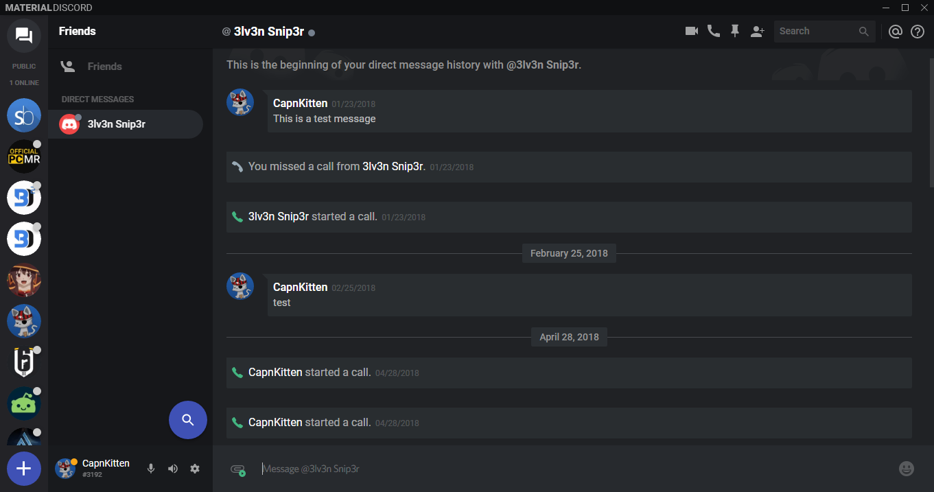

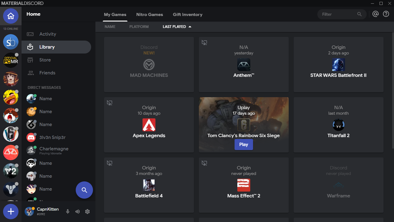
--app-bg- The background for the entire Discord app--main-color- The color for most of the large elements--main-alt- An alternative color for large elements--server-color- The background color for the server list--accent-color- The main accent color for the theme--accent-button-action- The color used for the hover and active states for accent buttons--accent-button-action-hover- The opacity for the accent button hover state--accent-button-action-active- The opacity for the accent button active state--accent-rgb- The accent color, but with a lower opacity for translucent backgrounds--accent-rgb-text-color- The text color for content inside elements that use accent-rgb--accent-text-color- The text color for buttons and other various elements with the accent background color--chat-color- The background color for the main chat area--message-color- The background color for message bubbles--message-alt- An alternative background color for message bubbles--card-color- Color of most of the cards--card-alt- A lighter color for some of the cards--card-border-colorBorder color for headers and footers in cards and modals--alert-color- Color of the various alert/error elements--alert-button-action- The color used for the hover and active states for alert buttons--alert-button-action-hover- The opacity for the alert button hover state--alert-button-action-active- The opacity for the alert button active state--alert-text-color- Text color for various buttons and elements with the alert color--status-picker-color- The background color for the user status area--status-popout-color- The background color for the user status popout menu--notification-color- The unread notification color--success-color- Color of various success elements--border-radius- Border radius of most of the elements--border-radius-big- Border radius of the modals/popouts--new-messages-radius- Border radius for the new messages bubble, images, and embedded attachments introduced in v2.3--audio-flash- The RGB value for the flashing icons such as the voice/video chat circles
- Icons updated for languages other than English
- Search results updated
- Pinned messages message for the compact appearance fixed