A configurable tabber component built for vanilla react.
I found that modern UI designs ofter use tabbed navigation, so I wanted to create something that was reusable throughout the application I am create, and future applications.
Add the component to your components folder and import it in any other component you would like.
import Tabber from './tabber' ReactDOM.render(<Tabber tabs={tabs} styles={styles} />) You can apply custom styles to the tabs, the animated underline, the surrounding box, and the text, using these variables inside the object. Must use css syntax.
tabColor: Changes the color of the tab
TabRowColor: Changes the tab container color
underlineColor: Changes the animated underline color
tabHeight: Changes the tab height
textColor: Changes the text color
just add a style object to the styles prop.
Example:
const styles = {
  tabColor: 'pink',
  tabRowColor: 'white',
  underlineColor: 'blue',
  tabheight: '55px',
  textColor: 'blue',
}To create tabs you can pass an array of tab objects to the tab's props. The tabs objects must include at least a null. A callback function is optional, , and defaults to null.
the callback will return the index of the tab clicked.
const changeView = index => {
console.log(`index of the tab clicked: ${index}`)
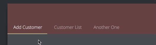
}const tabs = [
{
name: 'Add Customer',
cb: changeView
},
{
name: 'Customer List',
cb: changeView
},
{
name: 'Another One',
cb: null
}
]