Build map component #191
Build map component #191
Conversation
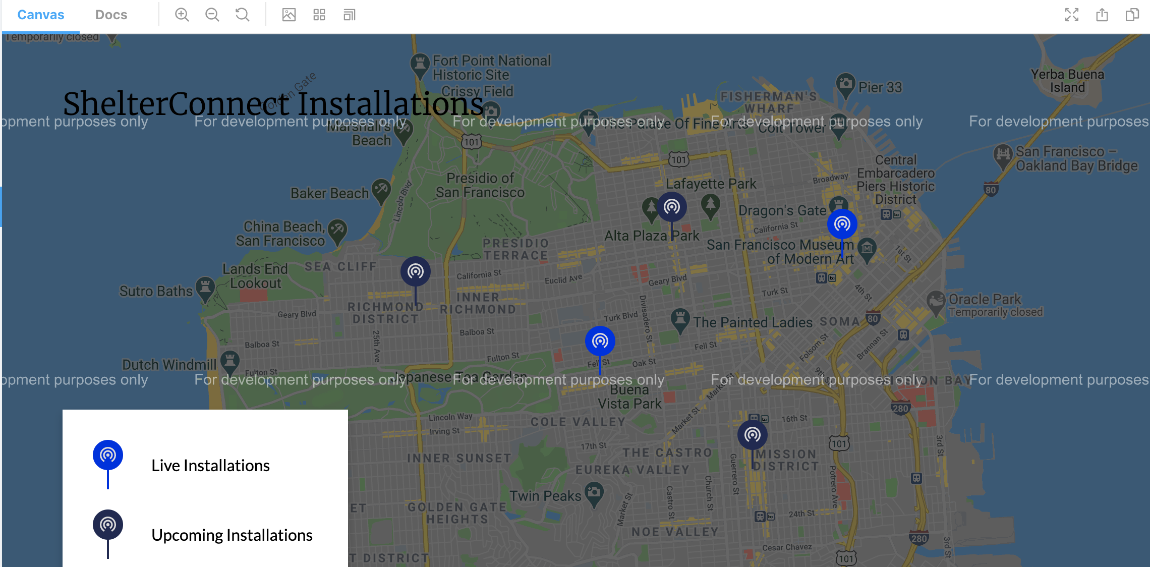
It's even bigger in the mockup but this is what fits on my laptop screen
Needed to keep typescript from complaining about google-map-react import
Also render MapKey in InteractiveMap
Possibly we might want a different file for this -- will discuss in PR
Height needs to be explicit for google maps to work
Position: relative is needed for absolute elements
- Render location markers in InteractiveMap.tsx
- Add dummy data to storybook
Current -> Live
Planned -> Upcoming
Matches the mockup now
Since the mockup doesn't have one
It does not like Google Maps and will always fail
There was a problem hiding this comment.
First of all, thank you for putting in the effort to write a very thorough PR description! It really helps me get a picture of the things you encountered and decisions you made while working on this!
I've left a lot of comments, both in response to your PR description as well as inline comments in the code. If you have any questions about about my comments or just want to talk through a few things in a more realtime session, let me know, and we can set up a time to chat about it.
Map Styling
For this, I think going with the default Google Maps styles is fine. I don't think the mockup was meant to be exactly matched here, since we will obviously have some limitations with what we can control. It's good to know, however, that Google does provide a lot of customizability here, so if @derekfidler's interested, he can tweak the styles as much as he wants.
Show marker info on hover.
My interpretation of the design was that this would show upon clicking the marker, rather than on hover. We'd need to implement on click anyway for mobile, since hovering doesn't really exist on touch screens. Our usual way of asking clarifying questions about the design is to just leave a comment on the Figma document itself, so do you think you could add a comment there?
I agree with splitting the development work for that out into a separate task, though, so we don't need to wait for the answer to that for this PR.
About the Data Models
Regarding the MarkerType type, I agree with your reasoning with separating it out from the the MapLocation type, but I was wondering if it'd be better to make the total set of MarkerTypes static, rather than something that lives only in a dynamic list. My reasoning is that 1) this would allow us to express the marker types in the type system, giving us greater type safety, even if the mapping of locations to marker types comes from an external source (can explain this in more detail later), and 2) I feel that it's unlikely that we'll be changing the kinds of marker types much in the future. Even if we wanted to add a new marker type, it's pretty simple to do so in the code.
As for how to express this in the type system, I was thinking that we could define it like type MarkerType = "Live" | "Upcoming", and the image URL would just be a function that accepts the marker type as an argument and returns an image path. We can guarantee that all marker types are mapped to an image because of TypeScript's ability to do exhaustive checks on union types. I think it would also be possible to use an enum, but I'm not familiar with the tradeoffs between enums vs. unions of literals in TypeScript.
This would address your concern about making sure the markerType property of the MapLocation contains a valid name, since by making the set of valid marker types static, it becomes possible to express in our type system, and therefore is something that the compiler can check.
Re: my comment a little bit earlier about having type safety even when data comes from an external source, we could have all API calls go through a validation step, where we check that the data conforms to what our application thinks it should be before we pass it to the rest of our application. At that validation step, we're basically going from a TypeScript unknown (e.g. the JSON response from an API) to something of a known type (e.g. "Live" | "Upcoming") or a validation error. Here's an article that describes the idea in more detail, both with some examples of doing it manually as well as with a library.
What do you think about this?
In the grand scheme of things, I don't think it matters too much which approach we take, since it isn't too much work to switch between the different approaches, especially before we actually integrate with an external CMS. Happy to chat about this some more in realtime at the next working session, if you're interested.
How to Test
Make sure you have a local .env file and add the same Google Map API key used by ask darcel. The key itself can be found here, and the key name should be GOOGLE_API_KEY.
Let's make sure to add this to the docs somewhere. It's not a requirement for everyone setting up the site, but it'd still be good to document in case if someone wants to do some development work on this component in the future. FWIW, it's nice that the map is still functional even if you don't add that key, since all it does is plaster "For development purposes only" as a watermark all over the map:
Google Maps requires an explicit height to be set in pixels or it won't render the map.
I think this is reasonable. It doesn't exactly fit into the normal "rules" for block components, since normally you would fill the width of your parent and then let your internal content determine your height. However, for this map, the internal content can't determine the height because it's not like it's filled with text/images. We may need to set a different height between mobile and desktop, but I think we can wait for the designs for the page to be finalized, where hopefully we'll have some guidance for what it should look like on a mobile device.
As stated in the testing instructions, I added the Google Map API key as an environment variable, but could just write it plainly in the code if we don't want to go through the hassle of using .env for this. It'll show up in the bundled JS anyway, so I don't know how much we care about caution here. Input is welcome.
Let's try keeping it separate, just for cleanliness, but if it becomes too much of a hassle, we can hardcode it. That reminds me, we'll need to update the GitHub Actions workflow to include the API key, at least for the workflow that builds the staging/production bundles.
But Typescript started screaming when I tried to import SVGs ... So I'm explicitly requesting input on this 👈 👈 👈 .
These kinds of "import some non-JavaScript file into a JavaScript file" come from Webpack's loaders, and in this particular case, I think it's probably file-loader that's loading the SVG files (but I could be wrong, since I didn't try figuring out what exactly Gatsby is using for SVG files. Could you try installing @types/file-loader to see if that makes the type errors go away?
Since I don't see any documentation for @types/file-loader anywhere, here are links to an issue that tracked the creation of those types as well as the PR that introduced it to DefinitelyTyped, in case if it's helpful:
- Create .d.ts definition with options interface for typescript webpack-contrib/file-loader#320
- [file-loader] introduce types DefinitelyTyped/DefinitelyTyped#38229
But in the event that @types/file-loader doesn't just work for us, I think my recommendation here would be to just rename styles.d.ts to something more generic, like external.d.ts or even loaders.d.ts, since the CSS modules stuff comes from css-loader.
But they look slightly off to me?
I didn't really notice at first, but upon closer inspection, it looks like the white concentric circles/arcs in the design are actually pure white, whereas the SVG file and Figma say that they're #DADADA. I used macOS's Digital Color Meter to confirm that they are actually pure white (255, 255, 255) in Figma, so I don't really know why Figma claims they're a light gray. Might want to ping Derek (maybe on the Figma, or even just Slack) to send you the raw SVGs?
The mockup clearly shows that the font-weight for the title is 300, and yet when I try to set it to anything lower than 400, I see no visual difference on any browser that I tried.
Ah, don't worry about that. I specifically made the request to Derek to not use the 300 weight font, since I was a bit concerned about bloating the site with too many font weight variations, since each weight is a separate collection of glyphs that need to be downloaded. For the most part, you can just look at the name of the typography style in Figma (the thing next to the "Ag") and match it to the font variables we have in globals.css. This matches the Figma typography styles, which we can select from when designing a new component to ensure that we stick to existing styles. The font variables in CSS also have the nice property of automatically conforming to the right sizes for mobile, since we have the CSS custom properties change globally for mobile.
| { | ||
| lat: 37.758684521153505, | ||
| lng: -122.42044428675193, | ||
| name: "Garden Creamery", |
There was a problem hiding this comment.
Nice choice, I support this entry :)
| latLngBounds: { | ||
| north: 37.82, | ||
| south: 37.7, | ||
| west: -122.53, | ||
| east: -122.37, | ||
| }, |
There was a problem hiding this comment.
This actually brings up an interesting question, since we're about to start our first San Jose installation, so the bounds currently mockups may either need to change to include San Jose, or we may want two separate maps. Anyway, I think that's a bridge we can cross when we actually get closer to having final designs for the new pages, so no action required on this comment.
| font-family: var(--font-family-merriweather); | ||
| font-size: 30px; | ||
| line-height: 39px; |
There was a problem hiding this comment.
All three of these can be set with font: var(--font-title), which I think is preferable because it helps keep our total number of font styles small and consistent.
Also, for future reference, you generally want to use a unitless size for line-height, since that will allow the line-height to automatically adjust if the font-size is changed. See https://allthingssmitty.com/2017/01/30/nope-nope-nope-line-height-is-unitless/ for a very short example explaining this. This isn't that relevant for this codebase, since we stick to the font shorthand variables that we've defined (I think there are only one or two exceptions across the whole site), but it's generally good to know for other web projects.
I think Figma doesn't always exactly describe the CSS that you want to write, since part of that is the job of a frontend engineer to translate from a design, and because Figma is also used for mobile app design, where there's totally different layout systems, so you'll want to always think about when to copy the Figma values verbatim and when to translate them to something more generalized in the app.
| lat: number; | ||
| lng: number; |
There was a problem hiding this comment.
Super nit: Do you think we could fully spell out latitude and longitude? I know that the Google Maps API uses the lat/lng spellings, but I think fully spelling it out would be more readable, especially to people not familiar with Google Maps' APIs. I will also make the argument that there exist other map APIs [1] [2] which spell them differently.
| subtitle: string; | ||
| fundingUrl: string; |
There was a problem hiding this comment.
Since these aren't being used right now, maybe we can leave them out of this PR until we get some more info on exactly what should be going into the info boxes? I think knowing more about the requirements will also help us with defining the data model here, since we may also just choose to make the whole body of the box be a freeform text description.
| lat: number; | ||
| lng: number; | ||
| location: MapLocation; | ||
| markerTypes: MarkerType[]; |
There was a problem hiding this comment.
I see why you've added the list of all marker types as a prop to this component, since it's due to how you're trying to handle the case where the marker types is dynamic and can be set by an external data source, but I think this could all go away if you just make the marker types static. To add one last argument for making the marker types static, I think it's a less awkward and more intuitive API to have this component only depend on the location and not the set of all marker types.
|
|
||
| const MapMarker = ({ location, markerTypes }: MapMarkerProps) => { | ||
| const imgPath = getMarkerImagePath(location, markerTypes); | ||
| return <img src={imgPath} className={s.mapMarker} alt="" />; |
There was a problem hiding this comment.
Do you think we could put the map location name in the alt text? This will make it much more helpful to screen readers and other assistive technology, since it would actually allow them to interact with it.
| @@ -0,0 +1,22 @@ | |||
| .mapKey { | |||
| background-color: #fff; | |||
There was a problem hiding this comment.
Could you replace this with our color variable, --color-white, for the same color value? This helps us prevent the creation of ad hoc hardcode values, and perhaps would make it easier to globally change the color scheme in the future, for example, but choosing a slightly different shade for "white".
| background-color: #fff; | |
| background-color: var(--color-white); |
| .mapKeyEntry:not(:last-child) { | ||
| margin-bottom: 20px; | ||
| } |
There was a problem hiding this comment.
This is kind of new, but could we replace this entire pseudoclass selector with the row-gap property on the regular .mapKeyEntry selector? We're already using it in other places in the codebase, so if we do need to support older browsers, then we'll need to update every instance of it anyway.
|
|
||
| .mapKeyText { | ||
| font-family: var(--font-family-lato); | ||
| padding-left: 28px; |
There was a problem hiding this comment.
Padding doesn't exactly feel like the "right" property to set here, since it's something that actually changes the shape and size of this element. Even though this is invisible today, since this element has neither a border nor a background, it's still something that feels conceptually a bit "wrong", and it could cause minor issues in the future if we did want to set a background, a border, or something else that cares about the actual size of the component.
One neat thing is that the row-gap/column-gap/gap CSS property is actually supported in flexbox on newer browsers, but that might be too new for us, given that Safari doesn't support it yet and Chrome and Edge only support it as of July last year. But instead, I think you could make this whole key component a grid rather than a sequence of flex rows and get the benefit of being able to set the row and column gaps.
Description
This PR begins building an interactive map component using Google Maps as shown on the Designs - V2 tab of this mockup. This component is not yet in use anywhere, but can be viewed in Storybook. It is also incomplete. I'll start this PR by describing what this component is still lacking, and then I'll explain some of my design decisions. Then I'll provide instructions for any brave souls who want to test this, and then I have some random notes and quirky things that came up.
The Mockup
Current Progress (in Storybook)
(I struggled to get the zoom levels matched up for this comparison 🤷♀️ )
Resolves #158.
What This PR Doesn't Do
About the Data Models
Because we've been discussing using a CMS in the future, I designed this component with the idea that it would be populated with data we retrieve via an API call. Below are the type definitions for the two main "models" in this schema:
MarkerType
The
MarkerTypeis what is used to build the map's key, like below:By simply adding or removing a
MarkerType, this key will adjust accordingly.MapLocation
(Mockup image, from the 2020 Vision version)
The
MapLocationis where we get data for each individual location marker, including its position and the text it should (but does not currently) display. The tricky part with this one is themarkerTypefield. Somehow we need to tell each marker which image file to render with. Rather than have all of them be explicitly assigned, I decided to link them to theMarkerTypedefinitions for the following reasons:MarkerTypeinstead of every individual locationRight now I'm doing this with string matching -- a
MapLocation'smarkerTypefield must exactly match thenamefield of an actualMarkerTypeor an error will be thrown. This is fragile and unideal, but depending on what kind of CMS we end up using, it's possible that the interface may allow a type of foreign key assignment instead, so our users would be incapable of providing faulty input here. This is something that I think will need to be revisited once we know more about our CMS situation. For the time being, I'm trying to get the basics in place such that migrating to use with a CMS won't be hard, but some amount of migration will still need to happen.The Actual Map
The third "model" is the data for the map itself, which would only require an optional title/subtitle, a list of
MarkerTypesand a list ofMapLocations. Right now the component also requires other props (its latitude/longitude boundaries, where it's centered, how far out you can zoom), but I don't expect we need to make those configurable via CMS.How to Test
.envfile and add the same Google Map API key used by ask darcel. The key itself can be found here, and the key name should beGOOGLE_API_KEY.Controlstab in Storybook, but if you want to try adding/removing data, it might be easier to just adjust the dummy data inInteractiveMap.stories.js.MapLocationwith amarkerTypethat doesn't match aMarkerTypename, you should get a very descriptive error about this. (Although, again, we might not want to keep this functionality).Other Notes
"esModuleInterop": truein ourtsconfig.jsor Typescript would yell at me when I tried to import thegoogle-map-reactlibrary. Here's the explanatory comment I added in the file itself: "Allows us to use default imports with CommonJS modules (which some third-party packages use)"..envfor this. It'll show up in the bundled JS anyway, so I don't know how much we care about caution here. Input is welcome.declare module "*.svg";to a.d.tsfile makes Typescript happy. For now I just stuck it into our only existing file of this type, namedstyles.d.ts...but that doesn't seem like the correct place for this, since it's unrelated to styling. But I couldn't decide if the answer was to rename the file, or create a new file, or what. So I'm explicitly requesting input on this 👈 👈 👈 .A Bug :(
The mockup clearly shows that the
font-weightfor the title is300, and yet when I try to set it to anything lower than400, I see no visual difference on any browser that I tried. I didn't deeply investigate the cause, because I figure that's a fairly trivial thing we could come back to later. For now I've decided to leavefont-weightout of the CSS entirely, so that it is simply unimplemented, rather than broken and misleading. After this PR merges, I can open a separate ticket for that. Although since these mockups aren't yet fully finalized, I don't think it would be high priority.