Studio is a tool that lets Admins and Developers alike build React Applications with ease. For now, we're focused on Applications corresponding to a Site. But, that may change in the future. It provides a no-code, visual editor that allows users to add and remove Components to pages, and configure Components on a page.
As users perform operations in the Editor, Studio is writing human-readable, well formulated TSX files to the repo. Developers can easily work with, and directly modify, these TSX files outside Studio, as need be.
-
To start, clone this starter repo.
-
Ensure you have the Pages development dependencies installed. Directions here.
-
Make sure you're using node 18.
-
Run
npm install. -
Connect to your yext account with
yext init <acount_id>oryext init -u sandbox <account_id>if using a sandbox account. -
Cd into the starter repo and run
yext resources apply platform-config. This will add some dummy data to your sandbox account. -
Run
npm run studioand follow the login prompts. -
You should now see Yext Studio appear in the browser
Your Site currently has one page: product. This page is actually an Entity Template. Studio's chosen a random Entity to render the preview you see. You'll want to add more pages, which can be either Static or Entity Templates. A new page can be added by using the + icon here:
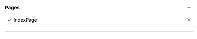
A modal will appear, prompting you to name your new page. Under the hood, a new TSX file is generated in the src/templates directory of your repo. If you want to remove a page, simply click the x icon associated with it. You can toggle between different Site pages in the Editor. To do this, simply click on the desired page name under the Pages header. A check-mark will appear to indicate this is the active page in Studio's Edit Mode.
Now that you have a page, you probably want to do some things with it. Specifically, you'll want to add Components to it. Adding a Component to a page is simple. Once you've set the desired page to active, click the icon in the top-left and you will see a drop-down like the following:
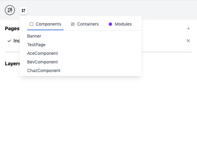
These are the various Components that can be added to your page. For now, you can ignore Containers and Modules. Those will be described later. Once you select a Component, such as Banner, it will appear in the middle preview pane and on the left-hand side under Layers:
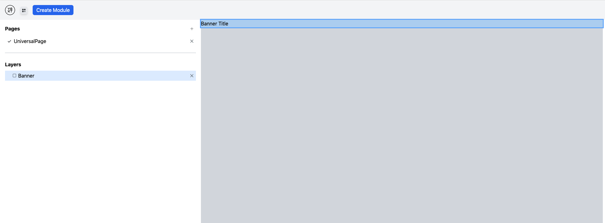
In the Layers Pane, you can re-order the Components on the page by simply clicking and dragging them.
To configure the Component, click on it under the Layers Section. That should highlight it in the page preview. Additionally, the Properties shown on the left-hand side should be populated:
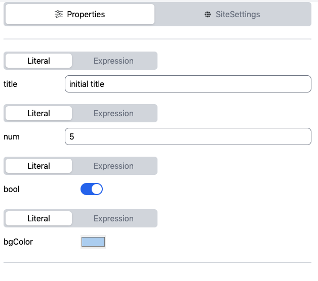
These are the props of the relevant Component (in this case Banner). You'll notice that the Props have a toggle between Literal or Expression above them. When Literal is used for a prop, that means the value is static. To source the prop value from a Stream Document, you'd use Expression. We will go into more detail about this below. But first, if you want to remove a Component from the page, simply click the x icon next to it under Layouts.
For a Stream to power a Component prop's value, additional setup needs to be done first outside of Studio. This would be done by the Developer. Firstly, the Developer would need to manually update the page's TSX file to resemble a PagesJS Template. This allows the page to accept a Stream document and scaffolds a Stream Configuration for the Page/Template. The modifications would look something like:
export const config: TemplateConfig = {
  stream: {
    $id: "my-stream-id-1",
    fields: [],
    // Defines the scope of entities that qualify for this stream.
    filter: {
      entityTypes: ["location"],
    },
    // The entity language profiles that documents will be generated for.
    localization: {
      locales: ["en"],
      primary: false,
    },
  },
};

const Component: Template<TemplateRenderProps> = ({document, props: ComponentProps}) => ...
export default Component;
The fields attribute of the Stream Configuration can be populated from the UI. If someone were to use document.name as the value for an Expression prop, Studio would addend "name" to the fields array. All other aspects of the Stream (localization, filter, etc.) must be configured directly in the file by the Developer.
Once an Expression value is used for a prop, and the above setup is complete, the page becomes an Entity Template, it's no longer Static.
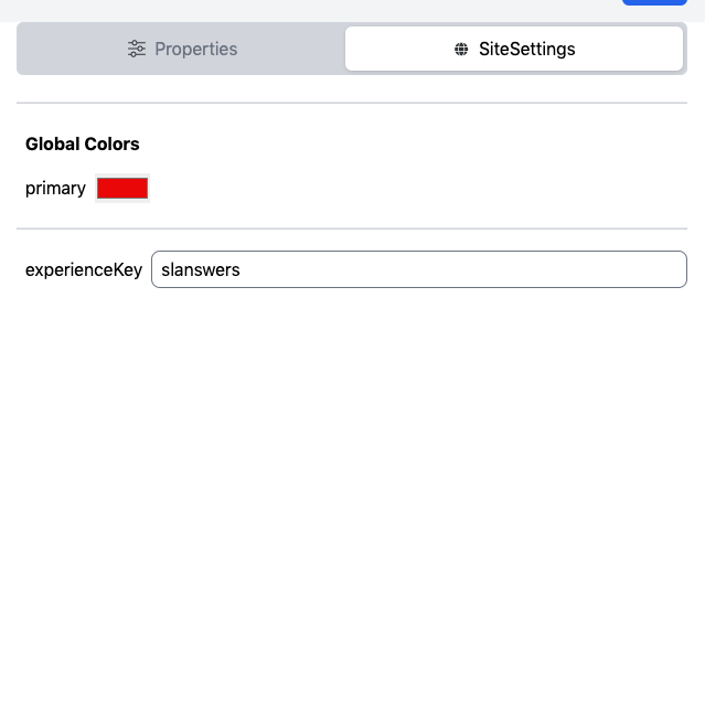
Site Settings (Attributes) can be used within Expression props in a similar way to Streams data. For example, you can specify siteSettings.["Global Colors"].primary and the corresponding Site Settings value will be passed to the component. The process for adding, removing, and modifying Site Settings is covered in a later section.
Developers have the ability to craft new Components that can then be used in Studio. As an example, an Admin might ask for a net-new piece of functionality on the page. The Developer would create the corresponding Component, which the Admin could then use. Authoring a Component is fairly simple. It starts with adding a new TSX file to src/components. The file will have the form:
export interface SomeComponentProps {
  prop1: string,
  prop2?: number,
  ...
};

export default function SomeComponent(props: SomeComponentProps) {
  return (
    <div>
      ...
    </div>
  );
}
Optionally, the Developer can specify initial values for the Component's props. In the same file, they'd add something like:
export const initialProps: SomeComponentProps = {
  prop1: "Hello World",
};
When the new Component is added to a page, the Properties tab on the left-hand side will be seeded with the defaults.
We've already added a few custom Components to the starter for you. One is a Banner, to prominently display an Entity's address. We also added an Entity Result Card and CTA in case you want to add Search functionality. You can use these Components as a guide when writing your own.
Authoring is one way to register new Components with Studio. An easier way, one that promotes wider re-use, is to import an NPM package containing custom Studio Components. These packages are called Studio Plugins. A Plugin's entry point is structured like:
import { PluginConfig } from "@yext/studio-plugin";

export * from "./components";

const PluginConfig: PluginConfig = {
  name: "[npm-package-name]",
  components: {
    SomeComponent: "src/components/SomeComponent.tsx",
    AnotherComponent: "src/components/AnotherComponent.tsx",
  },
};

export default PluginConfig;
To use a Plugin:
- Install it with
npm install [npm-package-name]. - Add a
requirestatement to the top of yourstudio.config.ts. Something likeconst SomePlugin = require("[npm-package-name]"). - Add the imported Plugin to the
pluginsarray instudio.config.ts.
Now, all Components in the Plugin will be available for use in Studio.
We've published a Plugin library, @yext/studio-plugin-search-ui-react, to power a basic Universal Search. The library exports three Components: SearchBar, UniversalResults, and ResultsCount. Note that these Components are hard-coded to use Slapshot's default Search Experience.
To use these components, first add a SearchProvider component to the page, which can be found under the Containers category. This is necessary so that the Search components can properly interact with one another.
Often, you will want to have attributes that are accessible to all pages within a Site. In Classic Pages, these were known as Site Attributes. In the new Sites system, we usually recommend adding these attributes to a Site Entity. Studio provides an additional mechanism for supplying these values: the src/siteSettings.ts file. We cannot rely exclusively on a Site Entity because Studio can be used outside of PagesJS. The siteSettings.ts file is initially setup by the Developer:
export interface SiteSettings {
  attribute1: string;
  attribute2: number;
  primaryColor: HexColor;
}

export default {
  attribute1: "Hello World",
  attribute2: 1,
  primaryColor: "#AABBCC",
};
The SiteSettings interface defines what attributes are available Site-wide. Optionally, defaults can be provided using the default export.
With this file in place, a user can edit the values of the Settings directly in Studio. To do so, click on the SiteSettings button in the right-hand panel:
Note that you cannot add or remove Settings from within Studio. That needs Developer intervention.
What if you make a mistake in the Editor? Say removing a Page accidentally, updating a Component's Props incorrectly, etc. By maintaining a history of your edits, Studio provides powerful Undo functionality. You can undo actions one at a time, until you return to the desired state. Likewise, Studio has Redo functionality. Both features are accessed in the top-right, using these buttons:
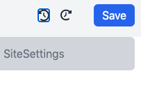
Once you're happy with the changes made during your session, you can click the Save button on the top-right. This will make all updates to the necessary TSX files in the repo. Note that Studio does not write to any files until Save is invoked. The preview is actually powered by a virtual representation of the Site.