Grid Helper
Grid Helper is a new new ConstraintLayout Helper. It offers the capability to easily create a Grid representation. Additionally, it can also be used to create a row, a column, and a nested representation.
To learn how to use the Grid Helper, let's introduce the basic concept of the Grid Helper starting with building a layout below.
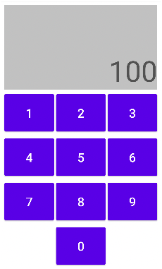
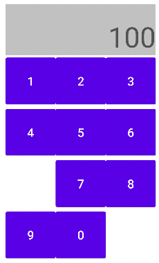
To build the layout, we can first create a 4x3 Grid representation (see the XML below for details). By specifying app:grid_rows="4" and app:grid_columns="3", the Grid Helper can create a Grid space with 4 rows and 3 columns. Later, we add the ids of buttons (widgets) to be arranged in the Grid space in an order (app:constraint_referenced_ids="btn1, …."). A keypad-like layout can then be generated.
<androidx.constraintlayout.helper.widget.Grid
        ...
        app:constraint_referenced_ids="btn1,btn2,... ,btn9,btn0"
        app:grid_rows="4"
        app:grid_columns="3" />
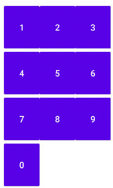
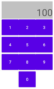
There are two possible ways to improve the layout a bit. 1. let btn0 take the entire row, and 2. move the btn0 to the center of the row. To make btn0 to take the entire row, we can use the spans feature of the Grid Helper by adding app:grid_spans="9:1x3". With this newly added attribute, it tells the Grid Helper to create a spanned area (1 row x 3 columns) starting at position 9 (Zero-based numbering) for the first widget in app:constraint_referenced_ids. To make btn0 take the spanned area, we also need to move the id of btn0 to the beginning of the app:constraint_referenced_ids attribute.
<androidx.constraintlayout.helper.widget.Grid
        ...
        app:constraint_referenced_ids="btn0,btn1,btn2,... ,btn9"
        app:grid_spans="9:1x3" />
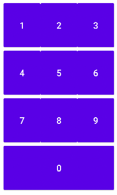
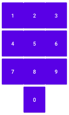
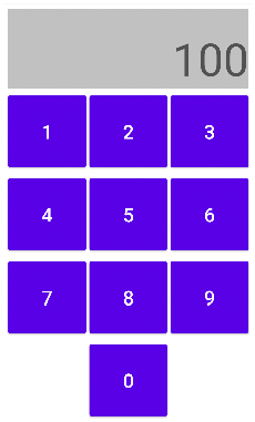
On the other hand, if we want to place the btn0 in the bottom row to the center of the row, we can then use the skips feature to skip certain position(s) in a Grid. In this case, we can add app:grid_skips="9:1x1" so that no widgets can be placed at the skipped position(s). Here, app:grid_skips="9:1x1" means that we want to skip a 1 by 1 space starting at the position 9.
<androidx.constraintlayout.helper.widget.Grid
        ...
        app:grid_skips="9:1x1" />
Later, we might want to add a new row to place a textView to display the clicked numbers. We can increase the row number from 4 to 5 and use the spans feature (app:grid_spans="0:1x3") to indicate the first widget in the app:constraint_referenced_ids will take the 1 by 3 (1 row and 3 columns) space. Then, we place the new textView at the beginning of the app:constraint_referenced_ids.
<androidx.constraintlayout.helper.widget.Grid
        ...
        app:constraint_referenced_ids="text,btn1,btn2,...
        app:grid_rows="5"
        app:grid_spans="0:1x3"
        app:grid_skips="9:1x1" />
Hmm…, the layout is off because we skipped the 1 by1 space at position 9 earlier. Since we add a row, the position we want to skip is updated from position 9 to position 12.
<androidx.constraintlayout.helper.widget.Grid
        ...
        app:grid_skips="12:1x1" />
It now looks like what we would expect, but those buttons seem too close to each other. We can add horizontal spacing between each button by adding a new attribute app:grid_horizontalGaps="5dp". By adding this attribute, we are letting the Grid Helper know that we want to add 5dp spacing horizontally between each position in the Grid.
<androidx.constraintlayout.helper.widget.Grid
        ...
        app:grid_horizontalGaps="5dp" />
The layout looks better now. In the end, we might want to make the textView larger - maybe two times higher. There are two ways to do that: 1. increase the number of rows from 5 to 6 and then increased the height of the spanned area with app:grid_spans="0:2x3". 2. use the rowWeight feature to specify the weight (height) of each row in a Grid. By adding this attribute app:grid_rowWeights="2,1,1,1,1", we tell the Grid Helper that we want the first row to have the twice weight (height) as the others. The final XML and layout can be seen below
<androidx.constraintlayout.helper.widget.Grid
        ...
        app:constraint_referenced_ids="text,btn...,btn0"
        app:grid_columns="3"
        app:grid_rows="5"
        app:grid_spans="0:1x3"
        app:grid_skips="12:1x1"
        app:grid_horizontalGaps="5dp"
        app:grid_rowWeights="2,1,1,1,1" />
Earlier, we give an example to demonstrate how the Grid Helper can be used to create a Grid representation. In this section, different Grid representations using the Grid helper are presented. All the examples can also be found on Github
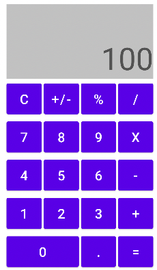
Based on the ideas in the keypad example, let's look at a more complete Calculator UI example showing how to use the grid_spans attribute to arrange widgets (TextView and Button 0) in spanned areas.
<androidx.constraintlayout.helper.widget.Grid
        android:id="@+id/grid"
        android:layout_width="match_parent"
        android:layout_height="match_parent"
        android:layout_margin="10dp"
        app:constraint_referenced_ids="calculatorText,btn0,..."
        app:grid_columns="4"
        app:grid_rows="7"
        app:grid_horizontalGaps="5dp"
        app:grid_verticalGaps="5dp"
        app:grid_orientation="horizontal"
        app:grid_spans="0:2x4,24:1x2" />
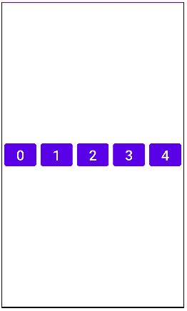
Additionally, the Grid Helper can be used to create a Row representation by setting grid_columns="0" and grid_rows="1". When setting the value of grid_columns as 0, the value of the grid_columns would be determined by the number of ids (of widgets) assigned to constraint_referenced_ids. Since there are five ids (btn0 to btn4), a 1X5 Grid would be created.
<androidx.constraintlayout.helper.widget.Grid
        android:id="@+id/grid"
        android:layout_width="match_parent"
        android:layout_height="match_parent"
        android:layout_margin="5dp"
        app:constraint_referenced_ids="btn0,btn1,btn2,btn3,btn4"
        app:grid_horizontalGaps="10dp"
        app:grid_columns="0"
        app:grid_rows="1" />
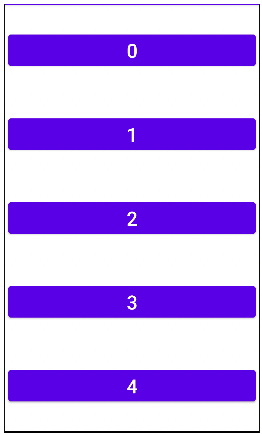
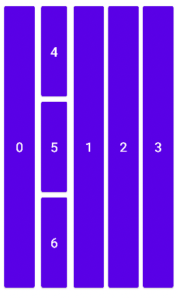
In contrast to the Row example, the Column example shows how to use the Grid Helper to create a Column representation by setting grid_columns="1" and grid_rows="0". Similar to the Row example, a 5X1 Grid would be created.
<androidx.constraintlayout.helper.widget.Grid
        android:id="@+id/grid"
        android:layout_width="match_parent"
        android:layout_height="match_parent"
        android:layout_margin="5dp"
        app:constraint_referenced_ids="btn0,btn1,btn2,btn3,btn4"
        app:grid_columns="1"
        app:grid_rows="0" />
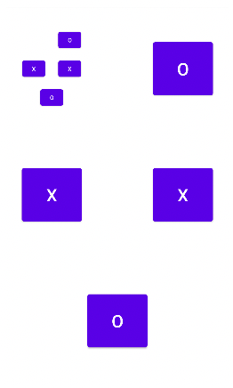
Another nice feature of the Grid Helper is that we can create a nested Grid representation. How it works is very straightforward. To create a nested representation, we will only need to add the id of an inner Grid to the constraint_referenced_ids attribute of the outer Grid.
<androidx.constraintlayout.helper.widget.Grid
        android:id="@+id/grid"
        android:layout_width="match_parent"
        android:layout_height="match_parent"
        android:layout_margin="30dp"
       app:constraint_referenced_ids="innerGrid,btn0,btn1,btn2,btn3"
        app:grid_columns="3"
        app:grid_rows="3"
        app:grid_horizontalGaps="10dp"
        app:grid_verticalGaps="10dp"
        app:grid_orientation="horizontal"
        app:grid_skips="1:1x1,4:1x1,6:1x1" />
<androidx.constraintlayout.helper.widget.Grid
        android:id="@+id/innerGrid"
        android:layout_width="0dp"
        android:layout_height="0dp"
        android:layout_margin="10dp"
        app:constraint_referenced_ids="btn4,btn5,btn6,btn7"
        app:grid_columns="3"
        app:grid_rows="3"
        app:grid_horizontalGaps="10dp"
        app:grid_verticalGaps="10dp"
        app:grid_orientation="horizontal"
        app:grid_skips="0:1x2,4:1x1,6:1x1" />
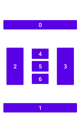
Column in Row The nested Grid example gives an idea how we can create a Grid in another. Since we can also use the Grid Helper to create a Row or a Column representation, it means we are also able to create a row within a column and vice versa. The layout below is an example of Column in Row.
<androidx.constraintlayout.helper.widget.Grid
        android:id="@+id/column"
        android:layout_width="match_parent"
        android:layout_height="match_parent"
        android:layout_margin="5dp"
        app:constraint_referenced_ids="btn0,row,btn1,btn2,btn3"
        app:grid_horizontalGaps="10dp"
        app:grid_columns="0"
        app:grid_rows="1" />
<androidx.constraintlayout.helper.widget.Grid
        android:id="@+id/row"
        android:layout_width="0dp"
        android:layout_height="match_parent"
        android:layout_margin="5dp"
        app:constraint_referenced_ids="btn4,btn5,btn6"
        app:grid_horizontalGaps="10dp"
        app:grid_columns="1"
        app:grid_rows="0" />
Similar to the example above, we could keep including a Grid into another. The following is an example of a Column representation in a Row representation in another Column representation.
<androidx.constraintlayout.helper.widget.Grid
        android:id="@+id/column"
        android:layout_width="match_parent"
        android:layout_height="match_parent"
        android:layout_margin="5dp"
        app:constraint_referenced_ids="btn0,row,btn1"
        app:grid_horizontalGaps="10dp"
        app:grid_columns="1"
        app:grid_rows="0" />

<androidx.constraintlayout.helper.widget.Grid
        android:id="@+id/row"
        android:layout_width="match_parent"
        android:layout_height="0dp"
        android:layout_margin="5dp"
        app:constraint_referenced_ids="btn2,innerColumn,btn3"
        app:grid_horizontalGaps="10dp"
        app:grid_columns="0"
        app:grid_rows="1" />
<androidx.constraintlayout.helper.widget.Grid
        android:id="@+id/innerColumn"
        android:layout_width="match_parent"
        android:layout_height="0dp"
        android:layout_margin="5dp"
        app:constraint_referenced_ids="btn4,btn5,btn6"
        app:grid_horizontalGaps="10dp"
        app:grid_columns="1"
        app:grid_rows="0" />
In addition to the demos shown above, the Grid helper can also be used to build more concrete layouts. Those examples can also be found on Github

From the demos above, we know that the Grid helper has different custom attributes, including:
- grid_rows and grid_columns: specifies the number of rows and columns will be created for the grid form. If only one of the value is set (e.g., grid_rows), the other value (grid_columns)would be calculated based on the number of widgets in a Grid.
- grid_spans: offers the capability to span a widget across multiple rows and columns. The format of a span is Position:RowxColumn. Position means the top and left most position of the spanned area. Row and Column imply the height and the width of the spanned area.
- grid_skips: enables skip certain positions in the grid and leave them blank. The format of a skip is the same with the grid_spans.
- grid_orientation: defines how the associated widgets will be arranged - vertically or horizontally.
- grid_horizontalGaps and grid_verticalGaps: add margin horizontally and vertically between widgets.
- grid_rowWeights and grid_columnWeights: specify the weight of each row / column - default weight is 1.
Although the Grid Helper can be used to build different layouts, there are two known issues:
- When setting wrap_content for android:layout_width and android:layout_height, it behave as the same as match_parent.
- It doesn't work with MotionLayout.