


🤷♂️ zero-dependency, 🤏 tiny JS base class for creating reactive custom elements easily ✨
When you extend the WebComponent class for your component, you only have to define the template and properties. Any change in any property value will automatically cause just the component UI to render.
The result is a reactive UI on property changes.
Links:
- Project Status
- Installation
- Exports
- Usage
- Examples
templatevsrender()- Prop access
- Styling
- Shadow DOM Opt-In
- Just the Templating
- Life-Cycle Hooks
onInit- the component is connected to the DOM, before view is initializedafterViewInit- after the view is first initializedonDestroy- the component is disconnected from the DOMonChanges- every time an attribute value changes
- Library Size
It is ready for many cases we see people use custom elements for. If you have a cool project built on WebComponent.io we'd love to know! :)
For building some advanced interactions, we have a few issues that are still open: #24 smart diffing, #15 memoization, #4 attachEffect improvements
In the mean time, if you have some complex needs, we recommend using the WebComponent base class with a more mature rendering approach like lit-html... and here's a demo for that: View on CodePen ↗.
...or you can even use just parts of it for your own base class.
The library is distributed as complete ECMAScript Modules (ESM) and published on NPM. Please file an issue in our issue tracker for problems or requests regarding our distribution.
Import using unpkg in your vanilla JS component. You can replace the version @latest in the URL with specific versions. We will use this in the rest of our usage examples.
import { WebComponent } from "https://unpkg.com/web-component-base@latest/index.js"Usable for projects with bundlers or using import maps pointing to the specific files downloaded in node_modules/web-component-base.
npm i web-component-baseYou can import everything separately, or in a single file each for the main exports and utilities.
// all in a single file

import { WebComponent, html, attachEffect } from "web-component-base";

// in separate files

import { WebComponent } from "web-component-base/WebComponent.js";

import { html } from "web-component-base/html.js";

import { attachEffect } from "web-component-base/attach-effect.js";// in a single file
import { serialize, deserialize, getCamelCase, getKebabCase, createElement } from "web-component-base/utils";
// or separate files
import { serialize } from "web-component-base/utils/serialize.js";
import { createElement } from "web-component-base/utils/create-element.js";
// etc...In your component class:
// HelloWorld.mjs
import { WebComponent } from "https://unpkg.com/web-component-base@latest/index.js";

class HelloWorld extends WebComponent {
  static props ={
    myName: 'World',
    emotion: 'sad'
  }
  get template() {
    return `
      <h1>Hello ${this.props.myName}${this.props.emotion === "sad" ? ". 😭" : "! 🙌"}</h1>
    `;
  }
}

customElements.define('hello-world', HelloWorld);
In your HTML page:
<head>
  <script type="module" src="HelloWorld.mjs"></script>
</head>
<body>
  <hello-world my-name="Ayo" emotion="sad">
  <script>
      const helloWorld = document.querySelector('hello-world');

      setTimeout(() => {
        helloWorld.setAttribute('emotion', 'excited');
      }, 2500)
  </script>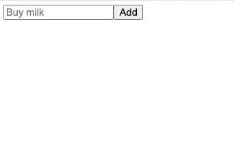
</body>A simple app that allows adding / completing tasks: View on CodePen ↗
Here is an example of using a custom element in a single .html file.
<!DOCTYPE html>
<html lang="en">
  <head>
    <title>WC Base Test</title>
    <script type="module">
      import { WebComponent } from "https://unpkg.com/web-component-base@latest/index.js";

      class HelloWorld extends WebComponent {
        static props = {
          myName: 'World'
        }
        get template() {
          return `<h1>Hello ${this.props.myName}!</h1>`;
        }
      }

      customElements.define("hello-world", HelloWorld);
    </script>
  </head>
  <body>
    <hello-world my-name="Ayo"></hello-world>
    <script>
        const helloWorld = document.querySelector('hello-world');
        setTimeout(() => {
            helloWorld.props.myName = 'Ayo zzzZzzz';
        }, 2500);
    </script>
  </body>
</html>Some feature-specific demos:
- Simple reactive property
- Counter & Toggle
- Using custom templating (lit-html)
- Using dynamic style objects
- Using the Shadow DOM
- Using tagged templates in your vanilla custom element
- Using attachEffect (experimental)
This mental model attempts to reduce the cognitive complexity of authoring components:
- The
templateis a read-only property (initialized with agetkeyword) that represents how the component view is rendered. - There is a
render()method that triggers a view render. - This
render()method is automatically called under the hood every time an attribute value changed. - You can optionally call this
render()method at any point to trigger a render if you need (eg, if you have private unobserved properties that need to manually trigger a render) - Overriding the
render()function for handling a customtemplateis also possible. Here's an example of usinglit-html: View on CodePen ↗
The props property of the WebComponent interface is provided for easy read/write access to a camelCase counterpart of any observed attribute.
class HelloWorld extends WebComponent {
  static props = {
    myProp: 'World'
  }
  get template() {
    return html`
        <h1>Hello ${this.props.myProp}</h1>
    `;
  }
}
Assigning a value to the props.camelCase counterpart of an observed attribute will trigger an "attribute change" hook.
For example, assigning a value like so:
this.props.myName = 'hello'
...is like calling the following:
this.setAttribute('my-name','hello');
Therefore, this will tell the browser that the UI needs a render if the attribute is one of the component's observed attributes we explicitly provided with static props;
Note
The props property of WebComponent works like HTMLElement.dataset, except dataset is only for attributes prefixed with data-. A camelCase counterpart using props will give read/write access to any attribute, with or without the data- prefix.
Another advantage over HTMLElement.dataset is that WebComponent.props can hold primitive types 'number', 'boolean', 'object' and 'string'.
The current alternatives are using what HTMLElement provides out-of-the-box, which are:
HTMLElement.datasetfor attributes prefixed withdata-*. Read more about this on MDN.- Methods for reading/writing attribute values:
setAttribute(...)andgetAttribute(...); note that managing the attribute names as strings can be difficult as the code grows.
Upcoming on v2.1.0: When using the built-in html function for tagged templates, a style object of type Partial<CSSStyleDeclaration> can be passed to any element's style attribute. This allows for calculated and conditional styles. Read more on style objects on MDN.
Try it now with this example on CodePen ↗
import { WebComponent } from "https://unpkg.com/web-component-base@latest/index.js";

class StyledElements extends WebComponent {
  static props = {
    emphasize: false,
    type: "warn",
  };

  #typeStyles = {
    warn: {
      backgroundColor: "yellow",
      border: "1px solid orange",
    },
    error: {
      backgroundColor: "orange",
      border: "1px solid red",
    },
  };

  get template() {
    return html`
      <div
        style=${{
          ...this.#typeStyles[this.props.type],
          padding: "1em",
        }}
      >
        <p style=${{ fontStyle: this.props.emphasize && "italic" }}>Wow!</p>
      </div>
    `;
  }
}

customElements.define("styled-elements", StyledElements);Add a static property shadowRootInit with object value of type ShadowRootInit (see options on MDN) to opt-in to using shadow dom for the whole component.
Try it now on CodePen ↗
Example:
  static shadowRootInit = {
    mode: "closed",
};You don't have to extend the whole base class just to use some features. All internals are exposed and usable separately so you can practically build the behavior on your own classes.
Here's an example of using the html tag template on a class that extends from vanilla HTMLElement... also View on CodePen ↗.
import {html} from 'https://unpkg.com/web-component-base/html'
import {createElement} from 'https://unpkg.com/web-component-base/utils'

class MyQuote extends HTMLElement {
  connectedCallback() {
    const el = createElement(html`
      <button onClick=${() => alert('hey')}>
        hey
      </button>`);
    this.appendChild(el)
  }
}

customElements.define('my-quote', MyQuote)Define behavior when certain events in the component's life cycle is triggered by providing hook methods
- Triggered when the component is connected to the DOM
- Best for setting up the component
import { WebComponent } from "https://unpkg.com/web-component-base@latest/index.js";

class ClickableText extends WebComponent {
  // gets called when the component is used in an HTML document
  onInit() {
    this.onclick = () => console.log(">>> click!");
  }

  get template() {
    return `<span style="cursor:pointer">Click me!</span>`;
  }
}- Triggered after the view is first initialized
class ClickableText extends WebComponent {
// gets called when the component's innerHTML is first filled
afterViewInit() {
const footer = this.querySelector('footer');
// do stuff to footer after view is initialized
}
get template() {
return `<footer>Awesome site © 2023</footer>`;
}
}- Triggered when the component is disconnected from the DOM
- best for undoing any setup done in
onInit()
import { WebComponent } from "https://unpkg.com/web-component-base@latest/index.js";

class ClickableText extends WebComponent {

  clickCallback() {
    console.log(">>> click!");
  }

  onInit() {
    this.onclick = this.clickCallback;
  }

  onDestroy() {
    console.log(">>> removing event listener");
    this.removeEventListener("click", this.clickCallback);
  }

  get template() {
    return `<span style="cursor:pointer">Click me!</span>`;
  }
}- Triggered when an attribute value changed
import { WebComponent } from "https://unpkg.com/web-component-base@latest/index.js";

class ClickableText extends WebComponent {
  // gets called when an attribute value changes
  onChanges(changes) {
      const {property, previousValue, currentValue} = changes;
      console.log('>>> ', {property, previousValue, currentValue})
  }

  get template() {
    return `<span style="cursor:pointer">Click me!</span>`;
  }
}All the functions and the base class in the library are minimalist by design and only contains what is needed for their purpose.
As of v2.0.0, the main export (with WebComponent + html + attachEffect) is 1.7 kB (min + gzip) according to bundlephobia.com, and the WebComponent base class is just 1.1 kB (min + brotli) according to size-limit.
There is an increase in size compared to that of before this release, primarily because of advanced features (e.g., effects, html tagged templates, and props blueprints) in building complex applications.