Note: Originally this was fork of this package.
A simple Angular 5 data table, with built-in solutions for features including:
- pagination
- sorting
- row selection (single/multi)
- expandable rows
- column resizing
- selecting visible columns
- accessibility
The component can be used not just with local data, but remote resources too, ie. when sorting and/or pagination are implemented server side.
The library is packaged with ng-packagr.
Furthermore the component is based on Bootstrap v4.0 (CSS-only) and Font-Awesome v4.7, hence be sure to include them into your project. Most likely you need to install them as dependencies...
npm install bootstrap@4.0.0 font-awesome@4.7.0... then you need to include the CSS bundles into .angular-cli.json file as show below.
{
  "apps": [
    {
      "root": "src",
      "styles": [
        "../node_modules/bootstrap/dist/css/bootstrap.min.css",
        "../node_modules/font-awesome/css/font-awesome.css",
        "styles.css"
      ]
    }
 ]
}npm install angular5-data-tableimport { BrowserModule } from '@angular/platform-browser';
import { NgModule } from '@angular/core';
import { DataTableModule } from 'angular5-data-table';
@NgModule({
imports: [
...
DataTableModule.forRoot()
...
],
bootstrap: [AppComponent]
})
export class AppModule { }<!-- my.component.template -->
<div>
...
<data-table id="my-table"
...
[title]="'Employees'"
[items]="items"
[itemCount]="itemCount"
...
>
<data-table-column
[property]="'name'"
[header]="'name'"
... >
</data-table-column>
<data-table-column
...
</data-table-column>
</data-table>
...
</div>title(string| default:'') table's name - it's highly recommend it's set for accessibility reasons as this will provide a better experience when interacting with the component, especially through a SR.showTitle(boolean| default:true): iffalse, the title is not shown into the component. Useful when want the header component visible (with its Reload and Coulumn Selector buttons), but not the title.items(JsonObject[]| default:[]) table data to show.itemCount(number| default:0) items's count.header(boolean| default:true) show/hide the table header sub-component - this holds the table name and two buttons (reload table and column selector).pagination(boolean| default: ) enable pagination. Iftrue, pagination controls are shown at the bottom of the table.indexColumn(boolean| default:true) whentruethe table shows a 0-indexed column.indexColumnHeader(string| default:'') text shown as column header for the index column.selectColumn(boolean| default:false) whentruethe table shows a checkbox column for selecting specific row.multiSelect(boolean| default:false) allows multi-row selection, showing a checkbox at select's column header.labels(DataTableTranslations| default:defaultTranslations) interface holding all needed labels. You can pass a subset of the labels. The missing labels will be defaulted.expandableRow(boolean| default:false) whentrueeach row will have a collapsible content.selectOnRowClick(boolean| default:false) whentrueeach row is selectable via a single-click.reload(function(): void| default:null) function that is invoked when the table needs to re-render its data. Note: most of the times this is the place where the developer connects to a server in order to pull down the item set.autoReload(boolean| default:false) whentrue, thereloadfunction gets invoked and init time (ngOnInit).rowColors(function(): 'color| default:null) custom function that must return a CSS color that will be applied to the entire row.rowTooltip(function| default:null) custom function to show a title tooltip when hovering the row.showReloading(boolean| default:true) whentruean overlay with a gear icon is shown on top of the table while it's reloading.noDataMessage(string| default:'') message displayed when no item are displayed. If it's empty nothing is shown.pageLimits(number[]| default:[10, 25, 50, 100, 250]) items per page selector options.primaryColumn(string| default: first data column) it identifies which columns has be marked as primary. This is an important aspect from an accessibility and SR perspective. If not given, the first column will be the primary column.page(number| default:0) page to load, valid only if pagination is enabled.limit(number| default:10) number of items per page, valid only pagination is enabled. Iflimitvalue is not a valid (not contained intopageLimitsarray) it will be defaulted topageLimits's first value.sortBy(string| default:'') column table is sorted by.sortAsc(boolean| default:true) valid only ifsortByis not defaulted. Defines the sorting order. Iftruesort is ascending, descending otherwise.
property(string| default: no default) item'sJSONObjectkey used to retrieve the row cell content.header(string| default: no default) column header text.sortable(boolean| default:false) marks the columns as sortable.resizable(boolean| default:false) marks the columns as resizable.visible(boolean| default:true) marks the columns visible.width(number | string| default:'') defines the column width. It can be a string like2remor a number. If it's a number, it will be considered as pixels.
data-column's content and header are not restricted to be text only - they can hold complex content too. In order to do that developers can use two references: #dataTableHeader and #dataTableCell.
</data-table>
...
<data-table-column
header="Actions">
<ng-template #dataTableHeader let-item="item">
<i>Actions</i>
</ng-template>
<ng-template #dataTableCell let-item="item">
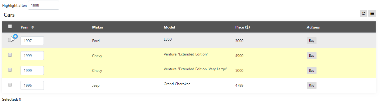
<button (click)="carClicked(item)" class="btn btn-sm btn-default">Buy</button>
</ng-template>
</data-table-column>
...
</data-table>As it can be seen from the above snippet, the dataTableHeader and dataTableCell are targeting two <ng-template>s nodes which will be used respectively as column header and cell content. In both cases item refers to the whole row item, so developers can use whatever they may need.
Clone this repository, run npm install and ng serve, then navigate to http:localhost:4200 where you can access to the demo application sporting a few demos with code viewer and docs.
##Examples


MIT License