Choose from 10k+ icons to use. iOSVectorIcons is inspired by react-native-vector-icons. You can search for icons by using demo app or this link.
pod 'iOSVectorIcons', '~> 1.0.0'github "https://github.com/dinhquan/iOSVectorIcons" ~> 1.0.0
dependencies: [
    .package(url: "https://github.com/dinhquan/iOSVectorIcons", .upToNextMajor(from: "1.0.0"))
]iOSVectorIcons provides Icon view for creating a simple icon.
Icon(.ionicons(.home))

// Customize size & color
Icon(.materialIcons(.message), size: 24, color: .blue)
Generally, we create an Icon with IconFont and size/color (optional). IconFont is defined as enum so it's strong typed, you are guaranteed with no typo in your code.
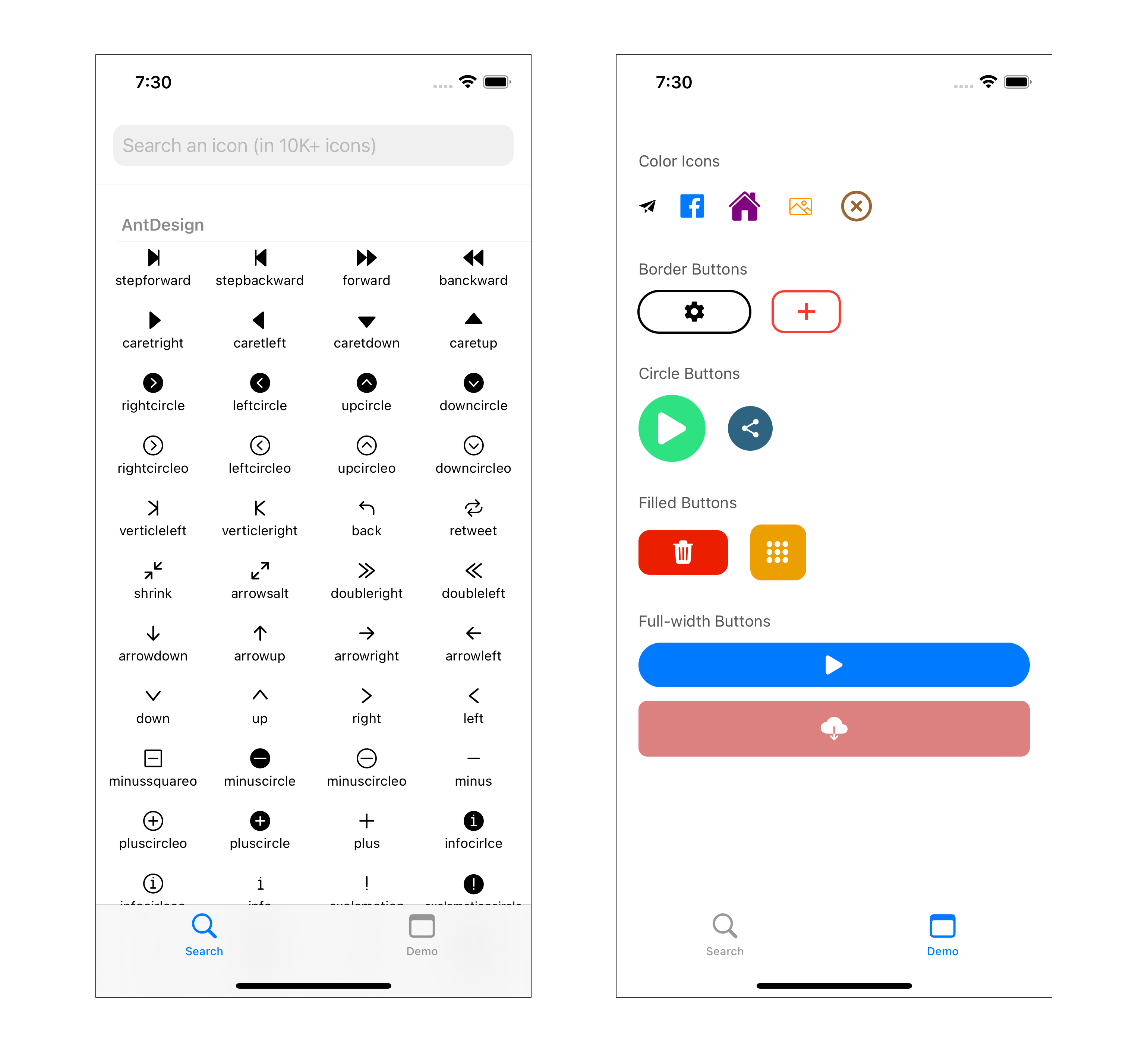
Create a button with IconButton
IconButton(.entypo(.share), size: 20, color: .black) {
    /// Handle click action here
}
Customize style to create border, circle or filled button by style modifier. Examples:
// Border button
IconButton(.octicons(.plus), size: 20, color: .red)
    .style(horizontalPadding: 20, cornerRadius: 10, borderWidth: 2, borderColor: .red)

// Circle button (corner radius = width / 2)
IconButton(.antDesign(.play), size: 40, color: .white)
    .style(width: 60, height: 60, backgroundColor: .blue, cornerRadius: 30)

// Filled button
IconButton(.fontAwesome(.trash), size: 24, color: .white)
    .style(width: 80, height: 40, backgroundColor: .red, cornerRadius: 10)

// Full-width button
IconButton(.ionicons(.download), size: 24, color: .white)
    .style(width: .infinity, height: 50, backgroundColor: .blue, cornerRadius: 8)
With style modifier, you can customize the following properties:
func style(
    width: CGFloat? = nil,
    height: CGFloat? = nil,
    horizontalPadding: CGFloat? = nil,
    verticalPadding: CGFloat? = nil,
    backgroundColor: Color = .clear,
    highlightedColor: Color? = nil,
    cornerRadius: CGFloat = 0,
    borderWidth: CGFloat = 0,
    borderColor: Color = .black
) -> some View
If width/height are not set, the button size will be based on horizontalPadding/verticalPadding. You can set width to .infinity to make the button width fill its parent.
Use setIcon method to set icon for UILabel or UIButton
// UILabel
yourLabel.setIcon(.ionicons(.download))

// UIButton, make sure button style is Default (in Storyboard/Xib)
yourButton.setIcon(.entypo(.erase), size: 30, color: .red, for: .normal)Contributions for bug fixing or improvements are welcomed. Feel free to submit a pull request. If you have any questions, feature suggestions or bug reports, please send me an email to dinhquan191@gmail.com.