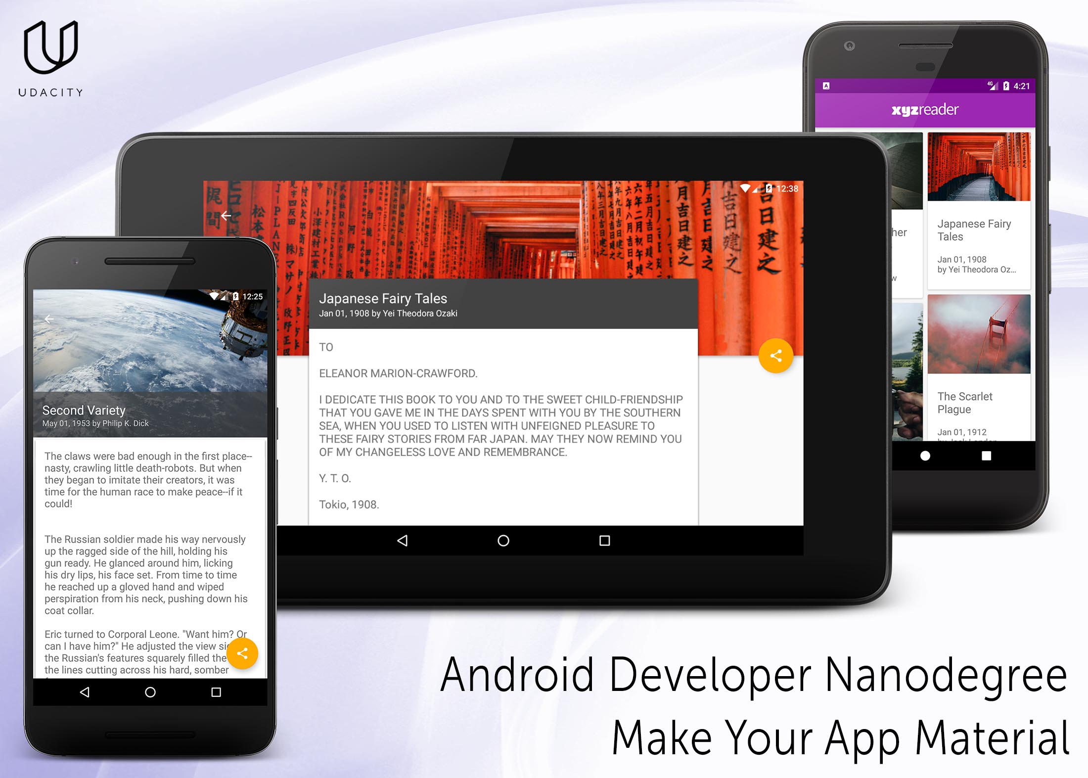
XYZ Reader created as a part of Udacity Android Developer Nanodegree Program.
- RxJava, RxAndroid, RxJavaInterop, RxRelay
- Dagger 2
- Retrofit 2 with RxJava adapter and Moshi converter
- OkHttp
- Retrolambda
- ButterKnife
- Moshi
- AutoValue with Moshi extension
- SqlBrite
- Glide
- Stetho
- Timber
In this project, you will redesign an app to follow the Material Design guidelines and translate a set of static design mocks to a living and breathing app.
You will improve an app for this project:
XYZ Reader: A mock RSS feed reader featuring banner photos and headlines. The app is currently functional, and work in most cases for most users.
Your job will be to take the user feedback in the UI Review node, and implement changes that will improve the UI and make it conform to Material Design.
This project gives you an opportunity to improve an app’s design, a vital skill for building apps users will love. It also replicates a common developer task of updating and changing an app's design as new standards are released.
Through this project, you will:
- Understand the fundamentals of Android design.
- Apply Material Design guidelines to an mobile application.
- Separate an interface into surfaces.
- Effectively use transitions and motion.
Lyla says:
- *“This app is starting to shape up but it feels a bit off in quite a few places. I can't put finger on it but it feels odd.”
Jay says:
- *“Is the text supposed to be so wonky and unreadable? It is not accessible to those of us without perfect vision."
Kagure says:
- *“The color scheme is really sad and I shouldn't feel sad.”
- App uses the Design Support library and its provided widget types (FloatingActionButton, AppBarLayout, SnackBar, etc).
- App uses CoordinatorLayout for the main Activity.
- App theme extends from AppCompat.
- App uses an AppBar and associated Toolbars.
- App provides a Floating Action Button for the most common action(s).
- App properly specifies elevations for app bars, FABs, and other elements specified in the Material Design specification.
- App has a consistent color theme defined in styles.xml. Color theme does not impact usability of the app.
- App provides sufficient space between text and surrounding elements.
- App uses images that are high quality, specific, and full bleed.
- App uses fonts that are either the Android defaults, are complementary, and aren't otherwise distracting.
- App conforms to common standards found in the Android Nanodegree General Project Guidelines .