There are so many elected offices and so many different kinds of districts with so many different shapes that the sheer volume of information involved in voting can be a turn-off. Multi-layered interactive maps of the districts and candidates (and sometimes polling places) for a given election are one way to smooth part of that steep learning curve. To that end, I've cooked up election maps like that for several elections.
- Where and How to Register to Vote in NC
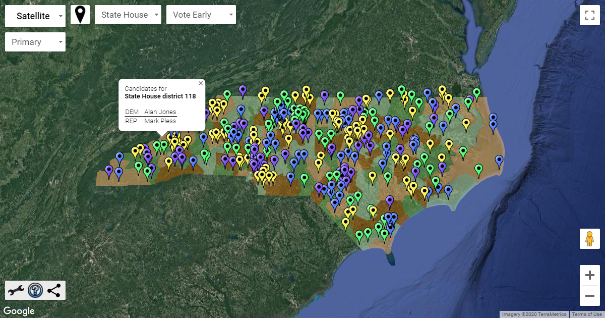
- NC state house and senate districts before/after Common Cause v. Lewis
- LA general/runoff November 16
- MS state legislature, DAs, Gov., other statewide, commissioners, Nov 5 2019
- MA municipals Nov 5 2019
- NJ state legislature, Nov 5 2019
- VA state legislature + county-level offices, Nov 5 2019
- NC municipal elections November 5th, 2019
- VA state legislature and local primaries June 11th 2019
- NJ state legislature primaries, June 4th 2019
- MS precincts with polling place names and addresses (Nov 27, 2018)
- NC statewide midterm map (Nov 6, 2018)
The colors mean nothing, generally. Fainter or grayer versions of the usual colors are generally used to suggest unimportance, as they're used to color districts that have no offices up for election in the election that the map in question describes.
The four different shades of green and orange only serve to visually differentiate neighboring shapes. The colors were initially chosen in 2018 from a palette of colors in the now-defunct Google Fusion Tables. Each of these four has a different overall brightness level which should keep neighboring districts visually different even for users with color vision deficiency.