Home
The Flexbox layout model aims to offer more efficient ways to lay out flex items in a flex container even if flex item's size are unknown. Thus it offers more efficient ways to achieve responsive UI than with existing layouts.
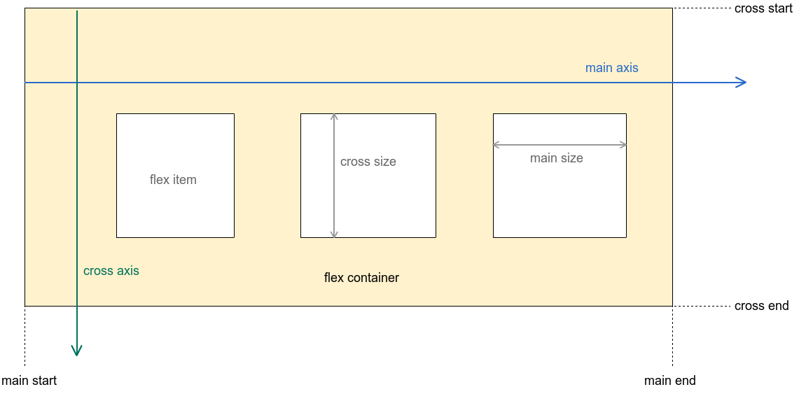
The image above illustrates the visual explanation of the Flexbox layout model.
- flex container
- A square that contains flex items as its children (In this library's case, it's the
FlexboxLayoutclass).
- A square that contains flex items as its children (In this library's case, it's the
- flex item
- flex container's immediate children.
- main axis
- The primary axis along which flex items are placed. In the example above, the direction of the main axis is from left to right (flex items are placed from left to right).
- cross axis
- The secondary axis which is perpendicular to the main axis.
- main start, main end
- The first flex item is placed starting on the
main startedge of the flex container and the remaining flex items are placed going toward themain end
- The first flex item is placed starting on the
- cross start, cross end
- The flex line is placed starting on the
cross startedge of the flex container and the remaining flex lines (multi-line flex container is only valid ifflexWrapattribute is eitherwraporwrap_reverse) are placed going toward thecross end
- The flex line is placed starting on the