This is the first of four courses where Platzi will guide you step-by-step to build a web application or virtual store.
- Layout Design → you are here
- React
- REST API with Express.js
- Database with PostgreSQL
- HTML layout
- CSS layout
- Responsive Design
Click this link to check the finished interfaces
Good practices are a set of customs, actions, decisions, and/or tools that streamline, improve performance, readability, maintenance, and/or scalability of our projects in a very specific CONTEXT.
The keyword is context. Good practices are NOT absolute. Just as they work in certain situations, they may not make sense in other circumstances.
It is a common mistake to talk about good or bad practices without understanding their context correctly.
The Practical Frontend Developer Course belongs to two schools in Platzi:
-
The JavaScript professional route: it is the shortest route to learn web development from scratch to a very advanced level with the PERNN Stack (PostgreSQL, Express.js, React.js, Next.js, and Node.js).
-
Web Development School: the longest and most complete learning path to master and delve into all the most important programming tools or stacks of web development. 💡 JavaScript School vs. Web Development School: Which one to choose? Which one is better?
Along with the Frontend Developer Course, this course is the introduction to the great world of HTML and CSS layout that we will study in the JavaScript School. After this course, we will continue with the basics of JavaScript, frontend with React.js, and backend with Node.js.
In contrast, in the Web Development School, we have many more courses to practice HTML and CSS, create even more projects for your professional portfolio, and delve into complex tools such as responsive design, CSS Grid, flexbox, and CSS animations.
In the next classes, you may wonder why we decided not to separate the styles into their own .css files if it is supposedly a "bad practice." But remember that good or bad practices are NOT absolute, they always depend on a context.
Later on your learning path, you will take the Practical React.js Course. One of its objectives is to teach you how to convert pages in HTML and CSS to components in React. You will realize that there we download the project from this Frontend Developer Practical Course to separate it into views, components, and containers.
The reason for keeping the HTML and CSS of each section of our store in a single .html file is to facilitate our work of separating and joining all that code when we take the React course.
If your project with HTML and CSS is the final version of the application that you will deploy to production (the one you will publish on the internet and will be used by real users), then it is definitely a very good practice to separate your styles into .css files.
On the other hand, if your layout with HTML and CSS is just the beginning of your frontend development and later you will convert these elements into components with a tool like Web Components, React.js, Angular, Svelte, or Vue.js, then it is NOT a bad practice to separate each element into its respective file or keep its HTML and CSS in the same place.
I hope this explanation has helped you understand a little about the development flow and decisions we made in this course. Always remember to have a very clear understanding of the context of each situation before determining if it is a good or bad practice.
Web layout or web design consists of transforming a graphic design —a sketch— (made by UX/UI in Figma or Sketch) into a functional interface in terms of programming that a specific browser or device understands.

The design area provided us with the project sketch in Figma. We can identify the views of:
- Home
- Account creation
- Access
- Shopping cart
- Purchase order
- Product detail
- Menu

From here, you can see how the interaction between the different screens works.
//platzi.com/categorias/diseno/)
We're starting to work! We'll follow a design system that will allow us to achieve a uniform project. For this, we'll declare variables in CSS with the colors we'll use and organize icons and logos into folders.
The main advantage of implementing a design system is that it simplifies the tasks of designers and developers in the creation process. It also speeds up decision-making among teams.
In CSS, we call variables to custom properties. They contain specific values that can be reused many times in a document.
They're established using double dashes notation
--variable-name: value;
They're accessed using the var() function
property: var(--variable-name);
Normally, we declare them inside the :root selector so their scope is global.
Our project would look like this:
:root {
    --black:#000000;
    --white: #FFFFFF;
    --very-light-pink: #C7C7C7;
    --text-input-field: #F7F7F7;
    --dark: #232830;
    --hospital-green: #ACD9B2;
}
The scope of CSS variables declared using another pseudo-class will be limited to the selector within which they are declared. Unlike variables declared within the :root pseudo-class, which have global scope and can be accessed anywhere in the document, variables declared within other selectors have a more limited scope.
For example, if you declare variables within a specific selector like .container, those variables will only be accessible within elements that are descendants of the .container class. They won't be available globally throughout the document.
Here's an example:
.container {
    --primary-color: blue;
}

.element {
    color: var(--primary-color); /* This will work */
}

.another-element {
    color: var(--primary-color); /* This won't work */
}
In this example, the --primary-color variable is declared within the .container selector. Therefore, it can be used within any element that is a descendant of .container, such as .element. However, it cannot be used outside of that scope, as demonstrated by .another-element.
You can also name your variables according to their function.
Examples: --background-color, --primary-color, etc.
We'll look for the fonts proposed by the design in Google Fonts We place the links inside the HTML head tag
<head>
    <link rel="preconnect" href="https://fonts.gstatic.com" crossorigin>
    <link href="https://fonts.googleapis.com/css2?family=Quicksand:wght@300;500;700&display=swap" rel="stylesheet">
</head>
Inside the style tag, we tell CSS to implement it
body {
    font-family: 'Quicksand', sans-serif;
}
<!DOCTYPE html>
<html lang="en">
<head>
  <meta charset="UTF-8">
  <meta name="viewport" content="width=device-width, initial-scale=1.0">

  <link rel="preconnect" href="https://fonts.googleapis.com">
  <link rel="preconnect" href="https://fonts.gstatic.com" crossorigin>
  <link href="https://fonts.googleapis.com/css2?family=Quicksand:wght@300;500;700&display=swap" rel="stylesheet">

  <title>Yard Sale</title>

</head>
<body>
  <div class="login">
    <div class="form-container">
      <img src="../resources/logos/logo_yard_sale.svg" alt="logo" class="logo">

      <h1 class="title">Create a new password</h1>
      <p class="subtitle">Enter a new password for your account</p>

      <form action="/" class="form">

        <label for="password" class="label">Password</label>
        <input type="password" class="input input-password" id='password' placeholder='*********'>

        <label for="password" class="label">Password</label>
        <input type="password" class="input input-password" id='new-password' placeholder='*********'>

        <input type="submit" value="Confirm" class='primary-button login-button'>
      </form>
    </div>
  </div>
</body>
</html>
Now we'll style the HTML for the "new password" screen. Design has suggested the following visual for both mobile and desktop. The only exception is that the logo should not be displayed in this latest version.

Which styles will we implement?
.login {
  width: 100%;
  height: 100vh;
  display: grid;
  place-items: center;
}
.form-container {
  display: grid;
  grid-template-rows: auto 1fr auto;
  width: 300px;
}
.logo {
  width: 150px;
  margin-bottom: 48px;
  justify-self: center;
  display: none;
}
.title {
  font-size: var(--lg);
  margin-bottom: 12px;
  text-align: center;
}
.subtitle {
  color: var(--very-light-pink);
  font-size: var(--md);
  font-weight: 300;
  margin-top: 0;
  margin-bottom: 32px;
  text-align: center;
}
.form {
  display: flex;
  flex-direction: column;
}
.label {
  font-size: var(--sm);
  font-weight: bold;
  margin-bottom: 4px;
}
.input {
  background-color: var(--text-input-field);
  border: none;
  border-radius: 8px;
  height: 30px;
  font-size: var(--md);
  padding: 6px;
  margin-bottom: 12px;
}
.primary-button {
  background-color: var(--hospital-green);
  border-radius: 8px;
  border: none;
  color: var(--white);
  width: 100%;
  cursor: pointer;
  font-size: var(--md);
  font-weight: bold;
  height: 50px;
}
.login-button {
  margin-top: 14px;
  margin-bottom: 30px;
}
@media (max-width: 640px) {
  .logo {
    display: block;
  }
}
As you can see in our .login class, with just two lines of code, we can center our content:
display: grid;
place-items: center;
The place-items shorthand property allows you to align elements, both horizontally and vertically, in a container with Grid or Flexbox. That is, it is an abbreviation of the align-items and justify-items properties. If you don't specify the second value, it will use the first for both alignments.
Try different combinations and see what happens:
- place-items: center stretch;
- place-items: center start;
- place-items: start end;
- place-items: end center;
One way to do it is according to its purpose. Following the following order:
- Positioning
- Box model
- Typography
- Visuals
- Others
See the detailed explanation here.
Now we will build the screen where the email has been sent by reusing the code. As a recommendation, start by creating the responsive version of the project.

<div class="login">
  <div class="form-container">
    <img src="./logos/logo_yard_sale.svg" alt="logo" class="logo">

    <h1 class="title">Email has been sent!</h1>
    <p class="subtitle">Please check your inbox for instructions on how to reset the password</p>

    <div class="email-image">
      <img src="./icons/email.svg" alt="email">
    </div>

    <button class="primary-button login-button">Login</button>

    <p class="resend">
      <span>Didn't receive the email?</span>
      <a href="/">Resend</a>
    </p>
  </div>
</div>
.login {
      width: 100%;
      height: 100vh;
      display: grid;
      place-items: center;
    }
    .form-container {
      display: grid;
      grid-template-rows: auto 1fr auto;
      width: 300px;
      justify-items: center;
    }
    .logo {
      width: 150px;
      margin-bottom: 48px;
      justify-self: center;
      display: none;
    }
    .title {
      font-size: var(--lg);
      margin-bottom: 12px;
      text-align: center;
    }
    .subtitle {
      color: var(--very-light-pink);
      font-size: var(--md);
      font-weight: 300;
      margin-top: 0;
      margin-bottom: 32px;
      text-align: center;
    }
    .email-image {
      width: 132px;
      height: 132px;
      border-radius: 50%;
      background-color: var(--text-input-field);
      display: flex;
      justify-content: center;
      align-items: center;
      margin-bottom: 24px;
    }
    .email-image img {
      width: 80px;
    }
    .resend {
      font-size: var(--sm);
    }
    .resend span {
      color: var(--very-light-pink);
    }
    .resend a {
      color: var(--hospital-green);
      text-decoration: none;
    }
    .primary-button {
      background-color: var(--hospital-green);
      border-radius: 8px;
      border: none;
      color: var(--white);
      width: 100%;
      cursor: pointer;
      font-size: var(--md);
      font-weight: bold;
      height: 50px;
    }
    .login-button {
      margin-top: 14px;
      margin-bottom: 30px;
    }
    @media (max-width: 640px) {
      .logo {
        display: block;
      }
    }
Our project is responsive, meaning it adapts to different screen sizes. To achieve this, we implemented media queries.
@media (max-width: 640px)
The styles outside apply to desktops, while those inside will apply when the viewport is smaller than 640 pixels.
There's another approach to responsive design, known as Mobile First. In this approach, you first think about styles for mobile devices and then gradually scale up to larger screens.
## Login
Now we will work on styling the login screen. This is where users will be able to access the application you are creating. You will also encounter a layout challenge that you can solve in the comments.

As we can see in the image, we have a logo, two inputs, a button with text below it, and another button that in its mobile version moves to the bottom of the screen.
<div class="login">
  <div class="form-container">
    <img src="./logos/logo_yard_sale.svg" alt="logo" class="logo">

    <form action="/" class="form">
      <label for="email" class="label">Email address</label>
      <input type="text" id="email" placeholder="platzi@example.cm" class="input input-email">

      <label for="password" class="label">Password</label>
      <input type="password" id="password" placeholder="*********" class="input input-password">

      <input type="submit" value="Log in" class="primary-button login-button">
      <a href="/">Forgot my password</a>
    </form>

    <button class="secondary-button signup-button">Sign up</button>
  </div>
</div>
.login {
  width: 100%;
  height: 100vh;
  display: grid;
  place-items: center;
}
.form-container {
  display: grid;
  grid-template-rows: auto 1fr auto;
  width: 300px;
}
.logo {
  width: 150px;
  margin-bottom: 48px;
  justify-self: center;
  display: none;
}
.form {
  display: flex;
  flex-direction: column;
}
.form a {
  color: var(--hospital-green);
  font-size: var(--sm);
  text-align: center;
  text-decoration: none;
  margin-bottom: 52px;
}
.label {
  font-size: var(--sm);
  font-weight: bold;
  margin-bottom: 4px;
}
.input {
  background-color: var(--text-input-field);
  border: none;
  border-radius: 8px;
  height: 30px;
  font-size: var(--md);
  padding: 6px;
  margin-bottom: 12px;
}
.input-email {
  margin-bottom: 22px;
}
.primary-button {
  background-color: var(--hospital-green);
  border-radius: 8px;
  border: none;
  color: var(--white);
  width: 100%;
  cursor: pointer;
  font-size: var(--md);
  font-weight: bold;
  height: 50px;
}
.secondary-button {
  background-color: var(--white);
  border-radius: 8px;
  border: 1px solid var(--hospital-green);
  color: var(--hospital-green);
  width: 100%;
  cursor: pointer;
  font-size: var(--md);
  font-weight: bold;
  height: 50px;
}
.login-button {
  margin-top: 14px;
  margin-bottom: 30px;
}
@media (max-width: 640px) {
  .logo {
    display: block;
  }
}
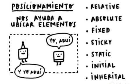
Position can have any of these values:
-
Static: Default position of elements. It's the only case where top, right, bottom, and left cannot be used.
-
Absolute: Elements remain in the position where they were placed but lose their physical space, meaning they overlap other elements. Note: to apply this value, the parent container must have position relative.
-
Relative: Elements retain their original position and physical space, but we can move them with the top, right, bottom, and left properties.
-
Fixed: Elements lose their physical space and remain fixed in place.
-
Sticky: Elements retain their physical space, but when scrolled, they follow without losing that space. It's commonly used for navigation bars.
-
Initial: Returns the position of an element to its original state.
-
Inherit: Inherits the position from its parent.
We will layout the view that will allow the user to create or edit their account. This includes a title, three input fields for entering data, and a button.

To layout this form, you can refer to the code generated for the login view. Remove the logo and subtitle from this structure, and it should look like this:
<div class="login">
    <div class="form-container">
        <h1 class="title">My account</h1>
        <form action="/" class="form">
            <div>
                <label for="name" class="label">Name</label>
                <input type="text" id="name" placeholder="Teff" class="input input-name">

                <label for="email" class="label">Email</label>
                <input type="text" id="email" placeholder="platzi@example.com" class="input input-email">

                <label for="password" class="label">Password</label>
                <input type="password" id="password" placeholder="*********" class="input input-password">
            </div>
            <input type="submit" value="Create" class="primary-button login-button">
        </form>
    </div>
</div>
Finally, before the closing form tag, add the button so the user can submit the information.
We'll add some more styles to the ones we used previously in the "new password" section to format this section.
Adjustments include:
- Increasing the spacing between the form inputs:
  .input-name,
  .input-email,
  .input-password {
      margin-bottom: 22px;
  }
- Modify the CSS of the "title" class to align the title to the left and distance it from the inputs:
  .title {
      margin-bottom: 36px;
      text-align: start;
  }
Similar to the previous challenge, in its mobile version, this screen moves the button away from the form by placing it at the bottom. One of the simplest and most effective ways to do this is by using Flexbox.
We start by giving our container and form a height of 100%. Since the form is already flexible and has a column direction, we just need to add in the media query: justify-content: space-between.
This property positions the content horizontally when the value of flex-direction is row. In our case, the value is columns, so justify-content will apply vertically.
Space-between distributes the items evenly, leaving the first item at the beginning and the last one at the end.
This time I'll teach you how to layout the screen that allows the user to edit their account. As you can see, this view contains other relevant data such as the email, password, and the person's name.

To show the user the data they entered during registration, we'll use the code from the "create account" section. Keeping in mind that the purpose of this view is to display information, not obtain it, we need to modify the form as follows:
- We'll change the inputs to paragraphs:
<div>
    <label for="name" class="label">Name</label>
    <p class="value">Camila Yokoo</p>

    <label for="email" class="label">Email</label>
    <p class="value">camilayokoo@gmail.com</p>

    <label for="password" class="label">Password</label>
    <p class="value">*********</p>
</div>
- Styling the text:
.value {
    color: var(--very-light-pink);
    font-size: var(--md);
    margin: 8px 0 32px 0;
}
- Apply the secondary-button class to the button:
.secondary-button {
    background-color: var(--white);
    border-radius: 8px;
    border: 1px solid var(--hospital-green);
    color: var(--hospital-green);
    width: 100%;
    cursor: pointer;
    font-size: var(--md);
    font-weight: bold;
    height: 50px;
}
We have completed the module for creating authentication screens. Now, all that's left is to build the main views. Remember that in the Practical React.js Course, we will combine all the screens to finish our frontend.
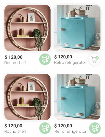
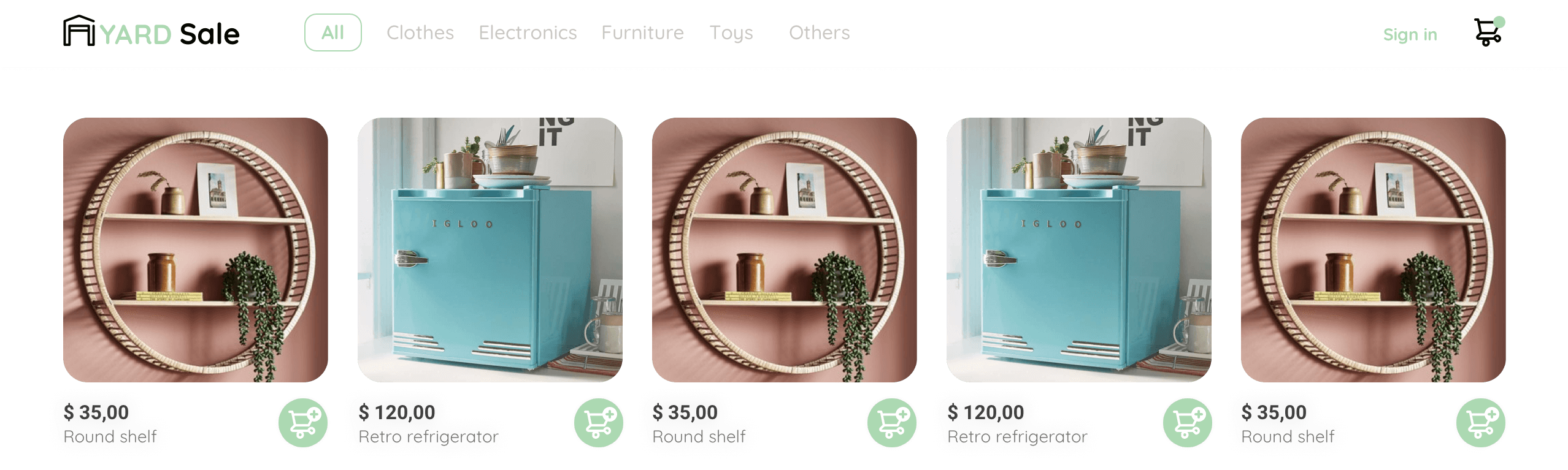
## Home Page: HTML The homepage is the main web page of a website and the first thing people will see when they encounter your brand. In this case, it contains an image for each product, with its price and name, as well as an icon that allows users to add the item to the shopping cart.
In this new module, we will work on the main views. We start with the HTML for the homepage, i.e., the cards that help the user review the available products in an e-commerce.

These are the steps to follow to layout the sections of an e-commerce. Let's get started!
-
Create a main section:
<section class="main-container"></section>
-
Inside, place a div that will serve as a container for the cards, allowing us to center them:
<div class="cards-container"></div>
-
Finally, structure a card and repeat it several times:
-
<div class="product-card">
    <img src="https://images.pexels.com/photos/276517/pexels-photo-276517.jpeg?auto=compress&cs=tinysrgb&dpr=2&h=650&w=940" alt="">
    <div class="product-info">
        <div>
            <p>$120,00</p>
            <p>Bike</p>
        </div>
        <figure>
            <img src="./icons/bt_add_to_cart.svg" alt="">
        </figure>
    </div>
</div>
The HTML img element embeds an image into a document. Its "src" attribute is used to specify where the image is located, whether in a folder or a URL.
Meanwhile, "alt" is used to add a description to our image. This is useful for SEO (search engine optimization) purposes and also improves site accessibility.
Review this information here 👈
There are two tags that allow us to organize images in a semantic way.
Now we'll style the cards that make up the homepage using CSS Grid. Users will see different styles depending on the device they connect from, and here you can identify their differences.
Here's the visualization from a computer:
And this is the design for mobile devices:
We'll work on the main container, whose class is "cards-container". Using "display: grid", we create the grids and then define the columns with "grid-template-columns", using the "repeat" function to repeat our code fragment.
Using "auto-fill", we ensure that the grid occupies 100% of the available space. Then, we generate space between the items with "gap". Finally, we align them horizontally and vertically using "place-content".
The CSS would look like this:
.cards-container {
  display: grid;
  grid-template-columns: repeat(auto-fill, 240px);
  gap: 26px;
  place-content: center;
}
Now we need to adjust the size of the images.
.product-card {
  width: 240px;
}
.product-card img {
  width: 240px;
  height: 240px;
  border-radius: 20px;
  object-fit: cover;
}
We want the cards on the homepage to display the item's price and below it, the name of the item with a different font size and color.
Next to both should be the shopping cart icon.
To achieve this result, we must:
- Apply Flexbox to the container:
.product-info {
  display: flex;
  justify-content: space-between;
  align-items: center;
  margin-top: 12px;
}
- Adjust the size of the icon:
.product-info figure {
  margin: 0;
}
.product-info figure img {
  width: 35px;
  height: 35px;
}
- Use nth-child on the p tags:
.product-info div p:nth-child(1) {
  font-weight: bold;
  font-size: var(--md);
  margin-top: 0;
  margin-bottom: 4px;
}
.product-info div p:nth-child(2) {
  font-size: var(--sm);
  margin-top: 0;
  margin-bottom: 0;
  color: var(--very-light-pink);
}
The nth-child pseudo-class allows us to apply different styles to the paragraphs without needing to assign a class to each one.
By assigning media queries, we ensure that the cards look good on different screens, i.e., we develop a responsive homepage.
Since we implemented CSS Grid, all we need to do is reduce the size of the images, like this:
@media (max-width: 640px) {
  .cards-container {
    grid-template-columns: repeat(auto-fill, 140px);
  }
  .product-card {
    width: 140px;
  }
  .product-card img {
    width: 140px;
    height: 140px;
  }
}
A dropdown menu, or dropdown list, is a graphical control element that presents the user with a variety of options from a category that they can choose to perform an action, such as making a purchase. It has two states: active or inactive. When it is inactive, it displays only one value.
Next, we will carry out the structure of the options list that will be displayed from the navigation menu on the web version of our site.

This section of the desktop menu has three items, which will allow the user to choose between: accessing their account, viewing their orders, or logging out of the page. In other words, they form a list of options.
Remember that HTML5 semantics require that list elements (li) be inside a special container tag (ul / ol).
Therefore, the structure is as follows:
<div class="desktop-menu">
  <ul>
    <li>
      <a href="/" class="title">My orders</a>
    </li>

    <li>
      <a href="/">My account</a>
    </li>

    <li>
      <a href="/">Sign out</a>
    </li>
  </ul>
</div>
You can use this shortcut: ul>li*3>a.title
This view of the menu is like a box that will appear when the user clicks on their email. For now, we'll just structure it, as we'll add functionality in the React.js course.
Therefore, we need to give dimensions and spacing to the container.
.desktop-menu {
  width: 100px;
  height: auto;
  border: 1px solid var(--very-light-pink);
  border-radius: 6px;
  padding: 20px 20px 0 20px;
}
Now, we remove the default styles from the list.
.desktop-menu ul {
  list-style: none;
  padding: 0;
  margin: 0;
}
Finally, we can define the visual as specified in the design.
.desktop-menu ul li {
  text-align: end;
}
.desktop-menu ul li:nth-child(1),
.desktop-menu ul li:nth-child(2) {
  font-weight: bold;
}
.desktop-menu ul li:last-child {
  padding-top: 20px;
  border-top: 1px solid var(--very-light-pink);
}
.desktop-menu ul li:last-child a {
  color: var(--hospital-green);
  font-size: var(--sm);
}
.desktop-menu ul li a {
  color: var(--back);
  text-decoration: none;
  margin-bottom: 20px;
  display: inline-block;
}
We use display: inline-block to define a margin-bottom, since it's not possible to apply the margin property to inline elements.
It's time to create the navigation menu for the mobile or responsive version of our virtual store, and this structure presents three lists with different options. Remember that configuring this version of the site helps it flow better on all screen sizes and saves time because you don't need to have two versions of a website.

The menu for the mobile version of our store contains three sections, and since they are lists, we can contain them in ul tags. First, we need to generate the main container that will allow for subsequent styling.
<div class="mobile-menu">
Secondly, we define the sections. The first section corresponds to the categories.
<ul>
  <li>
    <a href="/">CATEGORIES</a>
  </li>
  <li>
    <a href="/">All</a>
  </li>
  <!-- Other list items -->
</ul>
Then, we have the user's orders and account.
<ul>
  <li>
    <a href="/">My orders</a>
  </li>
  <li>
    <a href="/">My account</a>
  </li>
</ul>
Finally, we display their email and the option to log out.
<ul>
  <li>
    <a href="/" class="email">platzi@example.com</a>
  </li>
  <li>
    <a href="/" class="sign-out">Sign out</a>
  </li>
</ul>
Just like we did with the desktop menu, to style this view, we need to remove the default decoration from the lists and anchor tags, separate the containers by defining margin and padding, and add colors and font styles.
Here's how our CSS would look:
.mobile-menu {
  padding: 24px;
}

.mobile-menu a {
  text-decoration: none;
  color: var(--black);
  font-weight: bold;
}

.mobile-menu ul {
  padding: 0;
  margin: 24px 0 0;
  list-style: none;
}

.mobile-menu ul:nth-child(1) {
  border-bottom: 1px solid var(--very-light-pink);
}

.mobile-menu ul li {
  margin-bottom: 24px;
}

.email {
  font-size: var(--sm);
  font-weight: 300;
}

.sign-out {
  font-size: var(--sm);
  color: var(--hospital-green);
}
In the last section, we have a specificity problem. The font-weight of the email class and the color of the sign-out class are not being applied.
Specificity involves giving a CSS rule a value on how specific the style is, so that browsers can know which styles to apply over others, regardless of where they are in the code. The style will be applied where the specificity is higher.

By understanding the types of specificity, we realize that we need to increase the value or weight of the email and sign-out classes.
There are several ways to achieve this. One is to use !important.
.email {
  font-weight: 300 !important;
}

.sign-out {
  color: var(--hospital-green) !important;
}
Another way is to call both classes.
.mobile-menu .menu-email {
  font-size: var(--sm);
  font-weight: 300;
}

.mobile-menu .menu-signout {
  font-size: var(--sm);
  color: var(--hospital-green);
}
Now we will layout the screen called "my order," which is designed to display the items selected by the user within a virtual store or marketplace. This is the structure expected for you to create according to the view of each device.
- Desktop:

- Mobile:

The order page will show the user the products they selected, the total amount of money, the date, and the total quantity of items.
Therefore, our layout contains:
-
Div "my order" → main container
-
Div "my order container" → allows us to align the content more easily
-
Title → in the mobile version, it goes up to the menu
-
Div "my order content" → a bar-like container of text with the date, number of items, and total money
-
Div "shopping cart" → with the image of the item and text specifying its name and price.
The resulting HTML code is as follows:
<div class="my-order">
  <div class="my-order-container">
    <h1 class="title">My order</h1>

    <div class="my-order-content">
      <div class="order">
        <p>
          <span>03.25.21</span>
          <span>6 articles</span>
        </p>
        <p>$560.00</p>
      </div>

      <div class="shopping-cart">
        <figure>
          <img src="https://images.pexels.com/photos/276517/pexels-photo-276517.jpeg?auto=compress&cs=tinysrgb&dpr=2&h=650&w=940" alt="bike">
        </figure>
        <p>Bike</p>
        <p>$30,00</p>
      </div>

    </div>
  </div>
</div>
Shortcuts: .my-order>(.my-order-container>.my-order-content>(p>span*2)+p{560.00})+.shopping-cart>figure>img+p*2
We will style the HTML code we created for the "my order" section with the options provided by CSS to make users see their order like this:
A purchase order has an indefinite number of items, so we must implement CSS styles that work for both small sales and sales of thousands of items.
What should we do to build these two views? Follow these steps:
- Define the dimensions of the main container and center its content
.my-order {
  width: 100%;
  height: 100vh;
  display: grid;
  place-items: center;
}
The vh relative measurement, viewport height, defines the height of the container. In this case, we are telling it to be the total height of the screen.
- Set the font size of the title and its separation from the total bar
.title {
  font-size: var(--lg);
  margin-bottom: 40px;
}
- Prepare the CSS Grid grid
.my-order-container {
  display: grid;
  grid-template-rows: auto 1fr auto;
  width: 300px;
}
- Provide space to the elements and create another grid
.my-order-content {
  display: flex;
  flex-direction: column;
}
  .order {
  display: grid;
  grid-template-columns: auto 1fr;
  gap: 16px;
  align-items: center;
  background-color: var(--text-input-field);
  margin-bottom: 24px;
  border-radius: 8px;
  padding: 0 24px;
}
.order p:nth-child(1) {
  display: flex;
  flex-direction: column;
}
.order p span:nth-child(1) {
  font-size: var(--md);
  font-weight: bold;
}
.order p span:nth-child(2) {
  font-size: var(--sm);
  color: var(--very-light-pink);
}
.order p:nth-child(2) {
  text-align: end;
  font-weight: bold;
}
- Define the visual part of the "shopping cart"
.shopping-cart {
  display: grid;
  grid-template-columns: auto 1fr auto auto;
  gap: 16px;
  margin-bottom: 24px;
  align-items: center;
}
.shopping-cart figure {
  margin: 0;
}
.shopping-cart figure img {
  width: 70px;
  height: 70px;
  border-radius: 20px;
  object-fit: cover;
}
.shopping-cart p:nth-child(2) {
  color: var(--very-light-pink);
}
.shopping-cart p:nth-child(3) {
  font-size: var(--md);
  font-weight: bold;
}
We apply the object-fit property to images because it determines how the content will fit into its container.
Its values can be:
- contain → maintains the aspect ratio while fitting inside the container.
- cover → maintains the aspect ratio but adjusts it to fill the container.
- fill → resizes the content to fill the container.
- none → does not resize.
- scale-down → the content is sized as if none or contain were specified, resulting in a smaller concrete object size.
### aling-items: center VS place-items: center
In CSS Grid, there are two properties related to centering items: align-items and place-items. Here's the difference between them:
-
align-items: center;
- This property is used to vertically align items along the cross axis of the grid container.
- When applied to the grid container, it centers the grid items vertically within their respective grid tracks.
- It affects the alignment of items when the grid container has extra space along the cross axis.
- If the grid container has a fixed height, align-items: center; will center the grid items vertically within that height.
-
place-items: center;
- This property is a shorthand for both align-items and justify-items.
- It sets both the alignment of items along the block axis and the inline axis to center.
- When applied to the grid container, it centers the grid items both vertically and horizontally within their respective grid tracks.
- It's useful when you want to center items both horizontally and vertically without specifying separate properties for each axis.
In summary, align-items: center; specifically deals with vertical alignment along the cross axis, while place-items: center; centers items both vertically and horizontally within their grid tracks.
We will create the "my orders" screen. This will allow the user to see all the orders they have placed. As you can see in the image, it is similar to the "my order" view, so we will reuse code.

The orders section contains the date, total number of items, and total amount of money for each order requested by the user. Remember that at this moment we are only creating the layout; later with JavaScript, we will make the data dynamic.
The structure is as follows:
<div class="my-order">
  <div class="my-order-container">
    <h1 class="title">My orders</h1>

    <div class="my-order-content">

      <div class="order">
        <p>
          <span>03.25.21</span>
          <span>6 articles</span>
        </p>
        <p>$560.00</p>
        <img src="./icons/flechita.svg" alt="arrow">
      </div>

    </div>
  </div>
</div>
Since the orders view is very similar to the "my order" section, we will implement the same styles.
Our final CSS looks like this:
.my-order {
  width: 100%;
  height: 100vh;
  display: grid;
  place-items: center;
}
.title {
  font-size: var(--lg);
  margin-bottom: 40px;
}
.my-order-container {
  display: grid;
  grid-template-rows: auto 1fr auto;
  width: 300px;
}
.my-order-content {
  display: flex;
  flex-direction: column;
}
.order {
  display: grid;
  grid-template-columns: auto 1fr auto;
  gap: 16px;
  align-items: center;
  margin-bottom: 12px;
}
.order p:nth-child(1) {
  display: flex;
  flex-direction: column;
}
.order p span:nth-child(1) {
  font-size: var(--md);
  font-weight: bold;
}
.order p span:nth-child(2) {
  font-size: var(--sm);
  color: var(--very-light-pink);
}
.order p:nth-child(2) {
  text-align: end;
  font-weight: bold;
}
We will start building the navigation menu for our page. The design team suggested different views for desktop and mobile. Here’s how it should look on desktop.

And this is how it should look on mobile devices.

To create a menu in HTML5, we use the nav tag. This element respects semantics since it represents a section of the page whose purpose is to provide navigation links. These navigation links can be a tags inside lists or icons.
Our structure will look like this:
<nav>
  <img src="./icons/icon_menu.svg" alt="menu" class="menu">

  <div class="navbar-left">
    <img src="./logos/logo_yard_sale.svg" alt="logo" class="logo">

    <ul>
      <li>
        <a href="/">All</a>
      </li>
      <li>
        <a href="/">Clothes</a>
      </li>
      <li>
        <a href="/">Electronics</a>
      </li>
      <li>
        <a href="/">Furnitures</a>
      </li>
      <li>
        <a href="/">Toys</a>
      </li>
      <li>
        <a href="/">Others</a>
      </li>
    </ul>
  </div>

  <div class="navbar-right">
    <ul>
      <li class="navbar-email">platzi@example.com</li>
      <li class="navbar-shopping-cart">
        <img src="./icons/icon_shopping_cart.svg" alt="shopping cart">
        <div>2</div>
      </li>
    </ul>
  </div>
</nav>
It's time to modify the styles of our menu. The challenge is to align it with the shopping cart.
Styling a menu is very simple with CSS3. We need to align the elements in a horizontal bar so that they occupy the entire width of the screen.
How do we style this menu? Follow these steps:
- Hide the menu icon from view, as it should only be seen when the user navigates with a mobile device.
.menu {
   display: none;
}
- Remove the decoration from links and lists
text-decoration: none;
list-style: none;
- Center the elements with Flexbox, remove the default padding and margin from the tags, and define the colors and font sizes
body {
   margin: 0;
   font-family: 'Quicksand', sans-serif;
}
nav {
   display: flex;
   justify-content: space-between;
   padding: 0 24px;
   border-bottom: 1px solid var(--very-light-pink);
}
.logo {
   width: 100px;
}
.navbar-left ul,
.navbar-right ul {
   list-style: none;
   padding: 0;
   margin: 0;
   display: flex;
   align-items: center;
   height: 60px;
}
.navbar-left {
   display: flex;
}
.navbar-left ul {
   margin-left: 12px;
}
.navbar-left ul li a,
.navbar-right ul li a {
   text-decoration: none;
   color: var(--very-light-pink);
   border: 1px solid var(--white);
   padding: 8px;
   border-radius: 8px;
}
.navbar-left ul li a:hover,
.navbar-right ul li a:hover {
   border: 1px solid var(--hospital-green);
   color: var(--hospital-green);
}
.navbar-email {
   color: var(--very-light-pink);
   font-size: var(--sm);
   margin-right: 12px;
}
- Apply changes for mobile
@media (max-width: 640px) {
   .menu {
     display: block;
   }
   .navbar-left ul {
     display: none;
   }
   .navbar-email {
     display: none;
   }
}
The main challenge is to position the shopping cart next to the number. This is the counter that will show the user how many items have been added to their order.
To achieve this, we will use position: relative and absolute.
.navbar-shopping-cart {
      position: relative;
}
.navbar-shopping-cart div {
    width: 16px;
    height: 16px;
    background-color: var(--hospital-green);
    border-radius: 50%;
    font-size: var(--sm);
    font-weight: bold;
    position: absolute;
    top: -6px;
    right: -3px;
    display: flex;
    justify-content: center;
    align-items: center;
}
The design recommended that next to the email address, there should be an arrow that allows the user to expand the menu with options: "my orders", "my account", and "sign-out".

You can add it with these lines of HTML:
<li class="navbar-shopping-cart">
  <img src="../resources/icons/flechita.svg" alt="arrow">
</li>
Their styles are:
.navbar-shopping-cart img:nth-child(1){
  margin-right: 24px;
  transform: rotate(90deg);
}
It's time to create the product detail view, which allows the user to get more information about an item represented with text. This screen is the same across all devices. It contains an image, text, and a button.
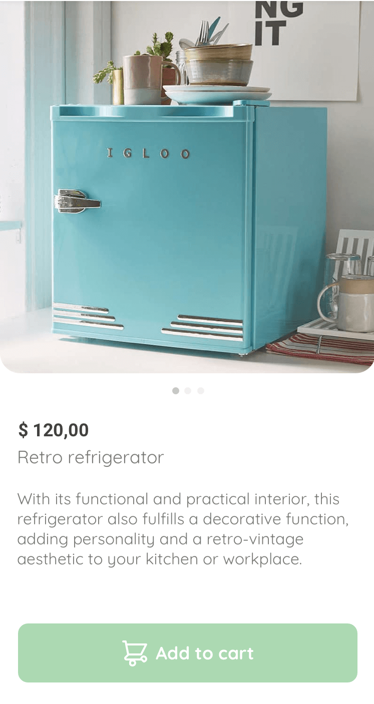
We can include this view within the aside tag because this element represents a section of the page consisting of content that is indirectly related to the main content of the document.
We need to consider that the product description is variable, and it's important to ensure it looks good with different amounts of text. For this, we can use Lorem Ipsum placeholder text.
In Visual Studio Code: <p>lorem*cantidadDeParrafos</p>
The complete structure is:
<aside class="product-detail">
    <div class="product-detail-close">
      <img src="./icons/icon_close.png" alt="close">
    </div>
    <img src="https://images.pexels.com/photos/276517/pexels-photo-276517.jpeg?auto=compress&cs=tinysrgb&dpr=2&h=650&w=940" alt="bike">
    <div class="product-info">
      <p>$35.00</p>
      <p>Bike</p>
      <p>With its practical position, this bike also fulfills a decorative function, add your hall or workspace.</p>
      <button class="primary-button add-to-cart-button">
        <img src="./icons/bt_add_to_cart.svg" alt="add to cart">
        Add to cart
      </button>
    </div>
</aside>
For the aside in our case, the product detail, we can reuse some of the styles we've already defined to maintain a uniform tone in the online store.
The steps you should follow are:
- Add the class “primary-button” to the button and then add another to implement Flexbox
.primary-button {
   background-color: var(--hospital-green);
   border-radius: 8px;
   border: none;
   color: var(--white);
   width: 100%;
   cursor: pointer;
   font-size: var(--md);
   font-weight: bold;
   height: 50px;
}
.add-to-cart-button {
   display: flex;
   align-items: center;
   justify-content: center;
}
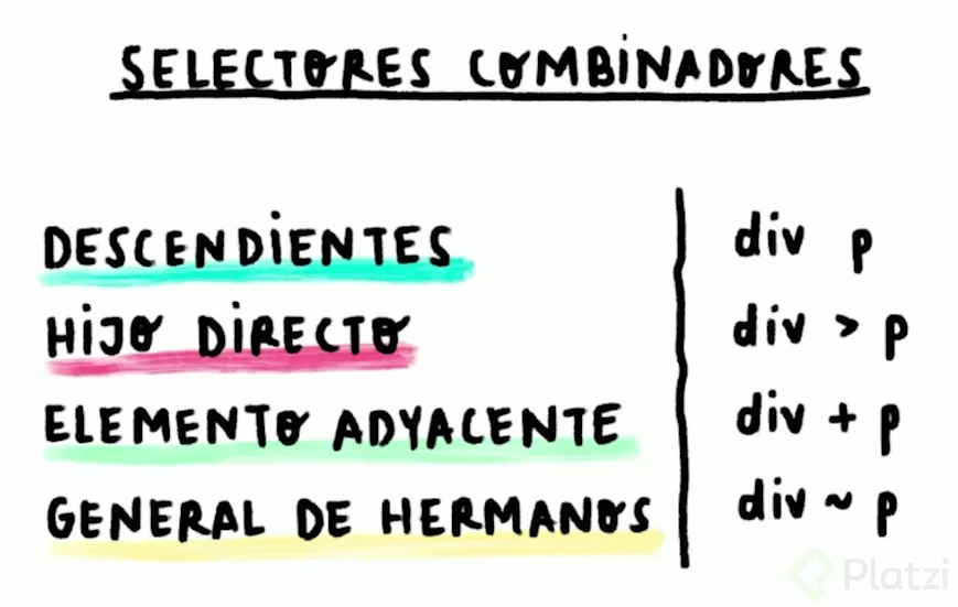
- Style the image and the close "x" Since we have more than one image within the same container class, we use the child combinator selector.
.product-detail {
   width: 360px;
   padding-bottom: 24px;
   position: absolute;
   right: 0;
}
.product-detail-close {
   background: var(--white);
   width: 14px;
   height: 14px;
   position: absolute;
   top: 24px;
   left: 24px;
   z-index: 2;
   padding: 12px;
   border-radius: 50%;
}
.product-detail-close:hover {
   cursor: pointer;
}
.product-detail > img:nth-child(2) {
   width: 100%;
   height: 360px;
   object-fit: cover;
   border-radius: 0 0 20px 20px;
}
- Continue with the part that displays the information
.product-info {
   margin: 24px 24px 0 24px;
}
.product-info p:nth-child(1) {
   font-weight: bold;
   font-size: var(--md);
   margin-top: 0;
   margin-bottom: 4px;
}
.product-info p:nth-child(2) {
   color: var(--very-light-pink);
   font-size: var(--md);
   margin-top: 0;
   margin-bottom: 36px;
}
.product-info p:nth-child(3) {
   color: var(--very-light-pink);
   font-size: var(--sm);
   margin-top: 0;
   margin-bottom: 36px;
}
- Modify the width to occupy 100% of the screen on a mobile device
@media (max-width: 640px) {
   .product-detail {
     width: 100%;
   }
}
So far, the detail view only has one image, but it's very common to have more. This way, the user can get a clearer idea of what they are about to buy. The design suggests this with the "dots" that appear below the refrigerator.
One way to achieve this is by adding the following lines to the HTML right below the img tag:
<div class="dots">
    <span class="dot"></span>
    <span class="dot"></span>
    <span class="dot"></span>
</div>
These are the styles:
.dots {
    text-align: center;
}
.dot {
    cursor: pointer;
    height: 8px;
    width: 8px;
    margin: 0 2px;
    background-color: var(--very-light-pink);
    border-radius: 50%;
    display: inline-block;
}
.dots span:nth-child(1) {
    background-color: var(--hospital-green);
}
But, how do we make another image appear when clicking on a dot? By implementing JavaScript, for example. This is an exciting concept to delve deeper into.
The shopping cart is the section of the page that allows the user to see the products they added because they want to buy them. As you can see in the image, it is very similar to the "my order" section, so we will use the same code.
We just need to create our cart screen to complete our page. As mentioned, it is a very similar process to the previous ones, and we can reuse the code from "my orders."

It's time to layout this section of the platform in HTML. Use these lines of code as a guide to ensure you've done a great job, and remember not to memorize them to ensure that you've learned correctly.
<aside class="product-detail">
  <div class="title-container">
    <img src="./icons/flechita.svg" alt="arrow">
    <p class="title">My order</p>
  </div>

  <div class="my-order-content">

    <div class="shopping-cart">
      <figure>
        <img src="https://images.pexels.com/photos/276517/pexels-photo-276517.jpeg?auto=compress&cs=tinysrgb&dpr=2&h=650&w=940" alt="bike">
      </figure>
      <p>Bike</p>
      <p>$30.00</p>
      <img src="./icons/icon_close.png" alt="close">
    </div>

    <button class="primary-button">
      Checkout
    </button>
  </div>
</aside>
The CSS styles for the cart are practically the same as for the section that shows the user their order.
The suggested CSS is:
.product-detail {
  width: 360px;
  padding: 24px;
  box-sizing: border-box;
  position: absolute;
  right: 0;
}
.title-container {
  display: flex;
}
.title-container img {
  transform: rotate(180deg);
  margin-right: 14px;
}
.title {
  font-size: var(--lg);
  font-weight: bold;
}
.order {
  display: grid;
  grid-template-columns: auto 1fr;
  gap: 16px;
  align-items: center;
  background-color: var(--text-input-field);
  margin-bottom: 24px;
  border-radius: 8px;
  padding: 0 24px;
}
.order p:nth-child(1) {
  display: flex;
  flex-direction: column;
}
.order p span:nth-child(1) {
  font-size: var(--md);
  font-weight: bold;
}
.order p:nth-child(2) {
  text-align: end;
  font-weight: bold;
}
.shopping-cart {
  display: grid;
  grid-template-columns: auto 1fr auto auto;
  gap: 16px;
  margin-bottom: 24px;
  align-items: center;
}
.shopping-cart figure {
  margin: 0;
}
.shopping-cart figure img {
  width: 70px;
  height: 70px;
  border-radius: 20px;
  object-fit: cover;
}
.shopping-cart p:nth-child(2) {
  color: var(--very-light-pink);
}
.shopping-cart p:nth-child(3) {
  font-size: var(--md);
  font-weight: bold;
}
.primary-button {
  background-color: var(--hospital-green);
  border-radius: 8px;
  border: none;
  color: var(--white);
  width: 100%;
  cursor: pointer;
  font-size: var(--md);
  font-weight: bold;
  height: 50px;
}
@media (max-width: 640px) {
  .product-detail {
    width: 100%;
  }
}
Transform is a CSS property that allows us to translate, rotate, scale, or skew elements. It is mainly used to create animations. We use it to rotate the arrow.
This project was developed by Juan Cumbe. If you have any questions or suggestions about the project, feel free to contact me via e-mail or my Linkedin profile.