Skip to content
New issue

Have a question about this project? Sign up for a free GitHub account to open an issue and contact its maintainers and the community.

By clicking “Sign up for GitHub”, you agree to our terms of service and privacy statement. We’ll occasionally send you account related emails.

Already on GitHub? Sign in to your account

Command Palette - "..." Icon in header is not communicative (as is easily covered) #6618

Closed
tgeorgeux opened this issue Jun 18, 2019 · 4 comments · Fixed by #6672
Closed
Assignees
Labels
bug pkg:application status:resolved-locked Closed issues are locked after 30 days inactivity. Please open a new issue for related discussion. tag:Design and UX
Milestone

Comments

@tgeorgeux
Copy link
Contributor

Command Pallette

UX Defficiency (1) Defect (2) - "..." Icon on headers in command palette

Context: When you mouse over a header in the command palette, a "..." Icon appears to indicate you can filter the command palette by clicking on the dots or the header. Clicking will filter the search as shown above.

Problem 1: I'm not sure "..." is the correct icon usage here. When I saw the "..." icon I thought it was going to open a menu with more options.

Solution 1: I think a "filter_list" icon makes more sense here.
baseline_filter_list_black_18dp

Problem 2: If you're trying to click the icon that appears there's a very small window in which you can hit the icon without surfacing the slider. See the gif below.
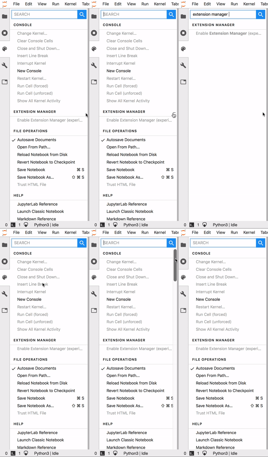
CommandPalletteDefect

Solution 2: This one's a bit trickier, one option would be to render the icons further left when the slider appears.

@tgeorgeux tgeorgeux changed the title Command Palette - UX Defect - "..." Icon in header is not communicative (as is easily covered) UX Defect - Command Palette - "..." Icon in header is not communicative (as is easily covered) Jun 18, 2019
@tgeorgeux tgeorgeux changed the title UX Defect - Command Palette - "..." Icon in header is not communicative (as is easily covered) Command Palette - "..." Icon in header is not communicative (as is easily covered) Jun 18, 2019
@ellisonbg ellisonbg added this to the 1.0 milestone Jun 18, 2019
@jasongrout
Copy link
Contributor

Solution 2: This one's a bit trickier, one option would be to render the icons further left when the slider appears.

I think the scrollbar appearing/disappearing/overlaying is a macos thing we have no control or knowledge of in the code. I find it really annoying personally and I turn that disappearing scrollbar off as soon as I get a new mac in the system preferences.

@jasongrout
Copy link
Contributor

Solution 1: I think a "filter_list" icon makes more sense here.

Do we have the filter-list icon anywhere already? The code that adds the ... is here:

.p-CommandPalette-header:hover::before {
content: '\2026'; /* ellipsis */
float: right;
margin-right: 4px;
}

@ellisonbg ellisonbg self-assigned this Jun 20, 2019
@ellisonbg
Copy link
Contributor

Will wait for #6663 to be merged to do this follow on icon work. I will use the filter list icon from MD and move it away from the scroll bar area.

@lock
Copy link

lock bot commented Aug 6, 2019

This thread has been automatically locked since there has not been any recent activity after it was closed. Please open a new issue for related discussion.

@lock lock bot locked as resolved and limited conversation to collaborators Aug 6, 2019
@jasongrout jasongrout added the status:resolved-locked Closed issues are locked after 30 days inactivity. Please open a new issue for related discussion. label Aug 9, 2019
Sign up for free to subscribe to this conversation on GitHub. Already have an account? Sign in.
Labels
bug pkg:application status:resolved-locked Closed issues are locked after 30 days inactivity. Please open a new issue for related discussion. tag:Design and UX
Projects
None yet
Development

Successfully merging a pull request may close this issue.

3 participants