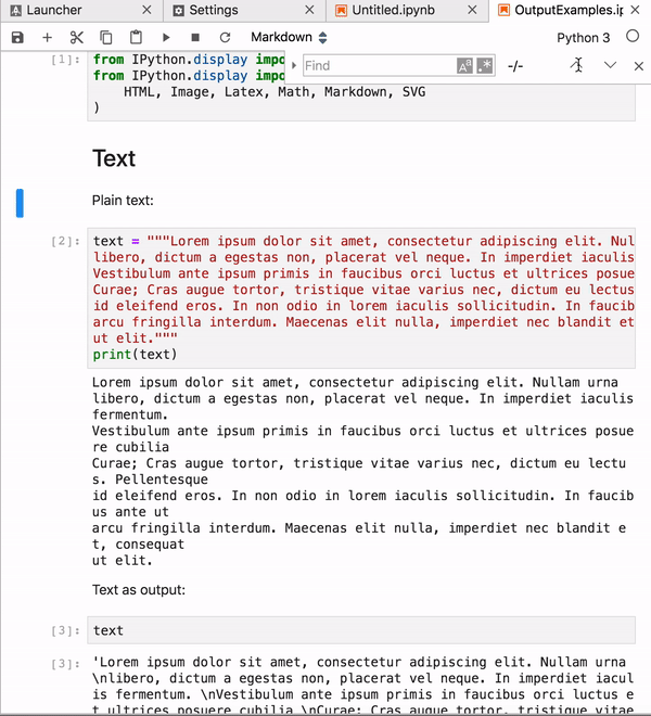
Usability of Find and replace. #6650
Comments
|
I'm just looking over the extension manager and it seems to make good use of the similar style twisty here as we're using here. I think if copy the properties of that button it would be sufficient for this case. I would still add a tooltip. |
|
ping @aschlaep |
|
Recently there was a question on Stack Overflow asking how to use the Find & Replace function. The asker even thought that it might have been removed. I added an answer, but it highlights that we need to increase discoverability. Some quick ideas:
Edit: #7725 partially addresses exactly this issue by adding "Find and Replace…" command to the menu. |
|
Minor visual thing when the simple mode is turned on: the top border is missing and it looks a bit strange.
|

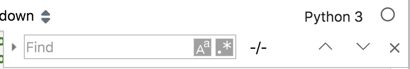
Would it be possible to add a replace icon next to the twisty icon or make it more prominent in any other way? It appears to me that many users are not aware of the replace functionality and it is a frequent complain on stack overflow and in other issues. There is |
|
I think we definitely can make it bigger and more prominent. It's pretty small. Compare to vs code, for example: |

|
I could also see it making sense to open with both the find and the replace
showing and leave the twisty for those who want to close the replace.
Alternately we should have a hotkey that opens the replace functionality in
addition to the hotkey that opens find.
…On Wed, Feb 10, 2021 at 3:09 PM Jason Grout ***@***.***> wrote:
I think we definitely can make it bigger and more prominent. It's pretty
small. Compare to vs code, for example:
[image: Screen Shot 2021-02-10 at 3 08 41 PM]
<https://user-images.githubusercontent.com/192614/107584757-e331b080-6bb1-11eb-94fd-25c715d74372.png>
—
You are receiving this because you authored the thread.
Reply to this email directly, view it on GitHub
<#6650 (comment)>,
or unsubscribe
<https://github.com/notifications/unsubscribe-auth/AFIVZQC755QMCQQV5DHY7YLS6MGZZANCNFSM4HZNQHLQ>
.
|
|
Contributing to the problem might be that under certain circumstances
|

|
Note: users coming from Colab may assume that there is no search & replace, because in Colab it is placed in the sidebar:
which is much more prominent and exposes all functions straight away. It might not work as well with mult-tab/panel layout of JupyterLab, but maybe having that as an option could be useful. (This is to follow the SO question I mentioned surpassing up votes from 53 users and frustrated comments below my answer). |

|
Hi! |

|
Thanks a lot @krassowski! I will check it out. I'm still on 3.0.16 :). If there's any chance at a shortcut for find & replace in highlighted cells, that would be great too ;). |
|
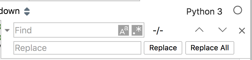
Checking in on this issue with JupyterLab 4.1. I'll go through each of the sub-issues, one at a time, moving them into other issues if they're still an issue in Lab 4.1. @tgeorgeux Thank you for your contributions! Issue 1 - Next and previous arrows.Still an issue in Lab 4.1: I opened #15813. Issue 2 - Add tooltips on extended hover.a. The twisty that activates the 'replace' functionality should be labeled 'show replace' on the tooltip. (hide replace on hover when replace is showing) This button now has a tooltip that reads, "Toggle Replace". Opened #15814 to request a more specific tooltip. b. An 'Aa' icon that I think has to do with case sensitivity that should have a 'toggle case sensitivity' tooltip This button now has a tooltip that reads, "Match Case". c. A '.*' icon that I'm not 100% sure what it does but should be labeled as well. This button now has a tooltip that reads, "Use Regular Expression". d. Also, the three buttons should have the tooltip, 'previous match', 'next match', and 'close find and replace' respectively. The "Previous Match" and "Next Match" buttons now have tooltips that also indicate their keyboard shortcuts. The close button does not have a tooltip; opened #15815 to request that one be added. Issue 3 - Visual elementsa. Align the width of the input text boxes horizontally This is now done; the "match case buttons" are aligned vertically, and the "Find" box has two additional buttons that extend further to the right. b. The 'find' box is 20px height and the replace is 16px height. These should match. (Use 20px for now) This is fixed; both Find and Replace have a height of 20px. c. Give all buttons a hover effect similar to other toolbar buttons, a color of layout-color4. This is fixed; all buttons now have a hover effect. d. For the Replace and Replace All buttons should be minimal buttons with a similar hover effect noted above, in 13px font, with ui-font-color1 (currently using ui-font-color0) These buttons now have a minimal theme with a hover effect. e. For the next and previous buttons as well as the close button, use the Material Design arrow_forward and arrow_backward icons, as well as the Material Design close icon for the close button. These buttons now use the previous and next buttons, consistent with other text editors (for example, VSCode uses an up and down arrow for "previous" and "next" match respectively). All buttons use f. For the twisty icon use Material Design expand_more icon to show replace functionality and expand_less to hide replace. This now uses the Material "caret down" or "caret right" icon. Closing this issue. Please open additional UX improvement ideas individually. Thank you for your contributions! |
Issue 1 - Next and previous arrows.
Problem: When there is no text in the input field, the up and down arrows are still active and move the document up and down. They should be disabled until there is text in the box that has a match. See the gif below:
Solution: Disable buttons at all times unless there is text in the input field with relevant matches in the document.
Issue 2 - Add tooltips on extended hover.
For quick reference:
Also, the three buttons should have the tooltip, 'previous match', 'next match', and 'close find and replace' respectively.
@ivanov would it make sense to do a quick accessibility audit of these pieces for aria labels?
Issue 3 - Visual elements
A couple of issues that should be addressed:The text was updated successfully, but these errors were encountered: