

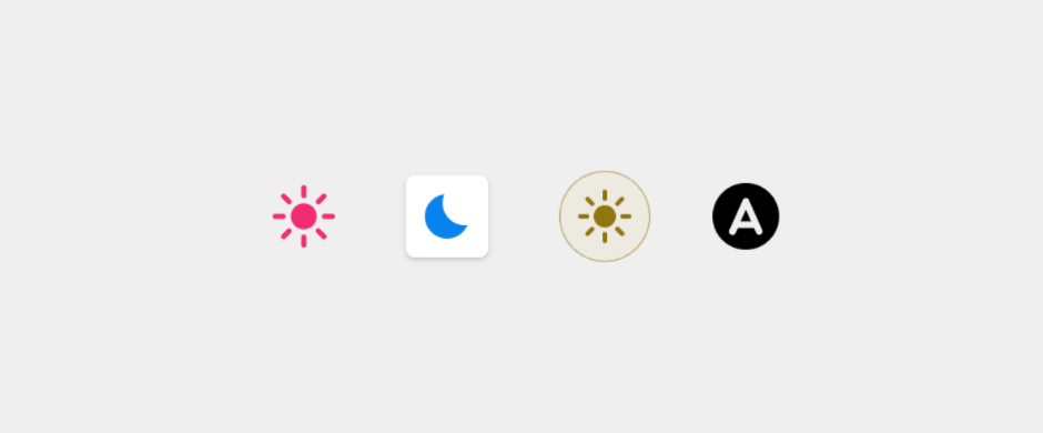
This is an animated custom HTML element
which toggles between light theme, dark theme, and automatic theme (OS theme).
It adds a custom attribute (data-theme) to the html element of your page.
You can style your page the way you like based on the value of that attribute.
See the demo page and scroll below for an example.
-
<script src="https://unpkg.com/@mahozad/theme-switch"></script>
-
npm install --save @mahozad/theme-switch
<script src="node_modules/@mahozad/theme-switch/dist/theme-switch.min.js"></script>
-
For Angular framework and more details about the above installation methods see the wiki.
After installing the library, use the element like this (make sure to include the end tag):
<theme-switch></theme-switch>A custom element is no different from the built-in elements of HTML.
Use and style it however you want just like you would use and style a regular element:
theme-switch {
  width: 64px;
  padding: 8px;
  background: #888;

  /*
   * There is a special property called --theme-switch-icon-color
   * which you can set, to change the color of the icon (shapes) in the switch.
   * You can even make the color change with animation (for example, on mouse hover);
   * see https://gist.github.com/mahozad/a8114b6145cac721f7652aa7b0732cf6
   */
  --theme-switch-icon-color: #aabbcc;
}In your CSS stylesheet, specify your desired styles for light and dark themes. One way is to define custom CSS properties for your colors, sizes, etc. and redefine them (if needed) with new values for the other theme:
/* These are applied for the default (light) theme */
/* (or when the toggle is auto, and the OS theme is light) */
html {
  --my-page-background-color: #fff;
  --my-text-color: red;
}

/* These are applied for the dark theme */
/* (or when the toggle is auto, and the OS theme is dark) */
/* If a property has the same value for light and dark themes, no need to redeclare it here */
html[data-theme="dark"] {
  --my-page-background-color: #112233;
}

body /* or any selector you want */ {
  background: var(--my-page-background-color);
  color: var(--my-text-color);
}The switch element fires (triggers) a custom event called themeToggle every time it is toggled (clicked).
You can listen and react to it if you want:
document.addEventListener("themeToggle", event => {
  console.log(`Old theme: ${ event.detail.oldState }`);
  console.log(`New theme: ${ event.detail.newState }`);
  // More operations...
});Click here to expand
This widget was inspired by this YouTube video and this library.
See this article which is about creating HTML custom elements.
See the icon for switching themes (located in the top right corner) on
Google Fonts site.
Also see this site.
See this article for implementing dark/light theme on sites.
See this post for how to override dark/light theme for a site.
See this comprehensive GitHub repo about custom elements.
See this feature.
- React Toggle Dark Mode
- Dark Mode Toggle
- <dark-mode-toggle>
- <color-scheme-button>
- <theme-toggle>
- Binary theme switcher component
TODO:
- Try to add the library to rufus site
- Try to add the library to jest site (probably its
docs/directory. see this PR) - Try to add the library to MDN site
- Try to add the library to docusaurus
- Try to add the library to dokka
- Try to add the library to Spring website and Spring docs
- Try to add the library to mkdocs-material
- Try to add the library to bootstrap website
- Try to add the library to Electron js website
- Try to add the library to https://playwright.dev/
- Try to add the library to https://tailwindcss.com/
- Try to add the library to and inspire from https://next.vuetifyjs.com/
- Try to add the library to scoop website
- See chrome auto dark feature for android