Nextcloud dialog helpers
npm i -S @nextcloud/dialogs
Since version 4.2 this package provides a Vue.js based file picker, so this package depends on @nextcloud/vue. So to not introduce style collisions version 4 of this library is only compatible with @nextcloud/vue version 7 (used by Nextcloud version 25, 26 and 27).
For nextcloud/vue version 8 (Nextcloud 28+) see version 5 of this package.
The styles for the components (Toasts and FilePicker) are provided in the style.css file.
So make sure that the @nextcloud/dialogs/style.css file is included in your app to make sure that the toasts or FilePicker have a proper styling applied.
import '@nextcloud/dialogs/style.css'import { showMessage, showInfo, showSuccess, showWarning, showError } from '@nextcloud/dialogs'
import '@nextcloud/dialogs/style.css'If you using @nextcloud/dialogs >= 4.0 you don't need any svg or scss loader in you projects anymore.
There are different toast styles available, that are exposed in separate functions:
showMessage('Message without a specific styling')
showInfo('Information')
showSuccess('Success')
showWarning('Warning')
showError('Error')
There are several options that can be passed in as a second parameter, like the timeout of a toast:
showError('This is an error shown without a timeout', { timeout: -1 })
A full list of available options can be found in the documentation.
There are two ways to spawn a FilePicker provided by the library:
This way you do not need to use Vue, but can programatically spawn a FilePicker.
import { getFilePickerBuilder } from '@nextcloud/dialogs'
const filepicker = getFilePickerBuilder('Pick plain text files')
    .addMimeTypeFilter('text/plain')
    .addButton({
        label: 'Pick',
        callback: (nodes) => console.log('Picked', nodes),
    })
    .build()

// You get the file nodes by the button callback, but also the pick yields the paths of the picked files
const paths = await filepicker.pick()<template>
<FilePicker name="Pick some files" :buttons="buttons" />
</template>
<script setup lang="ts">
import {
FilePickerVue as FilePicker,
type IFilePickerButton,
} from '@nextcloud/dialogs'
import type { Node } from '@nextcloud/files'
import IconShare from 'vue-material-design-icons/Share.vue'
const buttons: IFilePickerButton[] = [
{
label: 'Pick',
callback: (nodes: Node[]) => console.log('Picked', nodes),
type: 'primary'
},
{
label: 'Share',
callback: (nodes: Node[]) => console.log('Share picked files', nodes),
type: 'secondary',
icon: IconShare,
}
]
</script>For testing all components provide data-testid attributes as selectors, so the tests are independent from code or styling changes.
data-testid |
Intended purpose |
|---|---|
select-all-checkbox |
The select all checkbox of the file list |
file-list-row |
A row in the file list (tr), can be identified by data-filename |
row-checkbox |
Checkbox for selecting a row |
row-name |
Name of the row / file |
- Pull the latest changes from
masterorstableX; - Checkout a new branch with the tag name (e.g
v4.0.1):git checkout -b v<version>; - Run
npm version patch --no-git-tag-version(npm version minor --no-git-tag-versionif minor). This will return a new version name, make sure it matches what you expect; - Commit, push and create PR;
- Add the change log content from the 'Changelog' action on Github to
CHANGELOG.md; - Commit and push;
- Get your PR reviewed and merged;
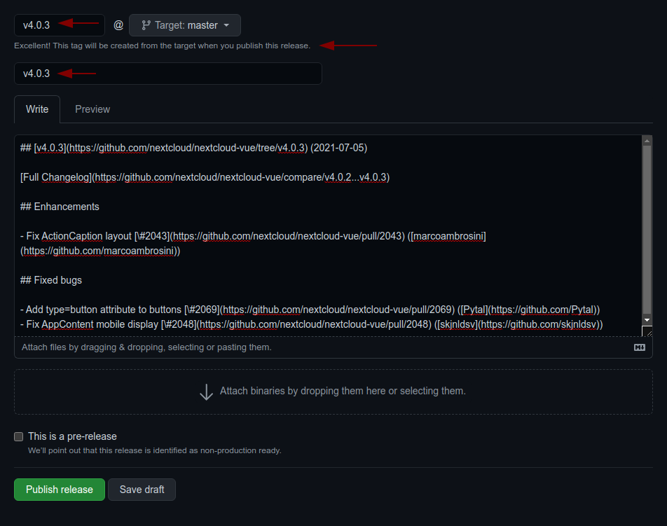
- Create a release on github with the version as tag (e.g
v4.0.1) and add the changelog content as description
![@dependabot[bot]](https://avatars.githubusercontent.com/in/29110?s=64&v=4)
![@transifex-integration[bot]](https://avatars.githubusercontent.com/in/18568?s=64&v=4)
![@dependabot-preview[bot]](https://avatars.githubusercontent.com/in/2141?s=64&v=4)
![@github-actions[bot]](https://avatars.githubusercontent.com/in/15368?s=64&v=4)