Skip to content
New issue

Have a question about this project? Sign up for a free GitHub account to open an issue and contact its maintainers and the community.

By clicking “Sign up for GitHub”, you agree to our terms of service and privacy statement. We’ll occasionally send you account related emails.

Already on GitHub? Sign in to your account

Further landing accessibility improvements #330

Merged
merged 6 commits into from
Jul 8, 2022

Conversation

Tropix126
Copy link
Contributor

@Tropix126 Tropix126 commented Jul 7, 2022

This PR improves the following potential accessibility pitfalls on the site:

  • Adds lang="en" to <html> which helps screenreaders correctly identify the site's language.
  • Adds a <ul> element to the navbar so their children <li>s have valid semantic meaning.
  • Removes <li> elements from benchmarks tabbar as ARIA requires the tablist role's direct children to have tabitem roles, making them redundant and potentially harmful to screenreaders. This also inadvertently fixes a regression with some missing selection styling introduced by fix a11y issues on landing #225.
  • Adjusts the text color of tag links to better contrast against their respective backgrounds.
  • Refactors InstallBox to not use IDs since it's used multiple times for mobile/desktop, resulting in invalid (well, more unorthodox) HTML, that could behave strangely.
  • Removes the unselectable class repetition from CodeBox and just slaps a user-select: none; on it's base element to simplify things CSS-wise.
  • Iterates over the copy button to ensure that all instances get the listener (unsure if this is required since mobile removes hides the second potential instance.)

@Tropix126
Copy link
Contributor Author

Tropix126 commented Jul 7, 2022

Also, this is more of an SEO thing, but according to lighthouse the page is also missing a <meta name="description"> tag. Not sure if the existing OpenGraph metatag would cover this, but I can add this in another PR if needed.

Copy link
Contributor

@michellbrito michellbrito left a comment

Choose a reason for hiding this comment

The reason will be displayed to describe this comment to others. Learn more.

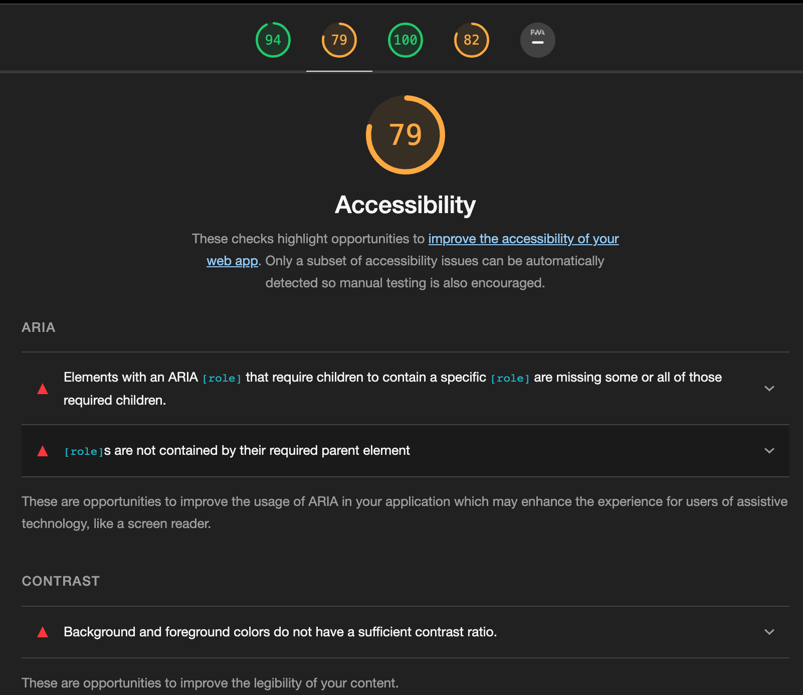
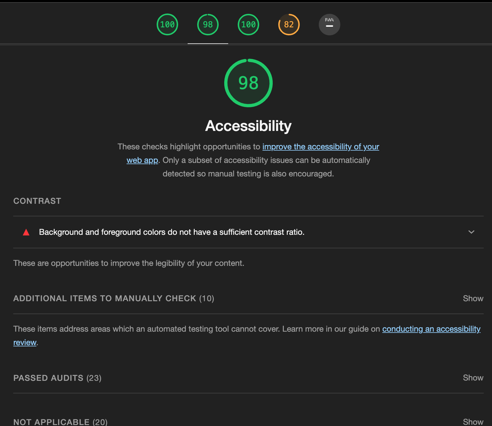
@Tropix126 mind posting screenshots of the following

  • before/after lighthouse report
  • before/after how the website looks

@alexkuz
Copy link
Contributor

alexkuz commented Jul 8, 2022

Lighthouse report

Before After
image image

@Tropix126
Copy link
Contributor Author

Tropix126 commented Jul 8, 2022

Visual Changes - Only thing changed are these chip colors for better contrast.

Before After

@Tropix126
Copy link
Contributor Author

Tropix126 commented Jul 8, 2022

Also: it's worth noting that the 98 in the "after" LH score is likely caused by the comment color used in the site's syntax theme. Since shiki renders these on build through inline styles, and it's pretty low priority I don't think i'll touch that in this PR.

image

@alexkuz
Copy link
Contributor

alexkuz commented Jul 8, 2022

@Tropix126 nah, it's that pink tag. I think we can ignore WCAG 2.0 lies on that one :)

Copy link
Contributor

@michellbrito michellbrito left a comment

Choose a reason for hiding this comment

The reason will be displayed to describe this comment to others. Learn more.

LGTM!

@michellbrito michellbrito merged commit b373126 into oven-sh:main Jul 8, 2022
Sign up for free to join this conversation on GitHub. Already have an account? Sign in to comment
Labels
None yet
Projects
None yet
Development

Successfully merging this pull request may close these issues.

None yet

3 participants