A simple, lightweight React time picker. Requires React 16.8.0 or higher.
- Supports typed input only (no dropdowns).
- Rejects input characters that would create an invalid time sting, and resets if input is not a complete, valid time string when unfocussed.
- Try demo here
npm install react-time-picker-lite
import React, { useState } from 'react';
import TimePicker from 'react-time-picker-lite';

function App() {
  const [timeMessage, setTimeMessage] = useState(null);
  const [errorMessage, setErrorMessage] = useState(null);

  const handleSuccess = (hhmmString) => {
    setTimeMessage(`Time is set to ${hhmmString}.`);
    setErrorMessage(null);
  };

  const handleError = () => {
    setErrorMessage('Please insert a valid time.');
    setTimeMessage(null);
  };

  return (
    <div>
      <TimePicker
        onSuccess={handleSuccess}
        onError={handleError}
      />
      {timeMessage || errorMessage || ''}
    </div>
  );
}| Prop name | Description | Data Type | Default Value |
|---|---|---|---|
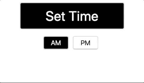
| placeholderText | The value to display in the time input before it's facussed | String | 'Set Time' |
| wrapperWidth | The width of the wrapper containing both the input and the AM/PM buttons | String | '120px' |
| wrapperHeight | The height of the warpper containing both the input and the AM/PM buttons | String | '150px' |
| inputHeight | The height of the input | String | '30%' (of the wrapper) |
| inputWidth | The width of the input | String | '100%' (of the wrapper) |
| inputFontSize | Font size for input text | String | '20px' |
| backgroundColorOnBlur | Color of input background when blurred | String | '#000' (black) |
| textColorOnBlur | Color of input text when blurred | String | '#FFF' (white) |
| backgroundColorOnfocus | Color of input background when focussed | String | '#FFF' (white) |
| textColorOnfocus | Color of input text when focussed | String | '#000' (black) |
| font | Font to be applied to input and AM/PM button text | String | 'inherit' |
| amPmButtonHeight | Height of AM/PM button | String | '25%' (of the wrapper) |
| amPmButtonWidth | Width of AM/PM button | String | '25%' (of the wrapper) |
| amPmButtonFontSize | Font size for the AM/PM button text | String | '10px' |
| amPmButtonHighlightedBackgroundColor | Color of AM/PM button background when selected | String | '#000' (black) |
| amPmButtonNonHighlightedBackgroundColor | Color of AM/PM button background when unselected | String | '#FFF' (white) |
| amPmButtonHighlightedTextColor | Color of AM/PM button text when selected | String | '#FFF' (white) |
| amPmButtonNonHighlightedTextColor | Color of AM/PM button text when unselected | String | '#000' (black) |
| onError | Function that is called when input is reset due to invalid time value | Function | () => null |
| onSuccess | Function that is called when input is unfocussed with valid time value. Includes 'HH:mm' (in 24-hour format) as argument | Function | () => null |
| shouldUse24HourMode | Allows input to use 24 hour time (hides AM/PM buttons if set to true) | Boolean | false |