Skip to content
New issue

Have a question about this project? Sign up for a free GitHub account to open an issue and contact its maintainers and the community.

By clicking “Sign up for GitHub”, you agree to our terms of service and privacy statement. We’ll occasionally send you account related emails.

Already on GitHub? Sign in to your account

Add Power Platform #7779

Closed
wants to merge 7 commits into from
Closed

Conversation

adamrusted
Copy link
Member

@adamrusted adamrusted commented Sep 15, 2022

powerplatform (2)

Issue: #7780

Similarweb rank: N/A (Microsoft Product, Citizen Developer Platform)

Checklist

  • I updated the JSON data in _data/simple-icons.json
  • I optimized the icon with SVGO or SVGOMG
  • The SVG viewbox is 0 0 24 24

Description

In the process of updating all of the Dynamics / Power Platform icons (I use them for work!)
This is a new icon for the over-arching 'Power Platform' ecosystem, which encompasses Power BI, Power Apps, Power Virtual Agents, etc.

Hex code is picked randomly from the middle of the icon, given the entire thing is a gradient.

@github-actions github-actions bot added the new icon Issues or pull requests for adding a new icon label Sep 15, 2022
@adamrusted adamrusted mentioned this pull request Sep 15, 2022
8 tasks
@LitoMore
Copy link
Member

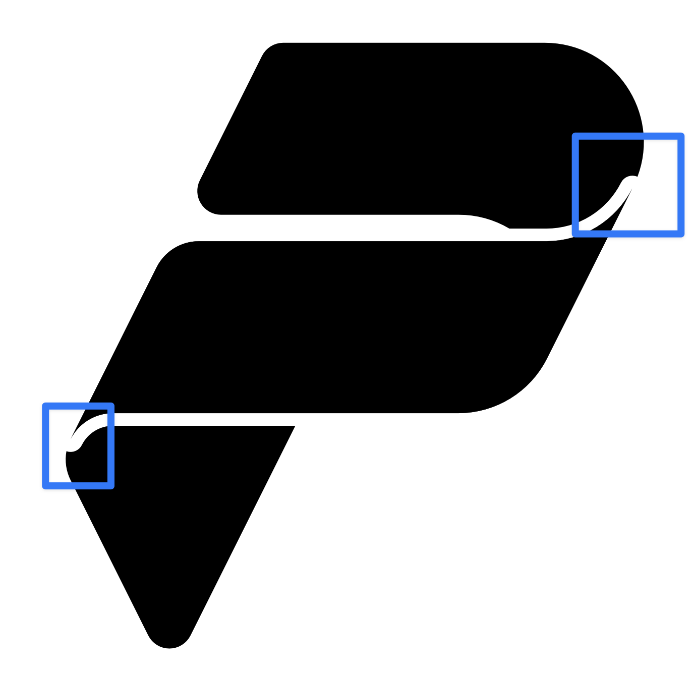
CleanShot 2022-09-17 at 12 27 18@2x

This part looks a little weird.

@LitoMore
Copy link
Member

CleanShot 2022-09-17 at 14 39 58@2x

@adamrusted We could apply an inside 0.5px stroke to each shape.

@adamrusted
Copy link
Member Author

CleanShot 2022-09-17 at 14 39 58@2x

@adamrusted We could apply an inside 0.5px stroke to each shape.

Would an inside stroke not impact the overall size of the icon? Or do you mean just the central shape?

@LitoMore
Copy link
Member

LitoMore commented Sep 17, 2022

Would an inside stroke not impact the overall size of the icon? Or do you mean just the central shape?

I mean all those three shapes. I think the change of overall size is acceptable. Just resize it to 24px after we finished the inside stroke process.

@adamrusted
Copy link
Member Author

Would an inside stroke not impact the overall size of the icon? Or do you mean just the central shape?

I mean all those three shapes. I think the change of overall size is acceptable.

Let me see if I can tidy up the edges of that original image - perhaps just extend it so the rounded edge doesn't show inside the icon

@LitoMore
Copy link
Member

LitoMore commented Sep 17, 2022

CleanShot 2022-09-17 at 16 43 58@2x

After we've modified the first shape we could make the edges on the right side are always on the edge of the new circle.

@adamrusted
Copy link
Member Author

Apologies @LitoMore - I was just getting my branch up to date. Just pushed a new update - though manually dragged the points, so be kind 🙏

@LitoMore LitoMore closed this Sep 17, 2022
@LitoMore LitoMore reopened this Sep 17, 2022
@LitoMore
Copy link
Member

@adamrusted 😂 Sorry I clicked the close button by accident.

@adamrusted
Copy link
Member Author

@adamrusted 😂 Sorry I clicked the close button by accident.

Rude! 🤣

@LitoMore
Copy link
Member

Apologies @LitoMore - I was just getting my branch up to date. Just pushed a new update - though manually dragged the points, so be kind 🙏

LOL. Of course. My native language is not English so sometimes I wrote a wrong tone 🙏

@adamrusted
Copy link
Member Author

LOL. Of course. My native language is not English so sometimes I wrote a wrong tone 🙏

No worries! It's all good 😄

@LitoMore
Copy link
Member

LitoMore commented Sep 17, 2022

I think the inside stroke didn't break their design concept for the logo. Just like fonts have thin and bold. The inside stroke ensures that its own curve is not modified by strokes from other shapes. What do you think?

@adamrusted
Copy link
Member Author

@LitoMore - not sure how I'd be able to apply the inner stroke effectively in Affinity. All I've done here is an outer stroke of the centre piece, which to my eye is the 'raised' bit of the logo - and then extended it out so we don't get those weird rounded corners any more. Might need some further guidance if we need to change that :)

@LitoMore
Copy link
Member

LitoMore commented Sep 17, 2022

CleanShot 2022-09-17 at 19 05 59@2x CleanShot 2022-09-17 at 18 50 55@2x

@adamrusted Hope this helps:

  1. Duplicate the shape
  2. Select the Align Stroke to Inside
  3. Change its color to none
  4. Select Layer -> Expand Stroke to convert its stroke to fill
  5. Now you can use Layer -> Geometry on the processed shape and the backup one to get a new shape.

@adamrusted
Copy link
Member Author

@LitoMore - Give that a try. I'm trying to avoid using that inner stroke, as it'll warp the image too much. I've given the edges on this another go - let me know what you think.

@LitoMore
Copy link
Member

@simple-icons/icon-review Any suggestions?

@adamrusted adamrusted closed this Jun 30, 2023
@adamrusted adamrusted added the abandoned Pull requests that have been abandoned by the contributor label Jun 30, 2023
@adamrusted adamrusted deleted the powerplatform branch July 20, 2023 12:29
Sign up for free to join this conversation on GitHub. Already have an account? Sign in to comment
Labels
abandoned Pull requests that have been abandoned by the contributor new icon Issues or pull requests for adding a new icon
Projects
None yet
Development

Successfully merging this pull request may close these issues.

None yet

2 participants