P.Pager is Lightweight package for easily paging through any IEnumerable/IQueryable, chop it up into "pages", and grab a specific "page" by an index. It supports Web projects, Winforms, WPF, Window Phone, Silverlight and other .NET projects. It is default configured to > Bootstrap 3.3.1.
Install P.Pager.Mvc via NuGet. This will install P.Pager automatically.
Install-Package P.Pager.Mvc -Version 3.0.0
Install P.Pager.Mvc.Core via NuGet. This will install P.Pager automatically.
Install-Package P.Pager.Mvc.Core -Version 1.4.0
Install P.Pager.Mvc.Core via NuGet. This will install P.Pager automatically.
Install-Package P.Pager.Mvc.Core -Version 3.0.0
- In your controller code, call ToPagerList off of your IEnumerable/IQueryable passing in the page size.
public class HomeController : Controller
{
    readonly DemoData _data;
    public HomeController()
    {
        _data = new DemoData();
    }

    public ActionResult Index(int page = 1, int pageSize = 10)
    {
        var pager = _data.GetMembers().ToPagerList(page, pageSize);
        // will only contain 10 members max because of the pageSize.
        return View(pager);
    }
} -
Pass the result of ToPagerList to your view where you can enumerate over it - its still an IEnumerable, but only contains a child of the original data.
-
Call Html.Pager, passing in the instance of the Pager and a function that will generate URLs for each page to see a paging control.
//Default Pager options
@Html.Pager((IPager)Model, page => Url.Action("Index", new { page }))
Default options for rendering pagination.
| Option | Type | Summary | Default |
|---|---|---|---|
| DisplayFirstPage | PagerDisplayMode | If set to Always, render a hyperlink to the first page in the list. If set to IfNeeded, render the hyperlink only when the first page isn't visible in the paging control. | IfNeeded |
| DisplayLastPage | PagerDisplayMode | If set to Always, render a hyperlink to the last page in the list. If set to IfNeeded, render the hyperlink only when the last page isn't visible in the paging control. | IfNeeded |
| DisplayPreviousPage | PagerDisplayMode | If set to Always, render a hyperlink to the previous page of the list. If set to IfNeeded, render the hyperlink only when there is a previous page in the list. | IfNeeded |
| DisplayNextPage | PagerDisplayMode | If set to Always, render a hyperlink to the next page of the list. If set to IfNeeded, render the hyperlink only when there is a next page in the list. | IfNeeded |
| PagesToDisplay | int? | How many page numbers to display in pagination, by default it is 5. | 5 |
| HasIndividualPages | bool | Display pages numbers. | true |
| TextToIndividualPages | string | A formatted text to show to show inside the hyperlink. Use {0} to refer page number, by default it is set to {0} | {0} |
| TextForDelimiter | string | This will appear between each page number. If null or white space, no delimeter will display. | null |
| HasEllipses | bool | Adds an ellipe when all page numbers are not displaying, by default it is true. | true |
| EllipsesFormat | string | A formatted text shows when all pages are not displaying, by default it is … | … |
| TextToFirstPage | string | A formatted text to show for firstpage link, by default it is set to <<. | << |
| TextToPreviousPage | string | A formatted text to show for previous page link, by default it is set to <. | < |
| TextToNextPage | string | A formatted text to show for next page link, by default it is set to >. | > |
| TextToLastPage | string | A formatted text to show for last page link, by default it is set to >>. | >> |
| ClassToPagerContainer | string | Css class to append to <div> element in the paging content, by default it is set to pager container. | container |
| ClassToUl | string | Css class to append to <ul> element in the paging content, by default it is set to pagination. | pagination |
| ClassToLi | string | Css class to append to <li> element in the paging content, by default it is set to page-item. | page-item |
| PageClass | string | Css class to append to <a>/<span> element in the paging content, by default it is set to page-link. | page-link |
| ClassToActiveLi | string | Css class to append to <li> element if active in the paging content, by default it is set to active. | active |
| HasPagerText | bool | Displaying current page number and total number of pages in pager, by default it is set to false. | false |
| PagerTextFormat | string | Text format will display if HasPagerText is true. Use {0} to refer the current page and {0} to refer total number of pages, by default it is set to Page {0} of {1}. | Page {0} of {1}. |
| HasEntriesText | bool | Displaying start item, last item and total entries in pager, by default it is set to false. | false |
| EntriesTextFormat | string | Text format will display if HasEntriesText is true. {0} refers first entry on page, {1} refers last item on page and {2} refers total number of entries, by default it is set to Showing {0} to {1} of {2} entries. | Showing {0} to {1} of {2} entries. |
A tri-state enum that controls the visibility of portions of the PagerList paging control.
public enum PagerDisplayMode| Fields | Description |
|---|---|
| Always | Always render. |
| Never | Never render. |
| IfNeeded | Only render when there is data that makes sense to show (context sensitive). |
- Shows custom page numbers, let say 10 pages.
@Html.Pager((IPager)Model, page => Url.Action("Index", new { page }), new PagerOptions { PagesToDisplay = 10 })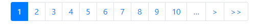
- With Custom Page Text.
@Html.Pager((IPager)Model, page => Url.Action("Index", new { page }), new PagerOptions { TextToIndividualPages = "Page-{0}" })
- Custom Wording. (Can use for translation also.)
@Html.Pager((IPager)Model, page => Url.Action("Index", new { page }), new PagerOptions { TextToPreviousPage = "Previous Page", TextToNextPage = "Next Page", TextToFirstPage = "First Page", TextToLastPage = "Last Page" })
- Custom options.
@Html.Pager((IPager)Model, page => Url.Action("Index", new { page }), new PagerOptions { TextToPreviousPage = "last-page", TextToNextPage = "next-page", TextToFirstPage = "first-page", TextToLastPage = "last-page", ClassToUl = "list-inline", ClassToLi = "list-inline-item", PageClass = "nopageclass", ClassToActiveLi = "niloclass", TextForDelimiter = " | " })
- Custom Icon Options (Fontawesome)
@Html.Pager((IPager)Model, page => Url.Action("Index", new { page }), new PagerOptions { TextToPreviousPage = "<i class='fas fa-step-backward'></i>", TextToNextPage = "<i class='fas fa-step-forward'></i>", TextToFirstPage = "<i class='fas fa-fast-backward'></i>", TextToLastPage = "<i class='fas fa-fast-forward'></i>" })
- Minimal Pager
//Shows only the Previous and Next links.
@Html.Pager((IPager)Model, page => Url.Action("Index", new { page }), PrePagerOptions.Minimal)
- Minimal Pager with Pager Text (Page Count Text)
//Shows Previous and Next links along with current page number and total number of pages in pager.
@Html.Pager((IPager)Model, page => Url.Action("Index", new { page }), PrePagerOptions.MinimalWithPagerText)
- Minimal Pager with entries text (Item Count Text)
//Shows Previous and Next links along with index of start and last item and total entries in pager.
@Html.Pager((IPager)Model, page => Url.Action("Index", new { page }), PrePagerOptions.MinimalWithEntriesText)
- Classic Pager (always shows Previous/Next links, but sometimes they are disabled)
//Shows Previous and Next page always with default, 5 pages.
@Html.Pager((IPager)Model, page => Url.Action("Index", new { page }), PrePagerOptions.ClassicPager)
- Classic Pager with First and Last(Classic Pager with First and Last links, but sometimes they are disabled)
//Shows Last, First, Previous and Next page always with default, 5 pages.
@Html.Pager((IPager)Model, page => Url.Action("Index", new { page }), PrePagerOptions.ClassicPagerWithFirstAndLastPages)
Licensed under the MIT License.