Treeview
The Treeview is a visualization for hierarchical quantitative data that renders a tree that visually shows the parent-child relationships between all the different nodes. The size of each node can be independently set in order to showcase quantitative information about each node's underlying value.
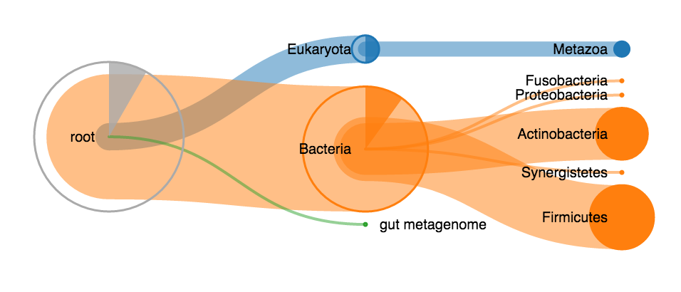
A live example of this visualization can be found on Observable.
The treeview visualization internally works with an SVG. This solution proves to be fast enough for almost any kind of input. The SVG can directly be downloaded or converted to a PNG using an external library (such as Canvg).
The constructor of the Treeview class automatically starts rendering the treeview upon invocation and has the following signature:
-
element: HTMLElement: TheHTMLElementin which the treeview should be rendered. -
data: DataNodeLike: The root node of the hierarchical data that should be rendered by this treeview. SeeDataNodefor how to construct these objects properly. -
options: TreeviewSettings(optional): Can be used to configure the treeview before rendering. See below for all the options that are currently supported.
A subclass of the DataNode class that has a few extra utility methods. A TreeviewNode can be collapsed or expanded (together with all of its children). The following methods are supported and are not available on regular DataNode objects:
Returns true if the current node is in the collapsed state (which means that its children should not be rendered at this moment).
Function that accepts one parameter which is used to change the collapsed state of this node.
-
value: boolean: Pass true to collapse this node, pass false otherwise.
Returns true if the current node is selected.
Mark this node and all of its children as (de)selected.
-
value: boolean: Pass true to mark this node (and all children) as selected. Pass false otherwise.
Recursively collapse all children of this node.
Collapse this node (and none of its children).
Expand this node and all of its children recursively.
Expand this node and all children that are at maximum i levels deeper than the current node.
-
i: number: Maximum amount of levels deeper at which nodes will be expanded.
Recursively set the color of this node and all of its children.
-
color: string: Color that should be associated with this node and all children.
A TreeviewSettings object can be used to fully configure the treeview and specifies a variety of different properties:
-
width: number(optional, default = 800): Maximum width of the visualization in pixels. -
height: number(optional, default = 800): Maximum height of the visualization in pixels. -
enableTooltips: boolean(optional, default = true): Are tooltips shown when hovering over a node in the treeview? -
minNodeSize: number(optional, default = 2): The minimal size of a node in pixels. -
maxNodeSize: number(optional, default = 105): The maximum size of a node in pixels. -
enableExpandOnClick: boolean(optional, default = true): Should a subtree be expanded / collapsed when it's root has been clicked? -
enableAutoExpand: boolean(optional, default = false): Should a heuristic be used to expand the most important branches when loading the initial visualization. A value to tweak this heuristic can be specified with theautoExpandValueoption. -
autoExpandValue: number(optional, default = 0.8): Set this value to a number between 0 and 1 to tweak the auto expand heuristic of this treeview. A higher value causes more expansion. -
levelsToExpand: number(optional, default = 2): The number of levels to expand after clicking on a node and when loading the initial visualization. -
enableRightClick: boolean(optional, default = true): Should the tree reroot when right clicking a node? -
enableInnerArcs: boolean(optional, default = true): Should inner arcs be shown? -
enableLabels: boolean(optional, default = true): Should labels (containing the node names) next to the nodes be shown? -
nodeDistance: number(optional, default = 180): The horizontal distance in pixels between nodes. -
animationDuration: number(optional, default = 500): Time the animation should last (in milliseconds).
-
nodeFillColor(optional, default = generic color function): Function that returns a color to use as fill color. Is called with aTreeviewNodeas parameter. This function needs to return a valid HTML color string and receives 1 parameter:-
d: TreeviewNode: current node for which the color should be determined.
-
-
nodeStrokeColor(optional, default = generic stroke color function): Function that returns a color that should be used as the stroke color for a node. Is called with aTreeviewNodeas paramter. This function needs to return a valid HTML color string and receives 1 parameter:-
d: TreeviewNode: current node for which the stroke color should be determined.
-
-
linkStrokeColor(optional, default = generic link stroke color function): Function that returns a color to use as link color between two nodes. This function needs to return a valid HTML color string and receives 1 parameter:-
l: d3.HierarchyPointLink<TreeviewNode>: Link containing a source and target node for which the link stroke color should be determined.
-
-
colorProvider(optional, default = generic color function): Function that returns the color that should be used for a specific node. This actually corresponds to the specific color scale that should be used for this visualization. This function needs to return a valid HTML color string and receives 1 parameter:-
d: TreeviewNode: current node for which the color should be determined.
-
-
getLabel(optional, default = function that returns the name of a node): Function that returns a string that should be used as a label for a node.-
d: TreeviewNode: Node for which the label should be returned.
-
-
getToolTip(optional, default = generic tooltip function) Returns the html to use as tooltip for a node. Is called with a node that represents the current node that's being hovered by the user. The result of getTooltipTitle is used for the header and getTooltipText is used for the body of the tooltip by default. This function needs to return a string representing HTML-code that will be executed and receives 1 parameter:-
d: TreeviewNode: Node for which the tooltip should be returned. NOTE: Be very cautious in passing user input directly as a result of this function. Please always sanitize the user's input before returning it, as this might lead to reflected XSS-attacks.
-
-
getToolTipTitle(optional, default = generic title function) Returns text that's being used for the title of a tooltip. This tooltip provides information to the user about the node that's currently hovered by the mouse cursor. This function needs to return a string representing HTML-code that will be executed and receives 1 parameter:-
d: TreeviewNode: Node for which the title should be returned. NOTE: Be very cautious in passing user input directly as a result of this function. Please always sanitize the user's input before returning it, as this might lead to reflected XSS-attacks.
-
-
getToolTipText(optional, default = generic body function) Returns text that's being used for the body of a tooltip. This tooltip provides information to the user about the node that's currently hovered by the mouse cursor. This function needs to return a string representing HTML-code that will be executed and receives 1 parameter:-
d: TreeviewNode: Node for which the tooltip body text should be returned. NOTE: Be very cautious in passing user input directly as a result of this function. Please always sanitize the user's input before returning it, as this might lead to reflected XSS-attacks.
-