Wurd is a service that lets you integrate a CMS into any website or app in minutes. This module provides components for integrating content and inline editing into your React app as easily as possible.
import wurd from 'wurd-react';
import { marked } from 'marked';

wurd.connect('my-app', {
  editMode: true,
  markdown: marked, // Optional for enabling markdown() mode
});

wurd.load('shared,homepage')
  .then(content => {
    //Access content via getters
    document.title = content.text('homepage.title');

    //Use blocks for accessing subsections of content
    const page = content.block('homepage');

    ReactDOM.render(
      <div>
        <h1><content.Text id="shared.company" /></h1>

        <h2><page.Text id="title" /></h2>

        <page.Image id="hero.image" width="300" />
        <page.Text id="hero.title" />
      </div>,
      document.getElementById('root')
    );
  });
See more in the examples folder or run them with npm run example.
Using NPM:
npm install wurd-react
- Create a Wurd account and app
- Connect to a Wurd app with
wurd.connect('appName', {editMode: true}) - Load top level 'sections' of content you'll be using with
wurd.load('section') - In your views/templates etc., use the provided components to integrate content and editing functionality:
<WurdText id="section.title"/>
Creates an editable text region.
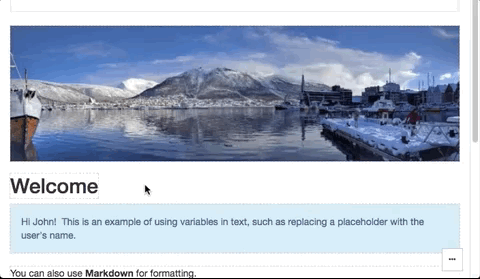
<content.Text
  id="title",             // Required
  type="h1",              // Defaults to `span`
  vars={{name: 'John'}},  // Replaces mustache style tokens (e.g. `{{name}}`) with the given data
  // Other standard props (className, style etc.) can be passed too
/>Creates an editable image (<img>).
<content.Image
  id="hero.image",     //Required
  // Other standard props (className, style etc.) can be passed too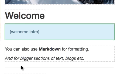
/>Creates an editable text region that displays formatted Markdown.
NOTE: This uses dangerouslySetInnerHTML, read up on it here.
<content.Markdown
  id="home.intro",        // Required
  type="div",             // Defaults to `div`
  vars={{name: 'John'}},  // Replaces mustache style tokens (e.g. `{{name}}`) with the given data
  // Other standard props (className, style etc.) can be passed too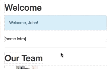
/>Creates an editable list of content. The children passed will represent an item in the list.
<content.List
  id="team.members"       //Required
  keys="name"             //At least 1 property of the list item
>
  {item =>
    <li key={item.id()}>
      <item.Image id="pic" width="50" />
      <item.Text id="name" />
    </li>
  }
</content.List>Allows editing a section of content, (like the properties of an object).
This editor is useful for:
- Off-page content such as metadata
- The content of complex page elements such as dropdowns, modals and popovers
- Editing many properties at once
<content.Object
  id="meta"
  keys="title,description" // Required; will define with items can be edited
  type="span"              // Defaults to `div`
  // Other standard props (className, style etc.) can be passed too
/>