Demo link: https://emails.jianyang995.com/
More explanations: https://www.jianyang995.com/projects/project/P4
This is a Data Visualization project from China Vis 2016 Challenge 2.
The task is to analyze emails from a company, including inner and outer ones. Here, three different aspects, employee, email and business are considered.
For data cleaning and processing, we use python here, because there are lots of libraries useful for this task, such as ntlk, panda, etc.
We also use Django to build a simple project, so we can deploy more easily.
Most pages are implemented with D3.js. Simply go to the website and you will find something interesting and powerful.
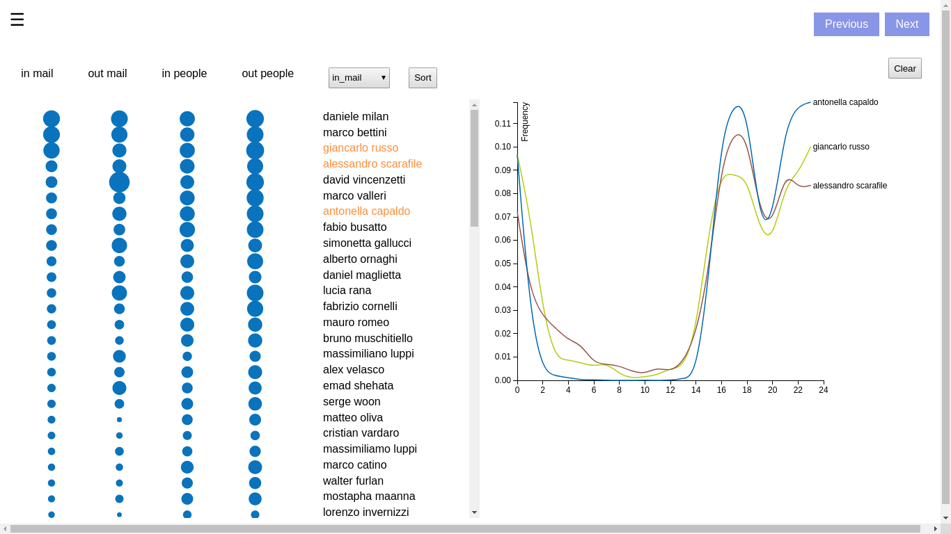
In the above figure, the left half represents the number of emails and people, each of which is separated into received (in) and sent (out). We use the radius of the circle to show the number respectively.
Meanwhile, we can click the sort button to sort the data according to a certain category. From this, we can conclude how important an employee is, as leaders are more likely to deal with a large number of emails.
We can see an employee's habit by clicking the name. In the right half, the distribution of time that employees send emails are drawn.
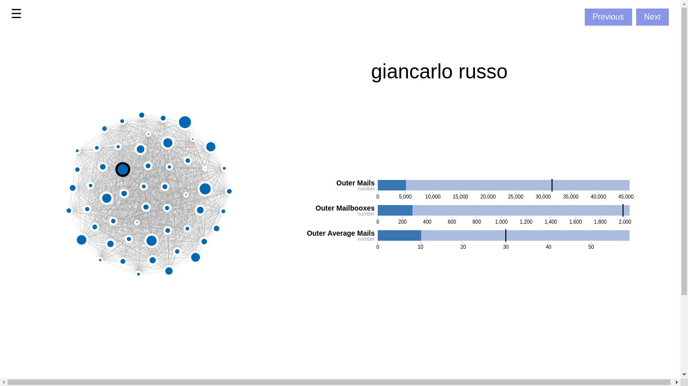
We use a graph to show the relationships between top employees, while the radius of the circle shows the number of emails.
We also apply a bullet chart to tell the percentage of emails from out of the company and compare it with the average value. In this way, we can know who is possibly responsible for inner or outer issues. You can get the bullet char by clicking a node in the graph.
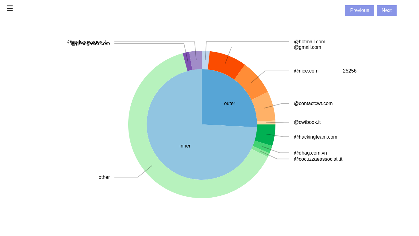
We simply count the number of different outer domains, which reflect the companies that the company is connected with and it may show the business. Hover on the pie graph and read the real value of each part.
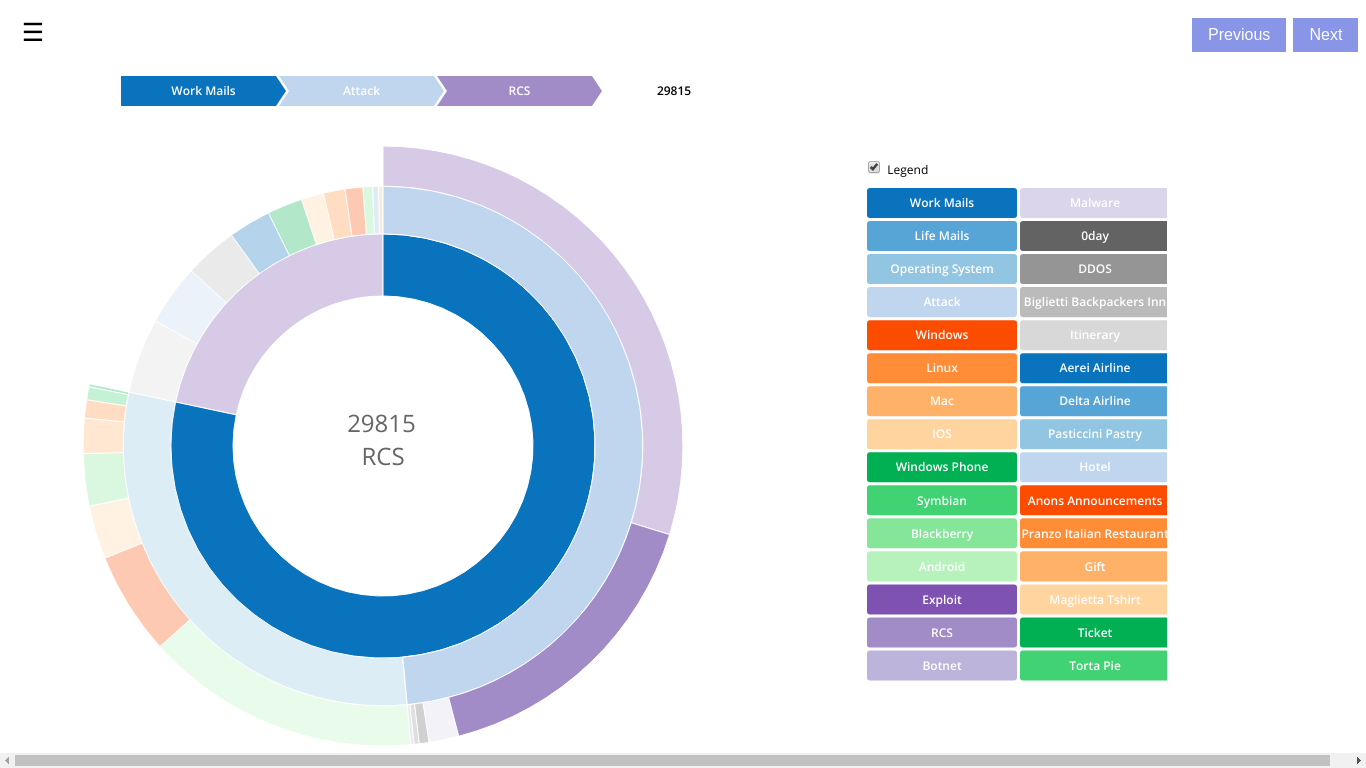
We analyze the text of subjects and the main body to get some keywords. And then we classify emails into 30 categories, which belong to either work emails or life mails. As a result, we can know the main business of the company and the life habits of employees.
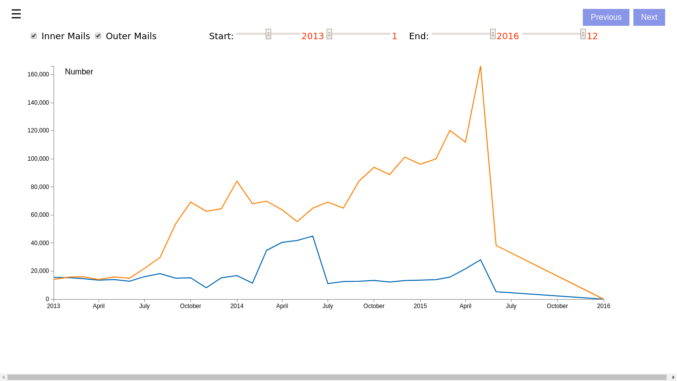
A line chart that customized with time and type of emails is used. You can use the slider bar to choose a time to be shown.
From the line chart, we can figure out when the company grew fast and fell down.
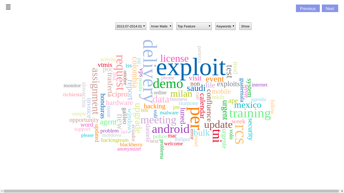
Similarly, you can choose time here, but you can choose to show top words or newly added words so as to analyze the most important and new business of a certain period.
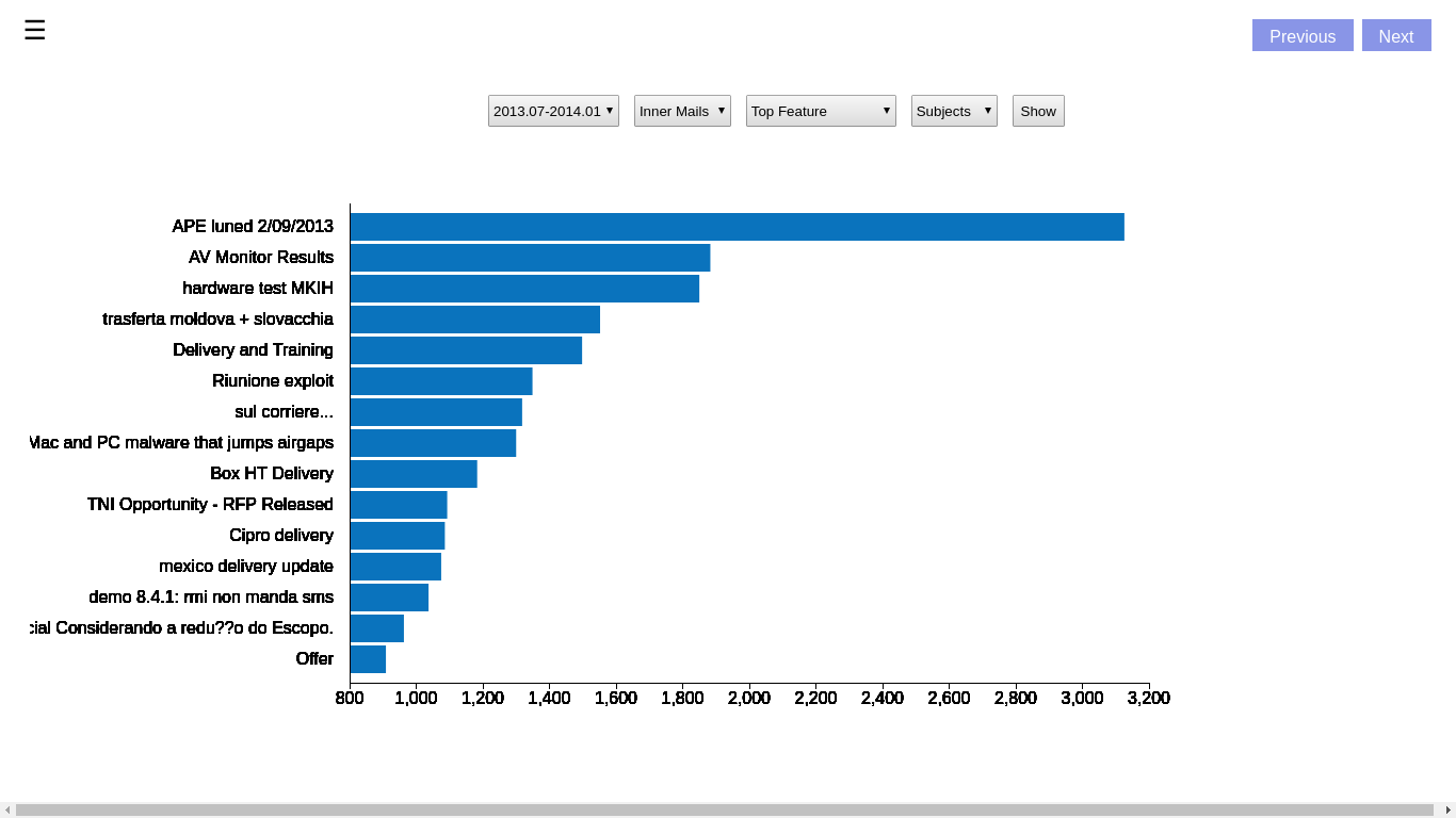
By changing Keywords to Subjects, we can see the top subjects of the period.
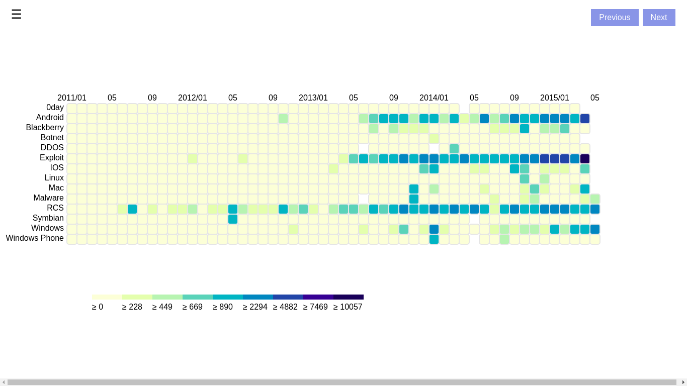
From former tasks, we have got top keywords for business. Therefore, we draw a heat map of top keywords against time to show the development of the business.