Accessibility Issues Needing Addressing for WCAG 2.1 compliance (As of Version 2.2.6) #9399
Comments
|
*Needs type:Accessibility label added to it but can't add it myself |
|
re: triaging this issue. i don't have permissions so i am putting some notes from a meeting with @isabela-pf to do:
|
|
@manfromjupyter i was wondering if your audit includes any features of the status of the status bar. in the past, there were discussions about interacting with the status bar. i was wondering if you had any takes on issues like: #1095 #6577 |
|
Having raised possibly the original complaint about screen reader accessibility problems 2.5 years ago in #4878, I would like to frankly vent my frustration in how making this accessible to the blind is being handled. The chief and really the only usability issue that makes codelab unusable by screen reader users, such as myself, is because the only available editor in the app is CodeMirror. It is an editor that represents the opposite of accessibility. Other than that, codelab is usable with not too many problems. Yes, it is very helpful to lable buttons that are just displayed as icons, so that I don't accidently perform an action I didn't intend to. And it is also good have things that navigate to a different page be marked up as a link, whereas elements that stay on the same page and perform an action to be marked up as buttons. But they aren't what stopped me from being able to use codelab. The editor did. Those other things are nice to have but they aren't a show stopper the way CodeMirror is. Focusing on fixing those things, without addressing the main problem is rearranging the chairs on the titanic. Worst yet, a supremely accessible and fully featured code editore that runs in the browser has been around for years and the developers here are even aware of it. Monaco Editor. Integrating it to be an alternative editor in codelab would do 100x for screen reader accessibility than the sum of the points listed here. I apologise for my very forward tone. I am usually very courteous, but this has been bubbling in me for at least a year now and this chair rearranging has set me off. Lastly, I feel like this WCAG evaluation might misunderstand how keyboard-only users, such as screen reader users interact with UIs. It seems to imply that because you cant tab out of a code cell that the application isn't navigable by the keyboard. However, from what I remember, navigating between code cells was probably the most accessible part of codelab, unless something drastically changed since I last tried. I rememer there being a full set of keyboard shortcuts that I used very succesfully to navigate with easee. i actually use the tab very rarely to navigate around. Mostly just in very basic dialogues, such as installers. For web pages screen readers provide much richer methods for navigation than tabbing. So I am not sure if that assessment accurately reflects the accessibility of navigating between cells. |
|
Sorry you're frustrated with the highlighting of issues above. It should bring you comfort to know that yours and other's earlier concerns with accessibility has lead private and public industry to finally assemble a tasks force to address these issues. Sorry if you feel unheard but I assure you it's because of the efforts of people like you that a call to address this all was issued. We're only here to help. I understand you don't feel heard so allow me to address each of your comments.
Lastly the "rearranging of chairs" or collection, closing, and categorizing tickets right now is an effort from said accessibility group to make sure 100% of issues are added to a product roadmap that can start being addressed once JupyterLab Version 3.0 hits very soon. First step to any successful development cycle is |
I cataloged errors found in your text editor, but not anything from the status bar as far as I know, but it was broadly addressed in Text section > Issue # 4 > (below)
The fix for this which I wrote to #6577 already is to just put a role of alert on it. This will appropriately inform screenreader users. Just as long as it's hidden by default and doesn't have that role of alert by default until a status message is displayed, it should work no problem. I didn't write on #1095 because it was very noisy but the solution is the same. Role of alert. Having it or something appear then disappear violates the accessibility needs of users with cognitive handicaps. Use of anything actively flashing should be avoided for those users with seizures, and the proposed sound solution mentioned should also be avoided. Best practice is just to avoid all sound if possible. New users do not know what a sound means and if they're experienced in the product enough to know what the sound means, they'd know where to find it and would have to navigate to it to read it anyway; might as well save them time and just interrupts their current action to read it to them. The role of alert will do that but won't create sound for any non-screenreader user. Less annoying user experience. |
|
@SamKacer thanks for replying with valuable and much needed feedback. Responses like this really help keep us on track and ensure we are making changes that can work for actual users, not just follow guidelines. And there’s no need to apologize; tone helps give an appropriate sense of urgency and much needed attention as this work is long overdue (as you mentioned with us taking 2.5 years to return to accessibility efforts). I can only speak for myself on this, but I don’t want to make excuses, so I appreciate you taking the time to hold the work and people involved accountable in this way. I’m also glad to say that the issues and solutions you’ve outlined don’t seem like they are mutually exclusive with the ones listed above, but maybe need a refocusing in terms of what resources we devote where and when. As handling code is critical to most user’s work in JupyterLab, I think your point to make handling the code editor we use a major priority makes sense. I’ve put #4878 and your comment here on the agenda for next week’s JupyterLab team meeting (Wednesdays at 9 AM Pacific) to bring it back to the attention of a lot of active community members and help us decide how to take action around your points. I’ve also put it in the agenda for the next JupyterLab accessibility meeting on Wednesday, December 16 at 10:15 AM Pacific, where we’ve been coordinating accessibility efforts and where the discussions that spawned this issue started. I’d like to invite you to attend either or both so you can make sure we aren’t misrepresenting your feedback and can prioritize work around this accordingly (both are on the Jupyter Zoom channel). Regardless, I’ll make sure your feedback gets accounted for and will report back as needed. Thanks again, and hope to hear more from you in the meetings. |
|
Some added context specifically about codemirror:
|
|
@manfromjupyter To explain just what I mean by show-stopping and why the points listed here that relate to screen reader accessibility aren't in the same ballpark. Using either jupyter notebook or jupyter lab, I was able to use all the menus for all the file, edit, kernel, etc. operations I needed. Were menu items and other interactable elements marked up in a confusing way such as being links or plain text? Absolutely, but I could still use them and navigate around, using just the basic screen reader browsing commands. However the editor being as opaque as it was, the only way I could reasonably write and edit code was to copy the contents from the code cell in jupyter and paste it into some editor like let's say VS code. Then make my edits in said editor, ctrl + A, ctrl + C, alt+ tab, ctrl + V. This was necessary when making any amount of editing in jupyter. So the former is something that makes things harder (still very doable, though) and the latter makes things impossible. So for me as a screen reader user, the editor isn't 20% of the problems. The problems I had weren't even listed in the assessment anyway, which was the main point my comment was trying to get across. Lastly, to clear up whether tabbing is the primary method for navigating in web content. As someone who uses a screen reader for several hours every day and regularly communicates with other screen reader users across the technical ability spectrum, let me assure the presumed fact is false. You might be mixing up web content with desktop applications, where I would say tabbing for many applications is a very common method. However for browsing web content, every screen reader worth the space on disc it takes up, provides a special mode for browsing web content (e.g. browse mode in NVDA and JAWS, Scan mode in narrator. This mode allows users to navigate using the arrow keys as if they were navigating through a docx. This is the same mode that provides users shortcuts for jumping between headings, landmarks, form fields, and other semantically meaningful elements. Moving through content using the arrow keys allows screen reader users to navigate sequentially through the content without depending on things being tabbable and with much finer grained control, so this is a much more general navigation method compared to tabbing, which is why for web content it is the default method. This is how I managed to not get trapped in the editor and to navigate through the menus, without them having bespoke keyboard navigation and not being in the tab order. Using the arrow keys in browse mode is enough, although of course if proper keyboard navigation is implemented then it is much more efficient. Further if you tab into an editor, the screen reader switches from the browsing mode into a mode where keystrokes go straight to the application and son you can't use them to navigate anymore, but it doesn't mean you are stuck. Screen readers allow you to manually switch back to browse mode and then you can use arrow keys to navigate around again. This isn't to say that keyboard sandtraps don't exist. I have certainly come across websites where when I am arrowing over content, some element's onfocus event triggers and js refocuses me somewhere else. But not being able to use the tab key is not a sandtrap at least for screen reader users, as other methods exist for navigating and tabbing is generally not even the default method for navigating (in the web). A type of web page where tabbing might be heavily utilized (which is not the norm) is a form page, like for registering for example. Tabbing between form fields is usually very convenient and indeed that is what many sighted users do themselves, but even here many screen reader users might not even use tabbing instead still opt for browse mode navigation. this is simply since by tabbing they potentially skip over content in between form fields and using browse mode navigation ensures they will not miss anything as they move from one field to the next. All of this is not to say being able to tab between elements in web content is worthless, I just want to illustrate that it isn't usually show-stopping and that it isn't the dfault. as a side note, movies are not a great source for facts. It is much more often I come across an inaccurate portrayal of a blind person in a movie, than one that reflects reality. The character is usually what the director assumes a blind person is like, instead of what blind people are really like. I also sometimes find the same sort of "blind" assumption making is committed when writing manuals, which might explain some of the ones you read. Of course if the manuals were for a desktop application, then that is another story entirely, as I already wrote that tabbing is common for desktop apps, but much less for web content. Finally I'd like to acknowledge the assessment raises very valid points that pertain to screen reader usability. Namely buttons that just have an icon need an accessible label and links that dont navigate but instead perform an action should have role=button. I did read through the assessment not just the first point. But my assessment was that these issues were relatively unimportant compared to the major issue screen readers face, which wasn't even mentioned. |
|
@SamKacer @manfromjupyter thank you so much for having these discussions. we appreciate you taking the time to explain how our software choices effect folks across the technical ability spectrum. we understand that there is considerable work to be done to meet everyone's needs. in the past, we have not been able to properly respected the needs of disabled users. we realize making jupyter accessible takes a consistent focused effort and we now have resources to improve accessibility. currently, we are working to triage past discussions on accessibility and synthesize them into a roadmap that can guide us through 2021. @SamKacer we understand that this assessment misses critical needs for you and other blind users; and it seems to me making our that making jupyterlab editor's accessible is a critical priority for us. meanwhile, @manfromjupyter assessment makes us aware that another critical roadmap item is meeting the A and AA wcag conformance criteria. our jupyterlab accessibility group is just getting started again, we are meeting bi-weekly and organizing our roadmap for accessible interactive computing. we're working as group to understand the needs of those using assistive devices, and translate those needs in actionable issues and software. all of your experiences help us understand better, and we acknowledge there is a long way to go. @SamKacer we'd love to meet at your at the JupyterLab Accessibility Meeting on Wednesday, December 16 at 10:15 AM Pacific that @isabela-pf mentioned or at an up and coming Jupyter Community Call on Dec 15 at 9am EST. if these times don't work for you i'd be happy to meet you at other time. I would really like to understand how we can turn your valid criticisms into achievable technical goals that we can communicate to the JupyterLab developers. |
|
@SamKacer My apologies, I can see what you are saying now. Yeah, I don't know of any WCAG criteria for the editor and I have no idea why that is. Thank you for the examples, personal experience, and history lesson; I greatly appreciate it. I now feel bad you read all of that, I included way too many special characters in both the ticket and my previous reply hahaha. Sorry. So to understand, are these the pains? If not or if I'm missing some, what specific aspects of it or your workflow are pains for you within the current editor? If you prefer talking about them perhaps in the meeting, I understand, just thought I'd bake it out while it's fresh on our minds and reference specific issues so you/the group doesn't miss out anything that is giving you trouble or that should be addressed.
EDIT for # 6: Was just spitballing but mentioned by SamKacer below and putting this here so nobody accidentally adds it as it's clearly a bad idea. Ctrl + Shift + Right or Left arrow already allows users to start reading from current position and then onward one word at a time. Does not allow move just selection to given word or phrase, but announces one word at a time and nevertheless screenreaders already have processes for unselecting and jumping cursor to that position once hitting the method, parameter, etc they need to edit. |
|
If I recall correctly, the inaccessibility of the code editor came up in the Web4All accessibility hackathon as a major issue as well. The thoughts at the time were that we're outsourcing the editor to CodeMirror 5 in core JupyterLab, but it is possible to switch the editor. Several options forward included:
Since we only had two days to push forward during the hackathon, and it seemed that the code editor might resolve itself with codemirror 6 over time, and we had a fallback with Monaco or a straight HTML text area, we put the code editor issue aside and worked on menus, tabs and workspace layout, etc. |
|
Apologies for the delayed response. I am currently being kept quite busy by my final year at uni, getting my master's degree. @isabela-pf @tonyfast Thanks for understanding my intention wasn't to say the points raised in this WCAG compliance assessment aren;t important, but instead that it is missing the key accessibility problem for screen reader users. I will try and make it to the meeting on the 16th, even if only for a short time, although I am unsure of how much value I will be able to add. @jasongrout Thanks for providing that context. I think it would have been very useful if similar information could have been provided or in some way linked to #4878 so people interested in how the issue is developing could be informed. If there was a working monaco extension then I and I am sure any other VI devs would have loved to know about it and be able to use it to get their work done. I am not sure if you are referring to the work done that was linked in #4878. I remember trying that ~2 years back and not having luck with getting it to work. If that was improved in the meantime then that could be a major help for VI devs, as even if it was RAM hungry, that would still be a massive improvement for us, although in the long run a more robust solution would need to be developed. I need to stress that jupyter accessibility is a time sensitive issue. Each year jupyter goes by being unusable for screen readers, the more VI people are dissuaded from going into the field of Data Science. To explain, jupyter has become the de facto environment used for university data science courses. After trying data science courses for two semesters, I decided to forsake the field all together, with jupyter inaccessibility making it hard for me to get assignments done being the major contributing factor. On another note, I have to say I am pleasently surprised about CodeMirror 6 having these accessibility improvements. Last time I checked on the CodeMirror accessibility issue (probably ~2 years ago), the CodeMirror dev seemed very unsympathetic and unapologetic about the inaccessibility. I knew it would take a rewrite of CodeMirror in order to fix the major accessibility problems, but I didn't expect them to go through with it. Checking the CodeMirror 6 editor it is obviously much more accessible, although the current version of CM can only improve in terms of accessibility. The major issues I complained before are gone, namely not being able to review the text inside the editor. But I have noticed one thing about CM 6 and that it does have a noticeable latency when reviewing the editor contents. For me it was noticeable from the very start of using it. To make sure it is really there and I am not imagining it, I opened up an in-browser Monaco editor for comparisn. And there I got no noticeable latency. So there is something about CM 6 implementation that doesn't make it quite as snappy as using other editors. Not sure if for sighted devs if there is some kind of noticeable latency when moving around the text with arrow keys or making edits. Might only be a screen reader thing. The latency isn't horrible, but it is still there. I would have to use the editor for a much longer time, preferably to develop some project in order to assess whether I could get used to it or not. My initial instinct is that it would never stop being at least a little irritating, but probably not enough to dissuade me from using the app all together. I did also notice that Monaco has a lot more functionality out of the box, with seemingly many more editing KB shortcuts and better code completion suggestions. Maybe CM6 is more bare bones on purpose and it is possible to implement more KB shortcuts and plug in a better language server, though. For making the monaco editor work better in jupyter, I had a thought that might be completely naive, but I thought I would share it nonetheless. What if when a cell isn't being edited that it is just turned from a monaco editor instance into a plain text element, so that the resources that editor was using are released. So that way there is always just one actual monaco editor on the page at a given time. Maybe this wouldn' work because turning the plain text back into an editor would come with a significant lag. Perhaps, the same editor instance could e kept around and shuffled around when a different cell becomes the one being edited, with the contents of the editr getting swapped. However, maybe the jupyter design wouldn't allow for this, so this idea might still be a non-starter, but I don't know enough to assess that. |
|
Some updates with the latest changes in Jupyterlab. Keyboard/Gestures
Focus
|
Accessibility Issues Needing Addressing for WCAG 2.1 compliance
JupyterLab Accessibility Summary by Handicap for Version 2.2.6
Issues
Keyboard/Gestures
Issue Area # 1
Expectation: Keyboard can be used to navigate all necessary tasks instead of the mouse. (WCAG Criteria 2.1.1 & 2.1.2 (A))
Observed:
Issue Area # 2
Expectation: All actions can be consistently executed by using either the Enter key or Spacebar. (WCAG Criteria 2.1.1 & 2.1.2 (A)).
Observed: Spacebar to selection elements within File Browser section and Launcher page are not working, and a couple others, but more importantly tabs vertically and horizontally can’t even be focuses to test if either work. (20% resolved with finish of Quick easy landmark fixes plus 1 that's not #9491 and Make Side Bars completely accessible #9686)
Focus
Issue Area # 1
Expectation: All supplementary elements that a user needs to interact with receive keyboard focus and be reached using only the keyboard. (WCAG Criteria 2.1.1 (A))
Observed:
Issue Area # 2
Expectation: Current focus is visually indicated on screen and programmatically exposed. (WCAG Criteria 2.4.7 (AA))
Observed: Keyboard tab focus is never exposed. Never.
Issue Area # 3 (90% solved with Ticket: Place region of elements in a logical reading order #9696. Will audit system after that and landmarks gets in, but to date all of the other sections seem in order and may just need to nitpick with listen form labels before the field is read or when focused on it, etc.)
Expectation: Focus moves in a logical order or flow. (WCAG Criteria 2.4.3 (A))
Observed: So many elements are not in the tab order so impossible to say. Safe to say it is probably logical, but the navs will need tweaking. Needs to be readdressed after tab order gets fixed.
Text
Issue Area # 1 (Ticket: Alt Text and Marking Elements Decorative #9682 & Make Side Bars completely accessible #9686)
Expectation: ALT text or other text equivalent is provided for all non-text static elements with content (WCAG Criteria 1.1.1 (A), 1.3.1 (A), and 2.4.6 (AA)).
Observed:
Issue Area # 2
Expectation: Links are visually distinct with text that explains what will happen when the link is clicked (WCAG Criteria 1.4.1 (A), 2.4.4 (A))
Observed:
Issue Area # 3 (50% done with Ticket: Add aria roles and labels #9622, rest will add notes for later)
Expectation: All controls, feedback, mechanisms, status indicators, navigational mechanisms, etc. are meaningfully and consistently labeled throughout the interface (WCAG Criteria 3.2.3 (A), 3.2.4 (A)).
Observed: Consistent, yes, but none from any of the 2-3 navs and up to 2 sidebars are labeled.
Issue Area # 4
Expectation: Interactive elements such as controls, form fields, and other form elements include sufficient information such as hints, help, mandatory format, length, values, status, and if the field is required (WCAG Criteria 3.3.1 (A), 3.3.2 (A)).
Observed:
Issue Area # 5 (Ticket: Alt Text and Marking Elements Decorative #9682)
Expectation: All decorative elements are coded as decorative and vis-a-versa. (WCAG Criteria 1.1.1 (A) and 1.3.1 (A)).
Observed:
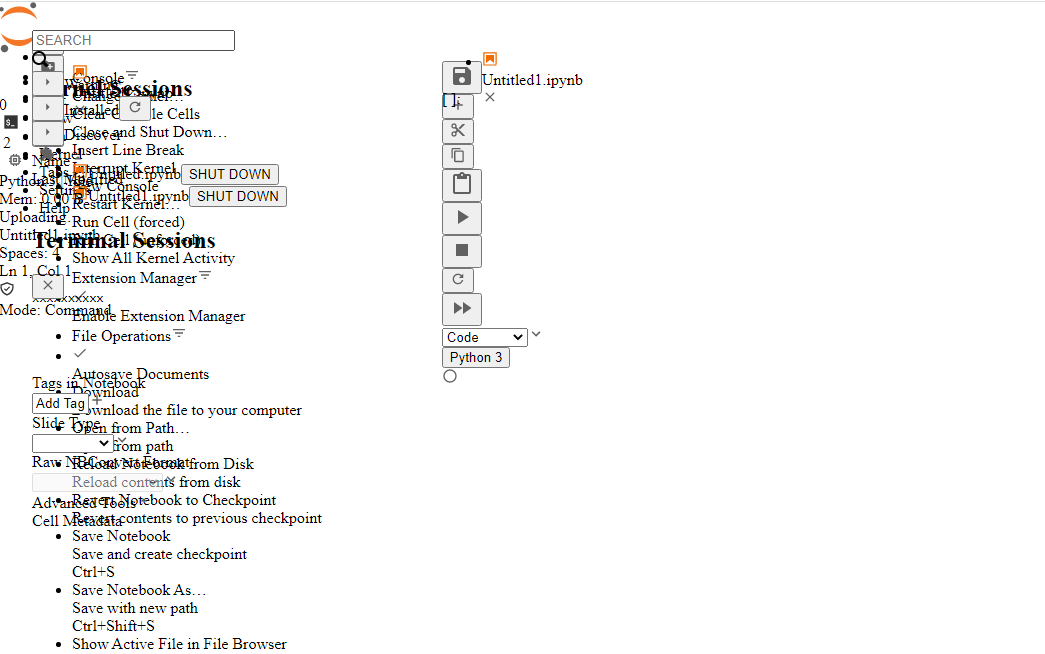
IMAGES of ALL of these problem areas: https://imgur.com/a/6HvOcYK
Issue Area # 6
Expectation: Meaningful labels are provided when user input is required. (WCAG Criteria 1.1.1 (A))).
Observed:
Issue Area # 7 (Ticket: Adjustable Text Spacing (low priority) #9684)
Expectation: The line height, paragraph spacing, letter spacing, and word spacing can be adjusted without loss of content or functionality. Should support line height at least 1.5 times font-size, letter spacing 0.12 times font-size, paragraph spacing at least 2 times font-size, and word-spacing at least 0.16 times font-size. (WCAG Criteria 1.4.12 Text Spacing).
Observed: When injecting the CSS most accessibility or elder-friendly browser extensions inject, found that Launcher tab’s text within kernel containers wraps and gets cut off (accessibility issue). In addition the nav in the header gets off centered and leaves a shadow looking thing when expanding their dropdowns (cosmetic issue).
Issue Area # 8 (Ticket: Alt Text and Marking Elements Decorative #9682)
Expectation: The programmatic and visual labeling of all user interface components with text or images of text are the same. (WCAG Criteria 2.5.3 (A)).
Observed: Images found under the packages section appear decorative but provide context of who is it that made the package/extension. Some of those labels such as IBM, Lab, Jupyter all include text within the image that is meant to provide additional information that a blind user wouldn’t have.
Solution Images found under the packages section need ALT text (ex. alt=”Created by IBM”) or hidden with aria-hidden=“true” and another field added to these listings that provide information on the maker.
Content, Organization, and Navigation
Issue Area # 1 (Landmarks) (Ticket Add aria roles and labels #9622 and partially Make Side Bars completely accessible #9686. Will need another for forms, but lower priority and not needed for compliance)
Expectation: Appropriate text and code labels are included to allow quick orientation and movement between pages and sections (WCAG Criteria 1.3.1 (A), 2.4.2 (A), and 2.4.6 (AA).
Observed:
<header>tag or role=”banner” has been applied to the div acting as the header tag.<footer>tag or role="contentinfo" has been applied to the div acting as the footer tag.Issue Area # 2 (Ticket: Place region of elements in a logical reading order #9696)
Expectation: The reading order of assistive technology is complete, logical, and intuitive (WCAG Criteria 1.3.2 (A), 2.4.3 (A)).
Observed:
When testing to see if the site is still usable or logical when loading without a stylesheet which is how you test this and also how a super small % of users may choose to view the site when fonts, contrast, and background images are too prolific and busy, JupyterLab looks like the image below.
All of the dropdown’s links are showing up in the tab order and shouldn’t until you expand it.
Text is overlapping indicating usually hardcoded styling regarding positioning.
Every icon, every, is missing screenreader-only text.
Proposed Solution:
Issue Area # 3 (Ticket: Add Skip Link to All Regions and Add Region Aria-Role to Panels #9688)
Expectation: The user can skip navigation functions/sidebar and go straight to the content (WCAG Criteria 2.4.1 (A)).
Observed: No skip link exists is available to skip the header, navs, etc and just straight to the left panel or notebook, etc editing.
Proposed Solution: On first or second tab, have an element that is off screen gain focus and upon gaining focus changes position down 50px (all via CSS) and something that is either a single skip to the notebook panel or a table of contents that lets you jump to sidebar, left panel, notebook panel, whatever.
Issue Area # 4
Expectation: User is informed when content changes dynamically (WCAG Criteria 3.2.2 (A) and 4.1.3 Status Messages).
Observed: Running a notebook and the code shell shifting to reveal a graph, error, or whatever else does not inform the user an error was found or the notebook has finished without issue and content may have adjusted to reveal code cell results.
Proposed Solution: When an error is hit, create a visually hidden error message just for screenreaders with role=”alert” so it interrupts anything they were reading while it was running to inform them their notebook has hit and error and has been injected below the code shell in question. Should also change their focus to the first error found. On success, should not change focus but should still inform them via an invisible role=”alert” that their notebook completed successfully and may have had the space below their code cells adjusted with results. Really the more information you can give them the better. What kind of error, how many code cells, etc but the before mentioned is key.
Issue Area # 5
Expectation: Tables are used appropriately, are clearly organized, and labeled (WCAG Criteria 1.3.1 (A)).
Observed: File browser contains a fake table made out of divs. This needs to actually be a table with the property table formatting. Table > thead & tbody > tr th tr td etc. In addition, table needs to contain a to explain the purpose of the table or just title it but only to screenreader users. Reason this is needed is because screenreader users can search by tables and just jump table to table if needed and it needs to have a description associated with it.
Issue Area # 6
Expectation: Content be used in both mobile portrait and mobile landscape orientation (WCAG Criteria 1.3.1 (A)).
Observed: Not mobile-responsive, switching shouldn’t break but both are broken, which means on a desktop it won’t be able to magnify appropriately for low-vision users without content being cut off or hard to use.
Proposed Solution: Explained in other sections what exactly to fix, but in short, using CSS flex display is a life saver and wrapping entire panels/containers once a certain width is seen, using ems and percentages and adjusting font-sizes over hard-coded pixels, and a handful of other things will be Jupyter perfectly usable for Low Vision as well as mobile users.
Color, Contrast, and Zoom
Issue Area # 1 (Ticket: Full Colorblindness Support #10008)
Expectation: The default text and background size and colors provide sufficient contrast. (WCAG Criteria 1.4.3 (AA)).
Observed for Default theme/OOTB Functionality:
Issue Area # 2 (Ticket: Full Colorblindness Support #10008)
Expectation: Interface components and graphical objects that convey information have sufficient contrast with the background and surrounding objects (WCAG Criteria 1.4.11 Not-Text Contrast (AA)).
Observed: File search section search icon is 1.87 contrast (dark gray magnified glass on blue background) and needs to be a 3.0 or higher.
Issue Area # 3 (Ticket: Full Low Vision Support (400% zoom) (Mobile/Tablet-Responsive Support) #10004)
Expectation: The page can be zoomed to 400% in a 1280px wide display and site is still completely usable (no loss of functional). In addition this is done without requiring BOTH a vertical and horizontal scroll bar (WCAG Criteria – {forgot}). For low vision support and assistance for color blind users.
Observed: 400% zoom makes coding impossible. File browser last modified column is lost, Kernel Session text only shows first letter (ex. “C…”), Search section console, extensions, and other subsettings are trundated, and complete inability to see, access, or use footer buttons, right sidebar, packages button in the left sidebar,
Error Handling
Extra Credit
The text was updated successfully, but these errors were encountered: